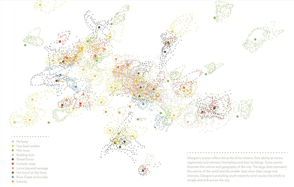

Square sausage and subway are the most powerful smells that define Glasgow. When I came across the ‘scent map of Glasgow’ another time I was amazed by the endless creativity of cartography. The artist Kate McLean came up with the idea to record the perception of smells in a city from the view of visitors, to locate them and to create a map from this information. In Glasgow, the basin-like location at the river Clyde and the weather conditions produce a high content of air moisture, which creates a dump atmosphere with lots of scents hanging in the air. The pungent smells are characteristic of the Scottish city lingering on visitors and citizens. During several weeks visitors were asked to sniff randomly at a variety of air samples and to tell which aromas arrested their senses. Ten different smells were asserted to remain with visitors even longer after they have left, among them the scent of commercial perfumes especially close to the centre, wet moss around the necropolis, hot Bovril at the football parks, the warm humid metallic flavour of the underground and warm fat smell of sausage grillers. So far, this idea was realised for a couple of cities like Edinburgh, Paris, NY, Newport and precisely also Glasgow.
The large dots identify the kind of smell and the small spots present the range and intensity of their spread. Particularly in areas where smells mash-up like Glasgow’s central parts new aromatic creations are composed.
I like the creativity in cartography and I think that maps do not always have to be political or economical. So now I’ll head outside to see where to find the best smell of an Austrian ‘Wiener Schnitzel’.

Project click here.

#Ideas


Next article

I believe that readers of Geoawesomeness are never lost… especially in Manhattan where most streets are simply a numbered grid. Nonetheless having difficulties in finding their way is a common problem for most of regular, mortal human beings (even in New York). In fact study says that 10% of New Yorkers are lost at any given time.
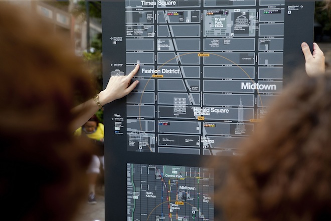
This year the New York City Department of Transportation (DOT) prepared something for them and for us – a new program of pedestrian maps called WalkNYC. ‘The other people’ will get a new set of city maps that will make it easier to navigate the city streets and find nearby interesting places. What we will get are beautiful maps that are a combination of cartography, great design and well-thought-out user experience.
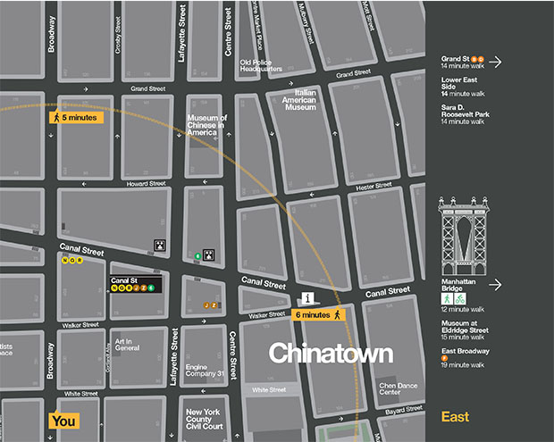
The maps are designed to encourage people to walk, bike and use public transit, and feature all local streets and major landmarks and destinations, as well as bike lanes. Kiosks displays a large map of the streets with a 5-minute walking distance marked as ring, and another map showing the area in relation to a larger section of the city. This is cool but we’ve seen it on many city maps.
But there is one feature which corresponds to the experience of mobile maps rather than old school analogue cartography… The orientation of the maps! WalkNYC uses heads-up orientation rather than north arrow which is one of traditional mapping dogmas. This mean that the orientation of the map corresponds with the direction the user is facing. This is a smartphone-like approach but I love it and it actually makes a lot of sense (similarly to mobile maps).
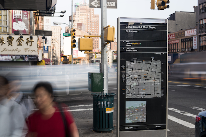
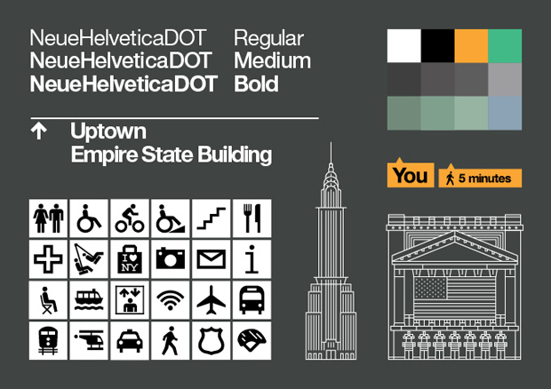
I also like the unique system of icons which includes the drawings of the landmark buildings. Such a representation makes it much easier for people to get a clue where they are. The custom version of Helvetica font family looks modern but it was designed to relate to NY metro maps from 60s’. And I must say that it works. There is something familiar about these maps. I feel like I’ve seen them before.
The maps are already installed on 300 kiosks of the CitiBike system. They will be located near subway stations, business districts and other high-traffic pedestrian areas, and the DOT is working with the Metropolitan Transit Authority to install the new maps in subway stations and at select bus service stops.
WalkNYC – one more reason to visit New York.