
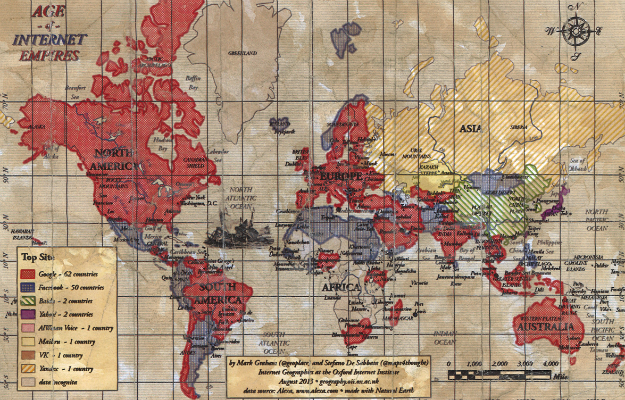
The Interesting Spatial Analytics on the most visited websites by country carried out by Oxford Internet Institute using public data from the web traffic service Alexa, showed that Google is still the King of the internet.
The Map below presents that Google and Facebook still reigned supreme among internet users across the world with some few exceptions.
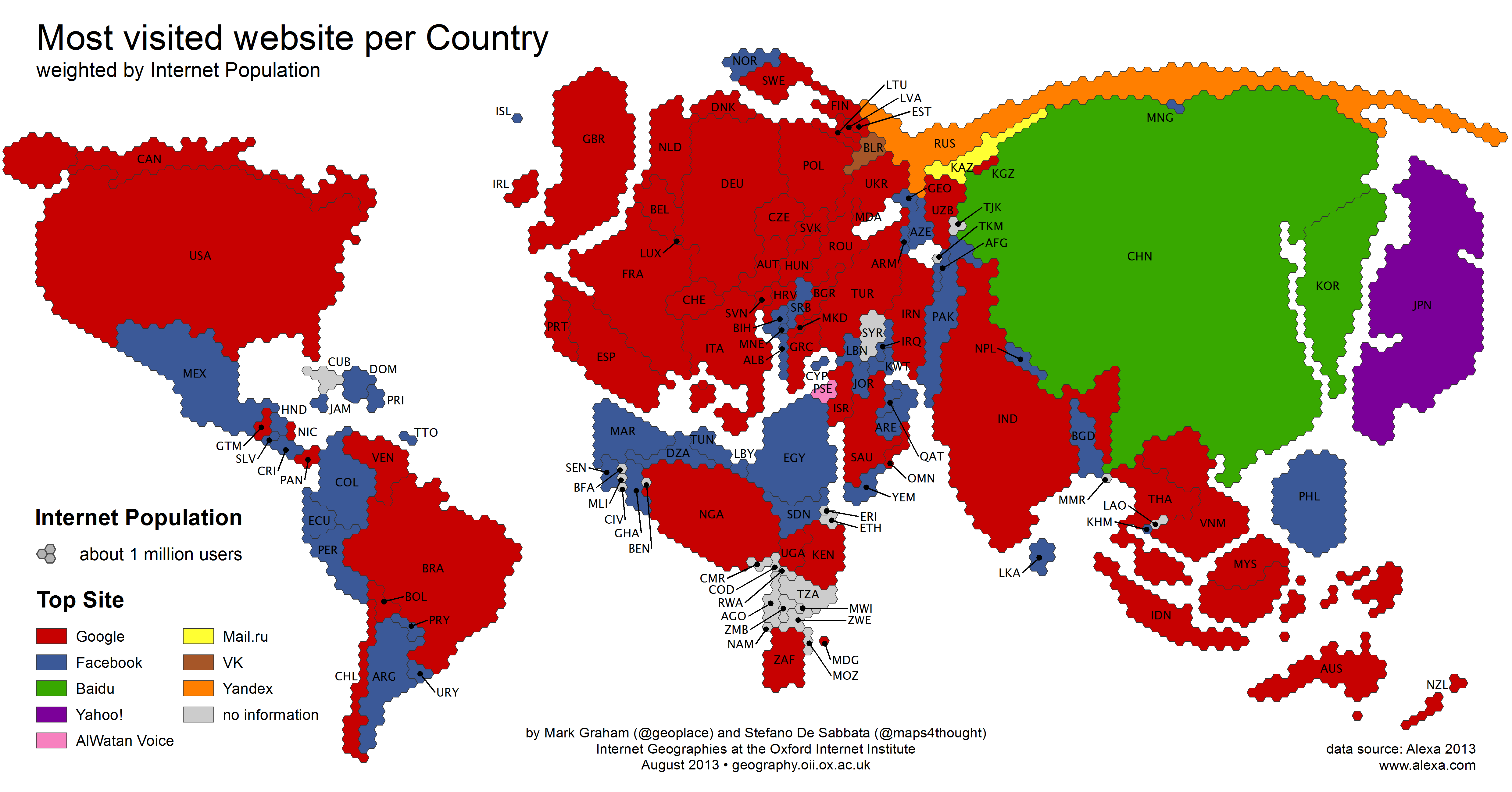
The Russian Mail.ru was found most popular in Kazakhtan, Al-Watan Voice newspaper dominates Palestine, Yahoo still in charge in Japan and Taiwan. Russian search engine, Yandex tops the list in Russia. Of course, Baidu tops Chinese web which obviously could be attributed to the part of Chinese government’s support.
The study clearly shows that Google is still the giant of the WWW as it emerged the top site in 62 countries out of the 120 countries studied. The study noted that the 50 countries that Facebook emerged the most popular, Google came second in 36 of them, the remaining 14, emerged YouTube as the second most popular (YouTube,currently owned by Google).
NB: Please take cognizance of blind spots in the survey because Alexa lacks information on countries with small Internet Populations including most of Sub-Saharan Africa.
Source: Mapcite.com

#Science


Next article


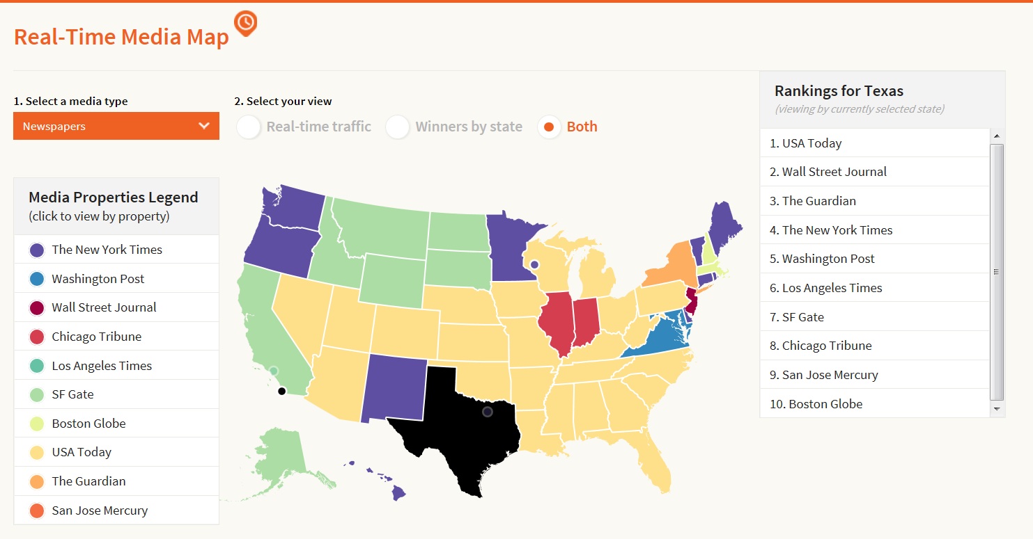
Wouldn’t it be amazing to know which television, newspaper, magazne and radio covers most of the daily news in my area or the other. Wouldn’t it be fascinating to put such tabular information in an easily understandable form of a digital MAP? Wouldn’t it be much more value addition if the digital map shows Real-Time link-sharing data from various publications.
Bitly, a URL shortening and bookmarking service, unleashed a fascinating GIS mapping project called the “Media Map”, which delineates each state with its most widely consumed media source on a state-by-state basis and displays real-time shares from those publications on the map. It not only allows you to visualize static and real-time information on map, but also allows you to interactively filter the information/news by either by state or by media source.
Below is the intuitive map showing both real-time information of shares and winners by state, on other hand, you can filter the information by selecting particular state.
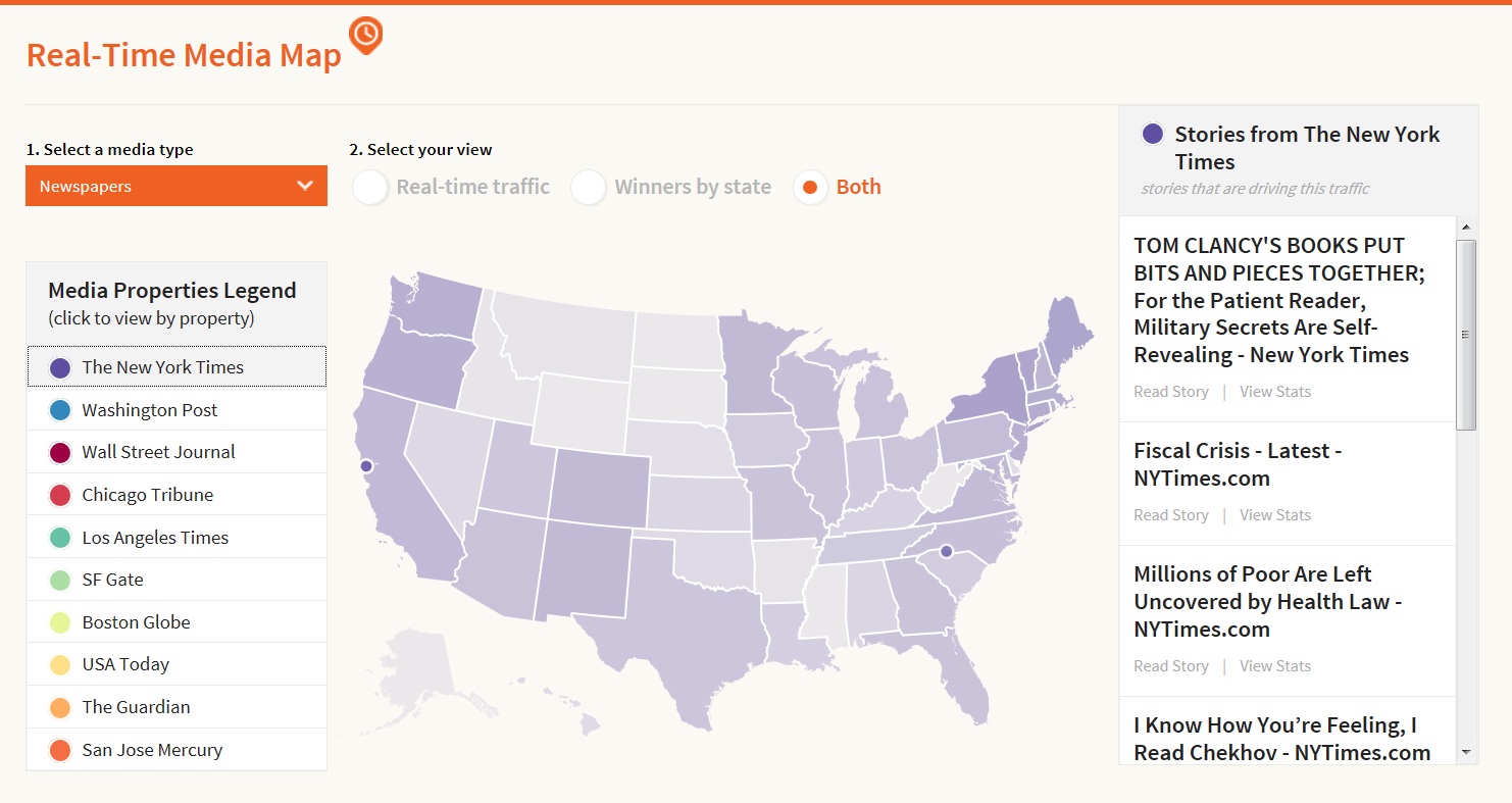
Below is another map which shows the map with the real time sharing of stories from New York Times media source.
Isn’t it so cool to visualize media information on a MAP with real time information? For more information, you may follow this link.
source: Bitly