
We all heard about the devastating typhoon Haiynan hitting the mid Phillippines on 7th to 8th November last week. With wind speeds of around 300km/h at landfall and gusts going up to 380km/h Haiynan became the strongest typhoon to ever hit land and corresponds to a Hurricane of category 1. It not only caused sever damage particularly in Tacloban City and Ormoc City on Leyte Island but also left a dozen thousands of deaths behind.
In that catastrophic situation first aid and subsequent help for taking care of the devastations (houses, infrastructure) is most important. For the aid coordination and distribution planning the information about what happened where is crucial. Mobile information technology devices have come to play an increasingly important role in responding to humanitarian emergencies and providing critical data to improve the understanding of the complex dynamics of emergencies. The advantage of geospatial and crowd sourcing technologies to prepare, mitigate, and respond to emergencies relies on its potential to quickly react after a disaster. The goal of the crisis mapping is to gather the spatial information before international and local aid workers are beginning to arrive. Therefore, time is a critical factor in crisis mapping. In the following lines I am going to talk about two examples of recent crisis mapping that was realised – and still is performed – in the Philippines after the devastating typhoon Haiyan.
OpenStreetMap
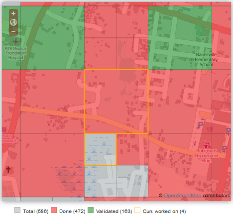
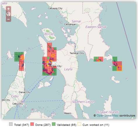
In this particular case, crisis mapping groups such as the Humanitarian Open Street Map Team (H.O.T.) and the Standby Task Force (SBTF) are officially deploying in response to a request (Digital Humaitarian Network) from UN Office for the Coordination of Humanitarian Affairs (UN OCHA) to contribute in media monitoring. They started promptly to map the affected areas using the crowd sourcing base OpenStreetMap (OSM). In order to map buildings, roads and any damage caused by the typhoon the affected regions are organised in square shaped fields that are worked off one by one. If an area was mapped by a crowd sourcer it is marked by red colour; if it also has been validated afterwards it becomes green (see figures below). Most recent satellite imagery is applied to detect changes and devastations and map buildings square by square. The imagery is delivered by the crisis mapper communities such as the SBTF and H.O.T. The mapping activity started very quickly after the typhoon moved off.
In the Philippines the mapping response captures the damage at three different levels from small to large scale:
- In the most affected area of Tacloban City all buildings are mapped. The disaster response reacted very quickly as by the first 24 hours over 10.000 buildings have been mapped already.
- The second step is to make a quick pass over the wider area affected by the typhoon to locate all of the villages and major roads in the region. The size of a village and its linkage is important for aid distribution planning. Therefore in the Philippines on this level it was decided to draw the residential areas around the villages (and not to mark them as nods; neither buildings are important here), its main inner roads as well as the roads to outer villages.
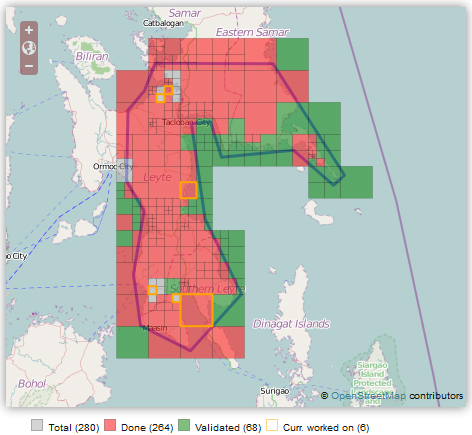
- The third level comprises the most severely damaged areas in the region apart from Tacloban City. Within the indicated purple boundaries on the maps all roads and buildings have to be traced accurately. This step is essential to estimate the regional damage.
Ushahidi
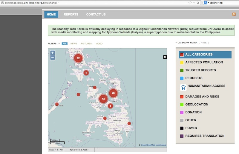
Ushahidi‘s is a software that allows users to begin crowd sourcing reports within minutes after a disaster or emergency situation eliminating the need of installing a platform on server or paying for host. Anybody can contribute information weather it is a simple text message from a phone, an image from a smart phone or a report submitted online. – Ushahidi collects information from any device with a digital data connection. After being submitted the post will be located on an interactive map that can be viewed on a desktop or a smart phone (crowdmap). Since it is an open source software anybody can fit the program according to its needs, which means that the software is permanently improved. Ushahidi was invented after the riots accompanying the Kenya elections in 2007 and since then was deployed several times as for instance to monitor unrest in the Democratic Republic of Congo, to track violence in Gaza, to monitor the swine flu outbreak worldwide and to assist in crisis intervention after the earthquakes in Haiti and Japan.
In the recent example of the Philippines the GIScience Research Group from the University of Heidelberg is assists crisis mapping with hosting a Ushahidi plattform (http://crisismap.geog.uni-heidelberg.de/ushahidi/).
There is more crisis mapping initiatives going on as one would think. Crowd sourcing has become powerful for disaster reporting due to its potential to get quick response from a potentially great amount of people. From the knowledge and technical point of view (finally the usage of the applications) OSM and Ushahidi have made big advancements in making the systems easier for customer/helpers. Crowd sourcing in my opinion is an optimal way to achieve one goal by collective effort.

#Ideas


Next article
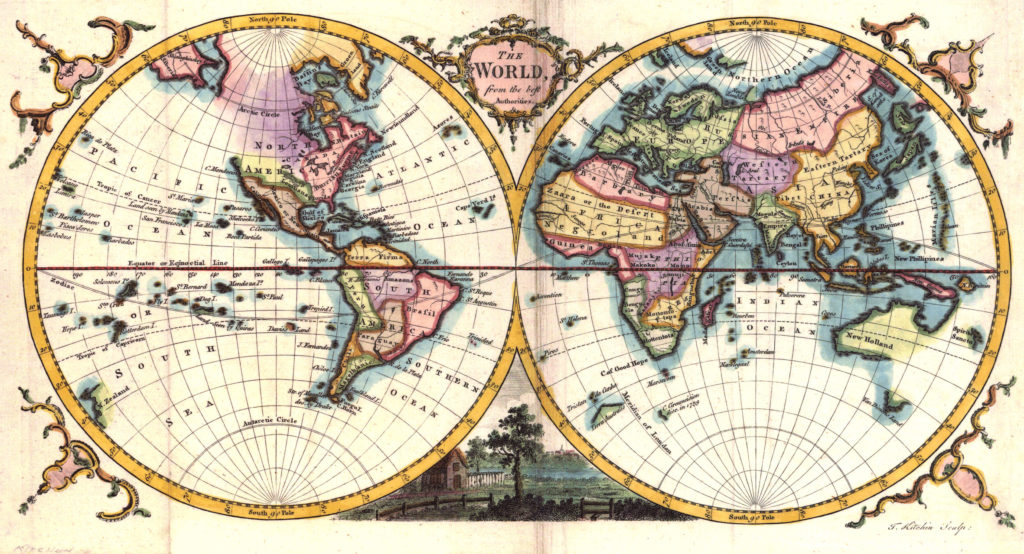

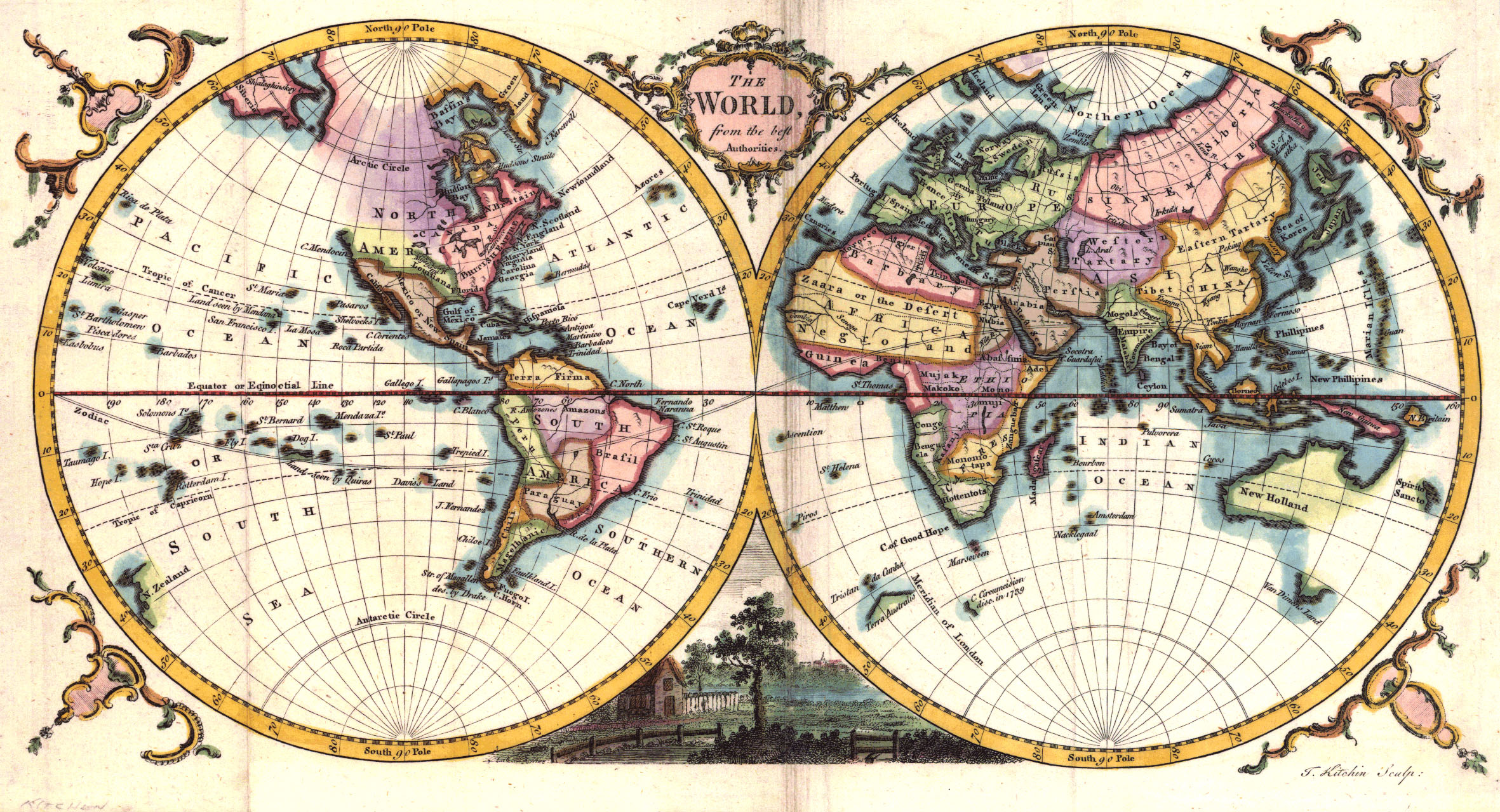 Maps were perhaps the first drawings that humans drew on the sands of time but it is amazing to notice that maps still hold a very special place in our digital world as well. Maps for representing billionaires on the planet, Maps for showing the internet network, Maps here and Maps there! It is amazing to see the recent trend of representation almost all information in the form of a Map!
The Internet is full of these “fun to look and discuss” maps and we at Geoawesomeness covered some of these interesting and “sometimes” controversial maps that were making waves on the Internet like the “Stereotype Map“, “Emotions Map” and so on. A Staff at the WashingtonPost decided to something more than that, he made a list of 40 Maps that explain our world. Surely the journalists’ these days love the concept of maps! If this trend continues, a degree in cartography could help you get a job at the media 🙂
Guessing what these “40 Maps” could be about? Well, I’ll let you experience the list firsthand and would be interesting to hear what your favourite map was and if you agree with the list? Whether you agree with the information in the map is a different story altogether, I don’t agree with some of the representation the maps are depicting. Oops Spoiler Alert! Let me hold my thoughts right there 🙂
Here’s my favourite map in the list – “Writing systems map of the world”. There is something amazing about this map! If you consider the population of the world and this map together, it is amazing to see that the most diverse place on the planet happens to be the most populous part of this little blue ball that is circling the sun! Coincidence or a little bit more than that, could be an interesting piece of research!
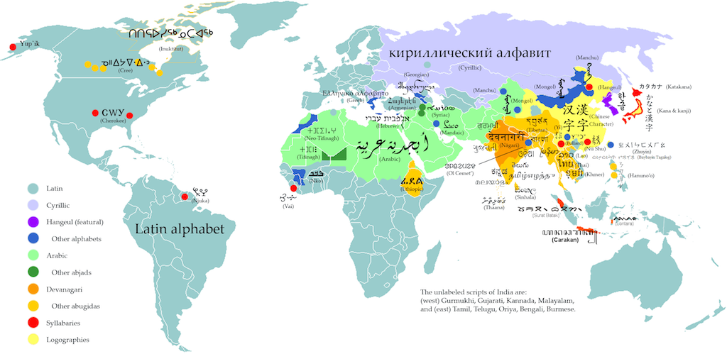
It’s such a diverse world out there!
What do you think? Let us know! Here’s the link to the article . 40 Maps that explain our world: bringing together geography & journalism!
Source: Washingtonpost