
Geography implies movement particularly when spatial data have a temporal component. Macro-economical data present such a sort of information as imports and exports from origin to destination create moving tracks. We know these trajectories for instance from the tracks of ships on the oceans. MIT Media Lab worked on a tool that allows composing a visual tale about countries and products they exchange (import/export). It provides five different kinds of visualisation, which can be the traditional presentation of geographic data as choropleth maps but also proportional illustrations of good exchange between countries that allow a sensation of thematic scale. The open source tool is called the Observatory of Economic Complexity and uses bilateral data of roughly 200 countries, 50 years and around 1000 different products. I wanted to confront the common portrayal of spatial data as cartographic maps and thematic visualisation of information, which this tool is powerful to show. Please, see some examples at the bottom.
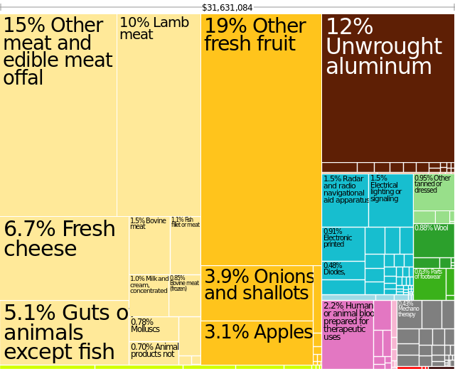
Tree map showing the exports from New Zealand to Austria in 2003.
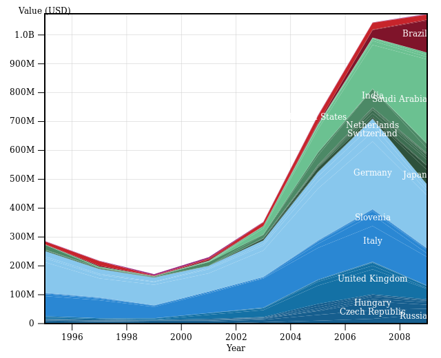
Stacked area chart of exports of hot rolled iron or non alloy steel and coil of Austria in 2010.
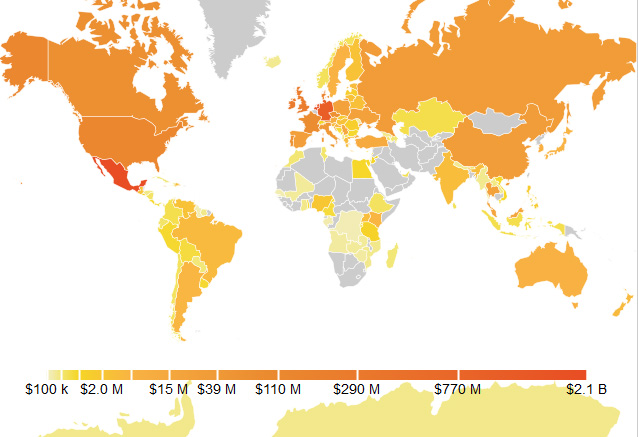
Map showing beer exports worldwide in 2010.
Website of project and source: http://atlas.media.mit.edu/

#Ideas


Next article
The United States Geological Society (USGS) has launched an amazing online database and map. Biodiversity Information Serving Our Nation (BISON) is a Web-based map with search functionality that contains more than 100 million recorded observations of animal species across the US. BISON’s search functionality allows users to enter in a particular species by its common name (“cat”) or scientific name (“felis catus“), and if the animal is in the database, the map will display each recorded observation as point on the map.
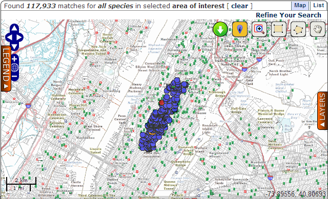
When I selected the area of Central Park in NY I found that there are 117 933 observations recorded… amazing. Clicking on each point gives extra information, such as who and when made the sighting. Another tab offers a list view of observations, which come from nearly 300 universities, web portals and scientific surveys going back decades.
The project is part of a larger international effort, called the Global Biodiversity Information Facility, that is working to compile biodiversity data and make it readily available for public use. The goal is to promote citizen science and the development of sustainable practices through easy access to environmental information.