
Trade deficits and protectionism are making headlines across the globe but how exactly does the flow of international trade look like? The global market for imported goods was $15300 billion in 2015 (UN’s Comtrade database).
Mapping the flow of international trade
This map created by Max Galka shows where those products came from and where they went, each dot representing $1 billion in value. It’s amazing to see how certain countries dominate exports. You can select any country to get an overview of the imports. The Map is totally cool and would be helpful if you could have also selected particular goods.
Max created the map using data from UN’s Comtrade database which provides free access to detailed global trade data. If you are interested in learning more about how the map was created – here’s the link to the Youtube video explaining that.


#Ideas


Next article
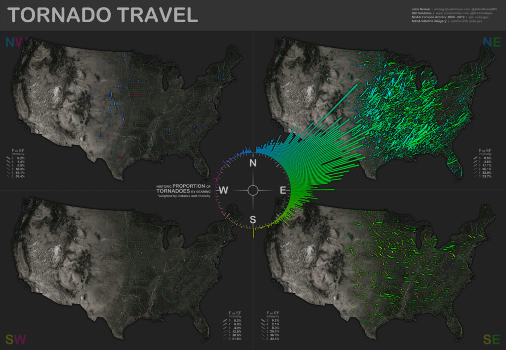

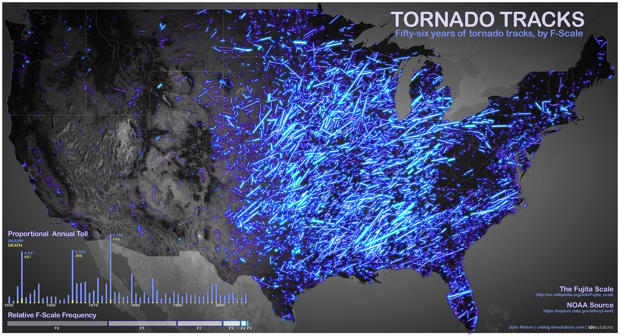
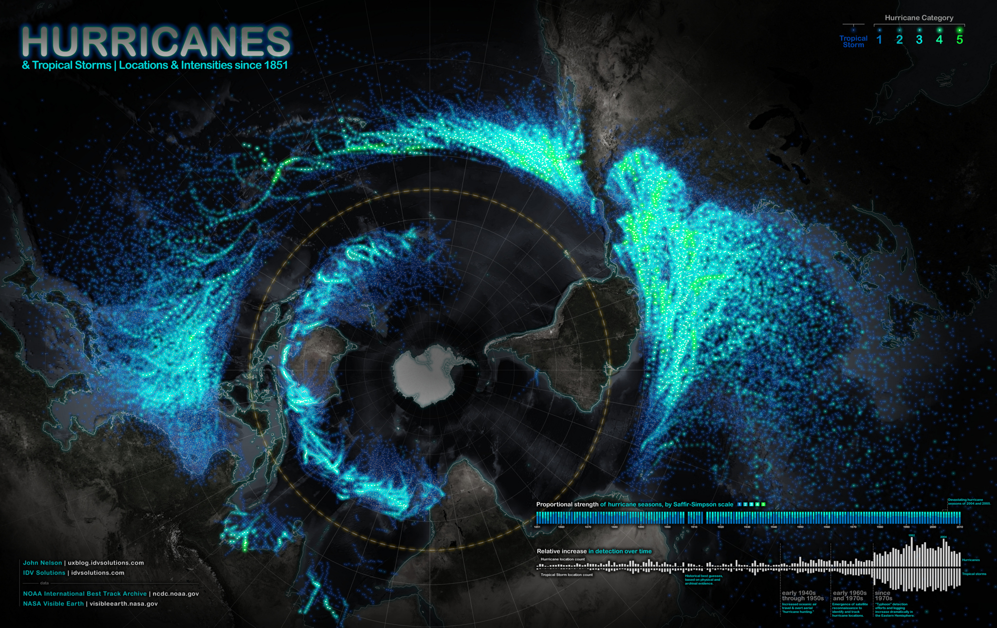
Nature can be as beautiful as violent. It can amaze, but it also brings a force of destruction: tornados and hurricanes. At the same time, mapping weather patterns is typically boring, and it lacks on this ambivalent excitement.
Typically… But not in this case of maps by John Nelson, who pulled the historic data from NOAA on hurricanes and tornados and created an amazing series of maps showing the direction, frequency, and strength of each storm. The brightness of the lines is indicating the intensity.
From design and cartographic perspective, the series is great. From user stand point it’s a pity that the maps are not interactive to play around and filter out data relevant for your region. Nonetheless, these beautiful maps of destruction are simply stunning!

source: IDV Blog
source: IDV Blog
source: IDV Blog