

With the coronavirus pandemic continuing to spread in many countries as economic activity revives, Google has ramped up its efforts to help people stay safe when they’re out and about. The next time you fire up the latest version of Google Maps on your smartphone, you will receive an option to activate COVID-19 data on the map.
By enabling this layer from the top right corner layers button on the app, you will be able to see the seven-day average of confirmed coronavirus cases in an area per 100,000 people. The layer display is color-coded to indicate whether cases are increasing or decreasing.
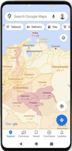 The layer’s colors indicate:
- Grey: Less than 1 case
- Yellow: 1-10 cases
- Orange: 10-20 cases
- Dark orange: 20-30 cases
- Red: 30-40 cases
- Dark red: 40+ cases
“Trending case data is visible at the country level for all 220 countries and territories that Google Maps supports, along with state or province, county, and city-level data, where available,” Sujoy Banerjee, Product Manager, Google Maps, explains, adding that the feature is being rolled out to both Android and iOS users simultaneously.
The data for this new Maps layer comes from multiple sources. These include authoritative sources, such as Johns Hopkins, the New York Times, local health agencies, and municipal corporations. But interestingly, one of the data sources is Wikipedia. Google already relies on these sources to power COVID case information in Search, and now this capability is being expanded to Google Maps.
You may recall that Google first updated Maps with new COVID-19 travel alerts when cities first started to reopen in June. The navigation app tied up with local transit agencies to tell commuters if their trip was likely to be affected by COVID-19 restrictions, and notified drivers about restrictions along their routes.
Google Maps’ crowdedness prediction feature for public transit is also helping users to see the times when a transit station is historically more or less busy, while also allowing them to check for insights like temperature, accessibility, and security onboard.

#Business


Next article
This new cloud-based GIS and data visualization platform is what you’ve been waiting for

Being a cartographer has never been as easy and at the same time as difficult as today. On one hand, we have all the great GIS tools from Esri and QGIS, that are great for data analytics but typically making great-looking maps using these tools still requires using Adobe After Effects or Illustrator in the workflow. On the other hand, we have Carto, Mapbox or Luciad that are great but typically require some coding skills which is a big barrier for a lot of folks.
When searching for a toolset to my new project (that requires very heavy drone raster data and a lot of vector data on the top) I found Aspectum and it seems it is bridging most of the barriers that I’ve seen in nearly every other mapping platform I’ve used.
Aspectum is a San Francisco-based startup founded in 2017 that offers cloud-based GIS software focused on ease of use for data visualization. Its mother company is EOS, which is a powerful platform for Earth Observation data analytics, we’ve been covering on Geoawesomeness. EOS brings a very powerful backend for raster data visualization and processing (which is great for any satellite or drone-based photogrammetry project) and Aspectum builds on the top of it vector data visualization features that were previously available to hard-core front end developers. This is a combination that doesn’t work elsewhere.
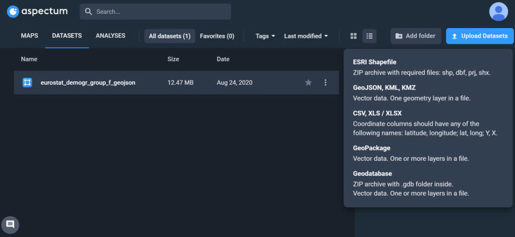
Right away from the beginning when you log in to the platform you will see that it was designed by someone who has been in our shoes and has been struggling with a lot of annoying things in the majority of the similar platforms out there. Starting with data import, Aspectum supports SHP, Geodatabase, GeoJSON, KML, KMZ, and GeoPackage, so the majority of formats you are using, with other formats from QGIS and PostGIS in the development roadmap.
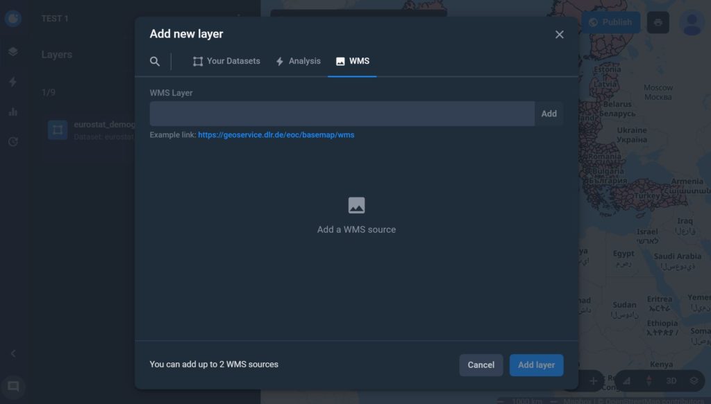
The vector datasets are uploaded quickly and you can geocode your data up to a city-level if required. On top of it you can add your own WMS layers that you can generate directly in EOS Storage platform. When you get a premium package from Aspectum you can access also EOS Storage, where you can generate all your raster analytics and publish to Aspectum.
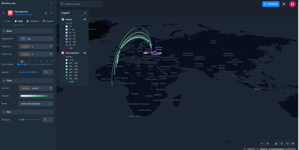
Once you have your environment ready the fun part begins. Mapmaking with Aspectum is fast and easy but I recommend you to have a look at their demos on YouTube to have an overview of what is possible with the platform. Besides all the regular things like choropleth maps and data clustering Aspectum is really good at 3D visualization and arcs (or flow maps).
Especially the flow maps have always been a difficult item to visualize in any online or desktop mapping software. Typically, you would need to use a lot of workarounds and the visual effect would still be poor. With Aspectum you can do it in an automated way in a couple of simple steps.
Another interesting feature is predefined analytics algorithms that allow you to do some basic data analysis directly in the app rather than going back and forth to desktop GIS environment which is a typical workflow. Additionally, you are able to directly use SQL queries to extract some additional insights from the data.
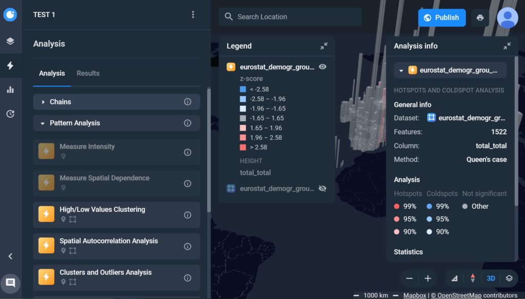
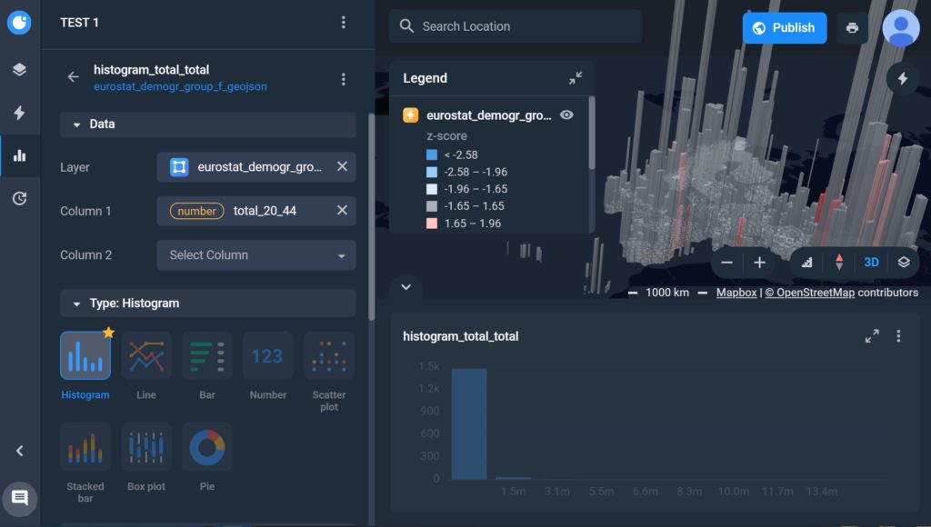
Last but not least feature I wanted to share with you, are the widgets that will let you customize the user experience by adding additional charts, plots and histograms that turn the map to an interactive dashboard. If you connect external datasets to the platform you can also schedule the data updates that make it even more powerful.
The project I have selected Aspectum for is about displaying construction progress based on drone photogrammetry data and the example below shows exactly how to do it.
I was really surprised when I found Aspectum because I thought that there is no space for another player in the crowded location intelligence tools sector. The platform gives, however, a bit of fresh perspective on how things should work across all the mapping software providers out there. You will definitely see much more Aspectum-based maps from me on Geoawesomeness and my other projects.