

From time to time you need to very quickly make a choropleth map based on a spreadsheet. There are a lot of different ways to do it but most of them require registering in one of the mapping services, having Excel plugin or a GIS software installed.
The easiest, fastest and free environment allowing you to make a simple and interactive map is Google Sheets (web-based competitor to MS Excel offered by Google). The map below shows data about life expectancy per country in 2015 and it took me around the 30 seconds to make it (hover over to see that data per country):
LIFE EXPECTANCY AROUND THE WORLD IN 2015
Here is how you do it:
The first step is getting your data to Google Sheets. I’ve copied and pasted my data from Wikipedia. You need to have two columns: the first one with a geographic reference and the second one with data. The geocoding (matching the name with a geographic location or area) works well with countries and cities. 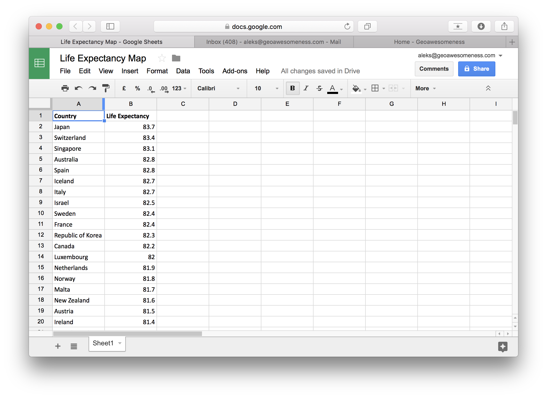 Once you have your data ready in a spreadsheet you can start making your map. Start from selecting your data:
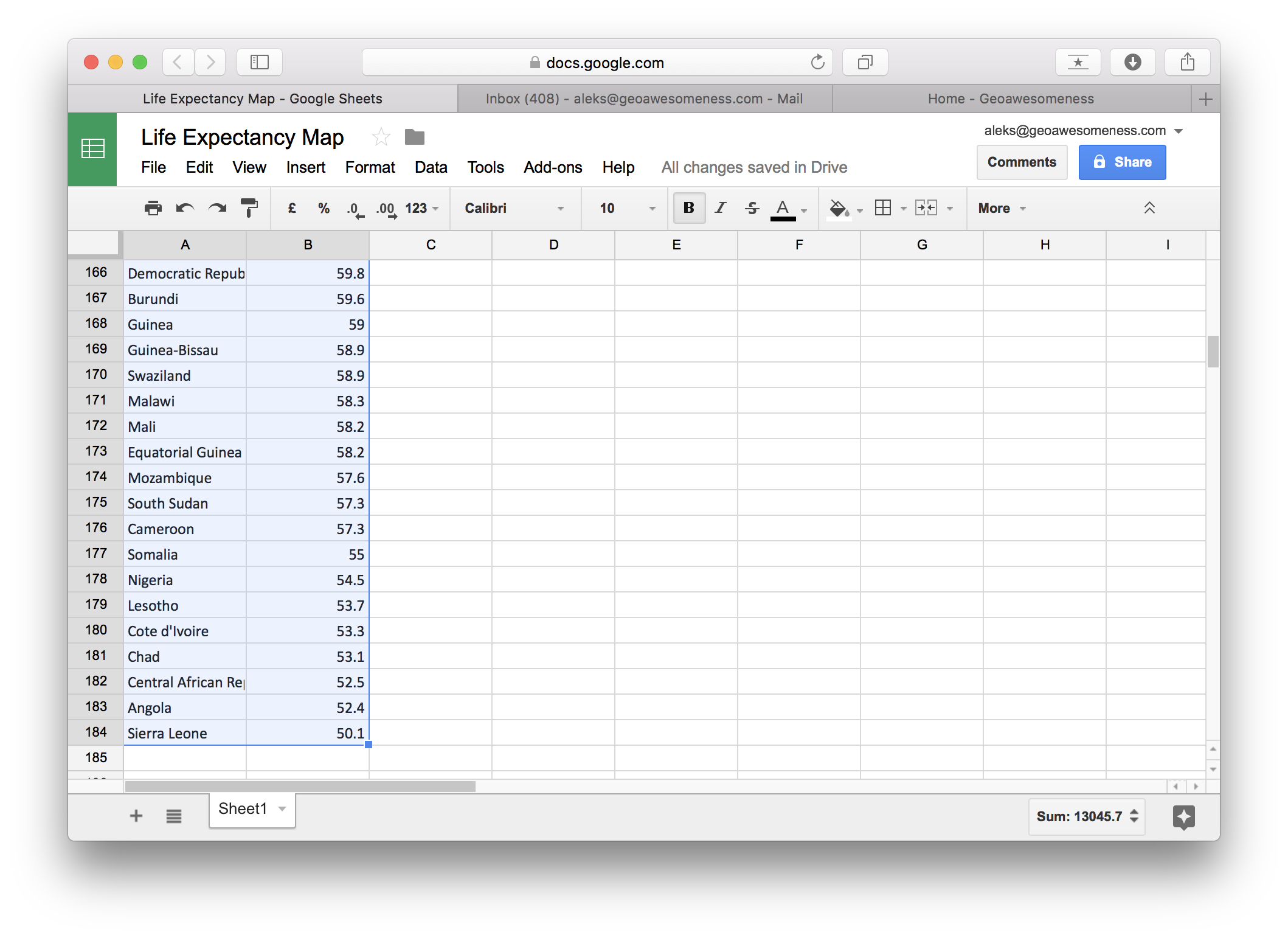
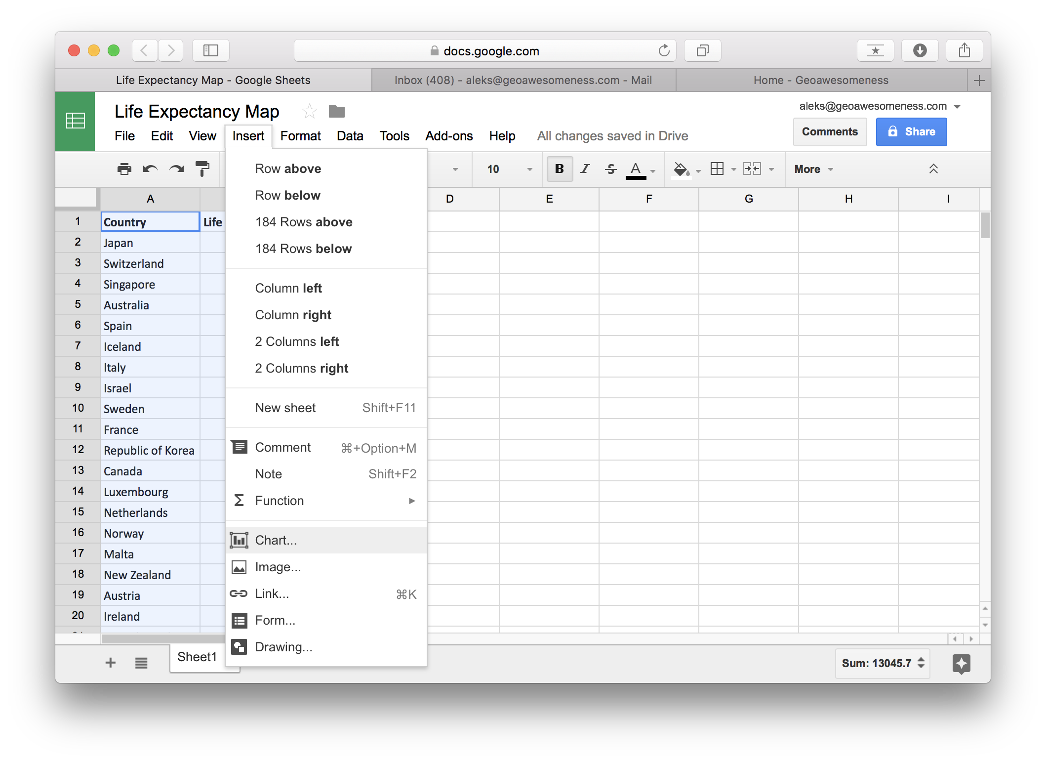
Than go to Insert and select Chart:
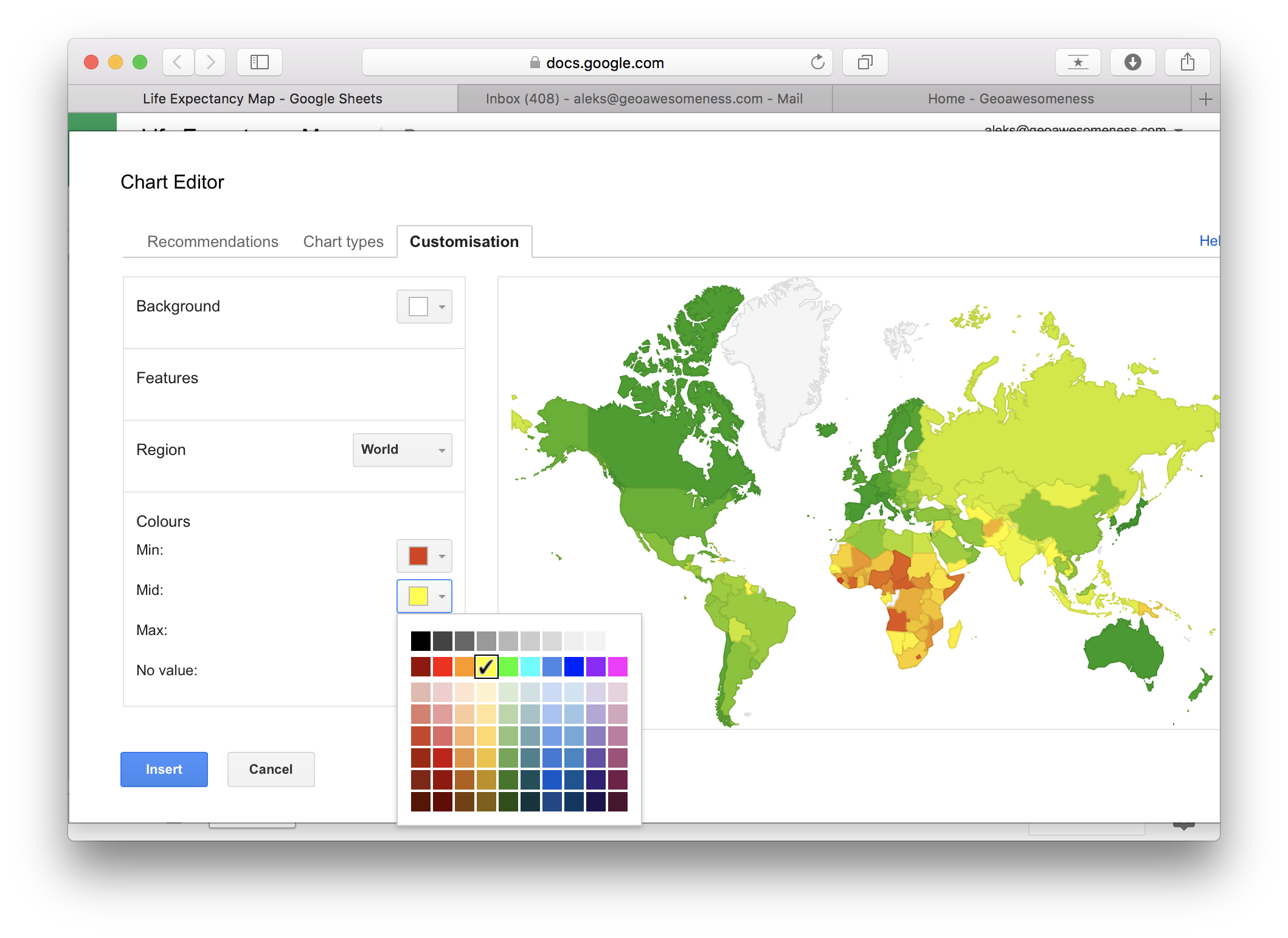
In Chart Editor go to Chart types and scroll down to Map and select choropleth or bubble map.
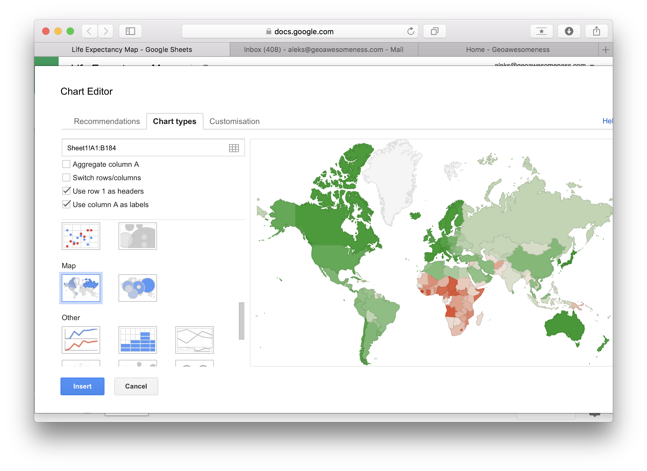
Move to customisation menu in order to edit the map. You can select only free colours that will represent the minimal value, median value and maximum value. All other colours will be automatically spread in between and there is no way to customise it.
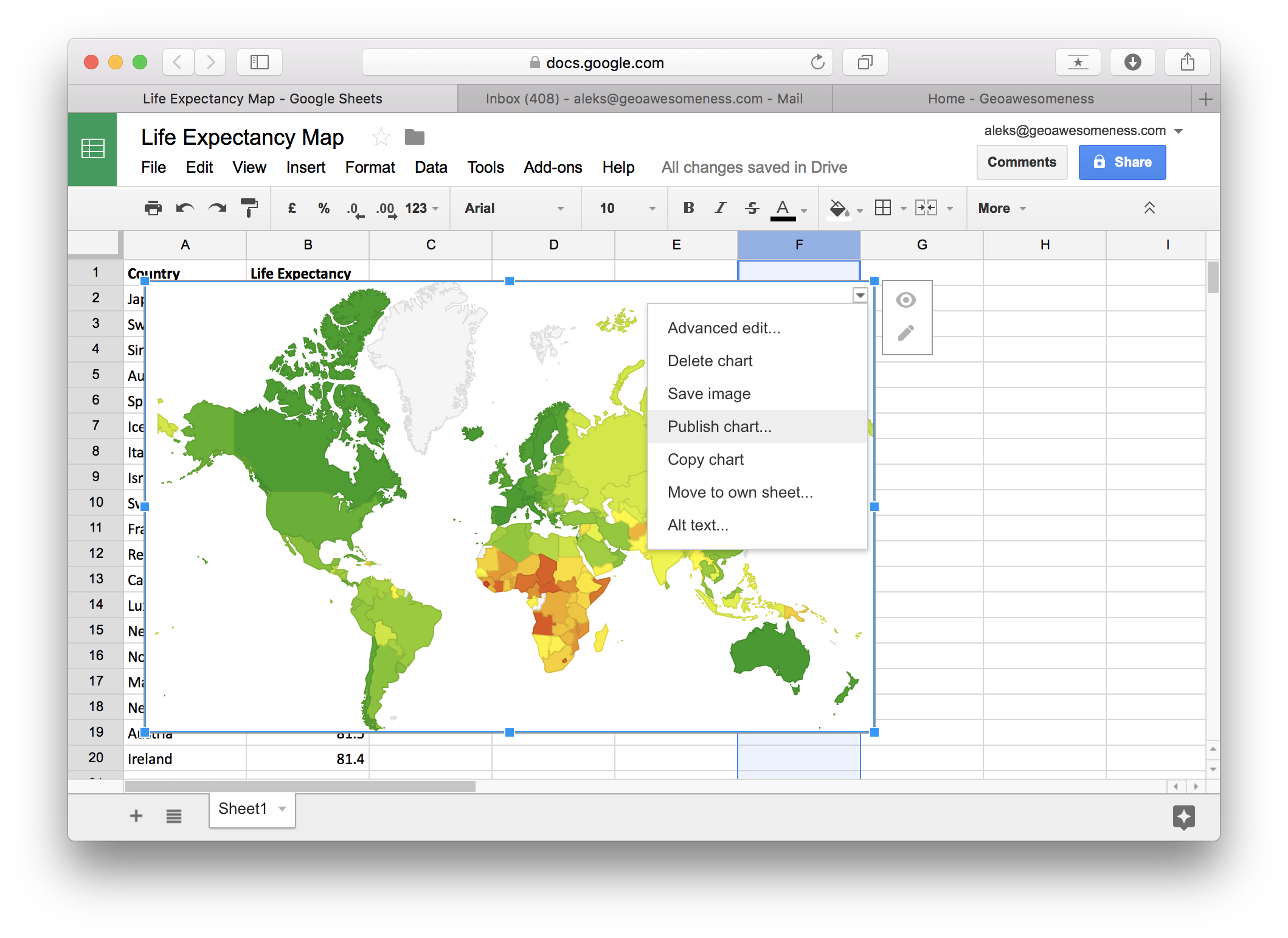
Once you insert the map, you can save it as image but you can also publish it in order to add it your website:
Also see: Free online GIS courses to help you upskill
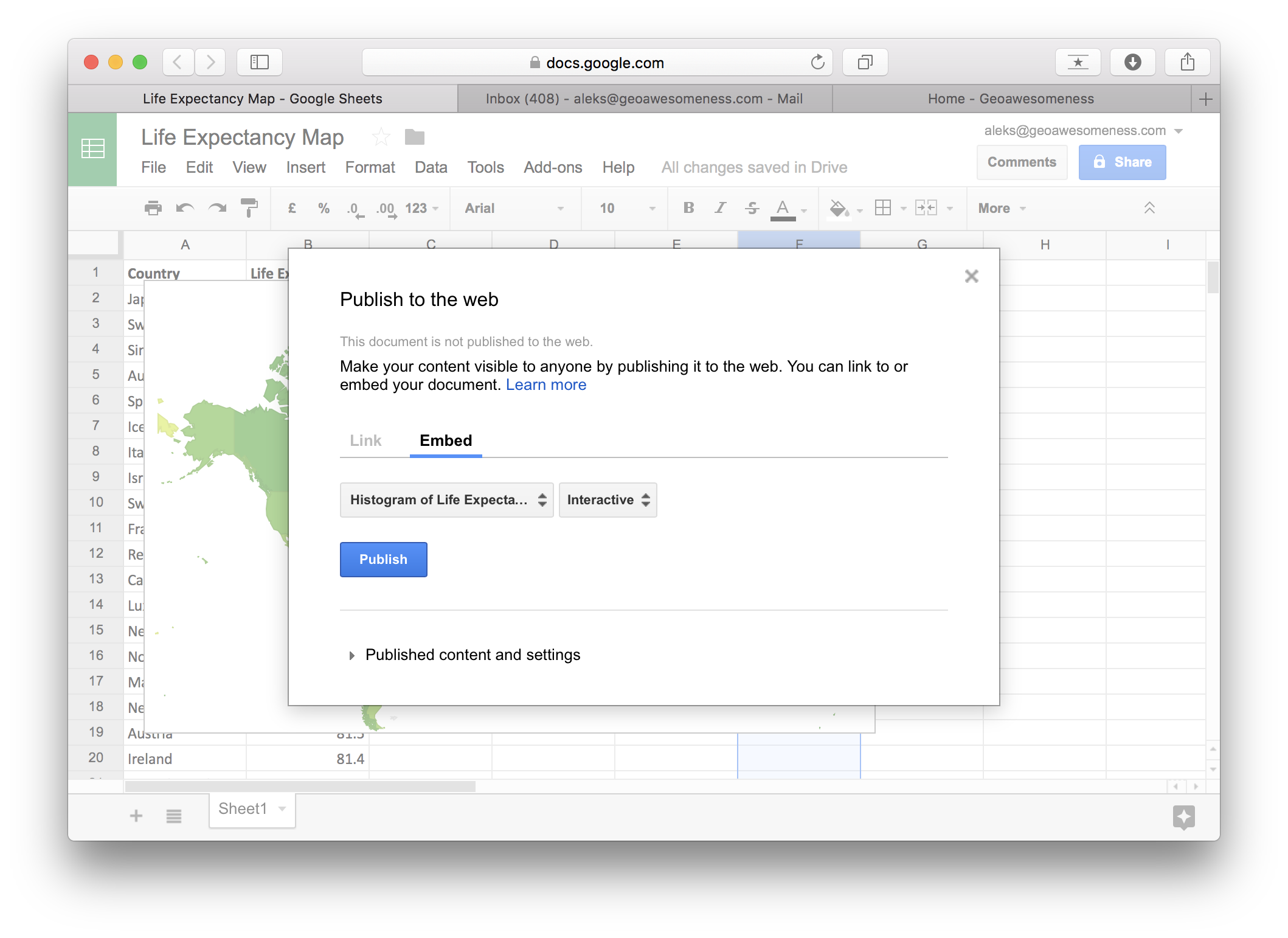
In order to embed it to your website select Embed and Publish:
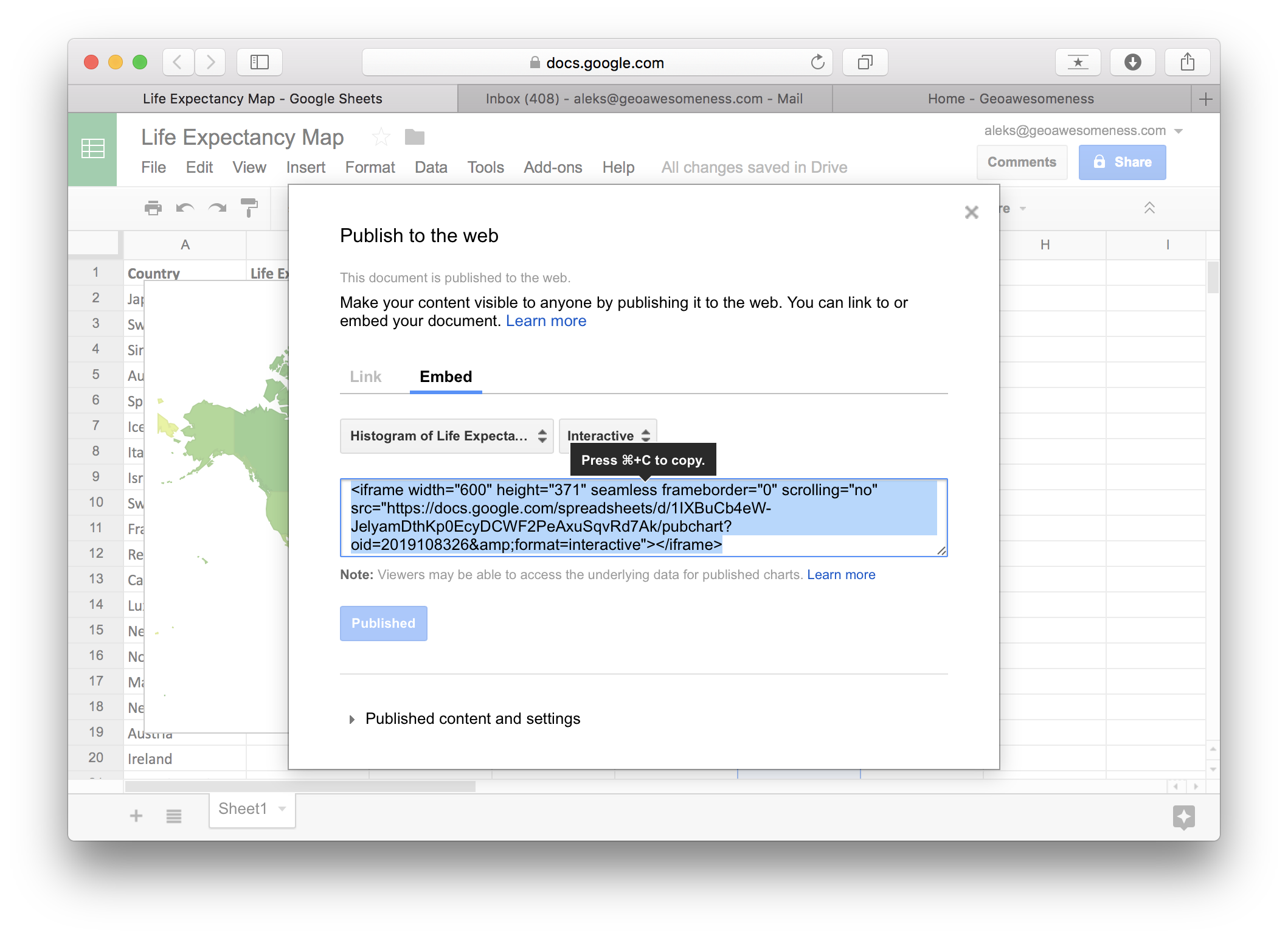
Now all you need to do is to copy and paste the iframe code to your website.
Maybe the final effect is not as astonishing and less customizable as in other solutions but you can make it in literally less than 1 minute which makes it the fastest environment to map your data based on a spreadsheet.
Try it yourself!

#Featured


Next article
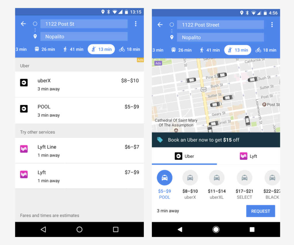
Google first introduced price estimates for Uber back in 2014. Last year the company added a new ride services mode to Google Maps which was a big step forward but it required you to switch between apps.
Yesterday the company announced that the latest version of Google Maps lets users request a Uber ride and pay for it directly within the app. It will also show an actual real-time location of Uber drivers around to make it a bit easier to decide whether to take a cab, use public transit, drive, walk or bike to your destination.
This is the comparison between the old version (left) and the next version of the app (right):
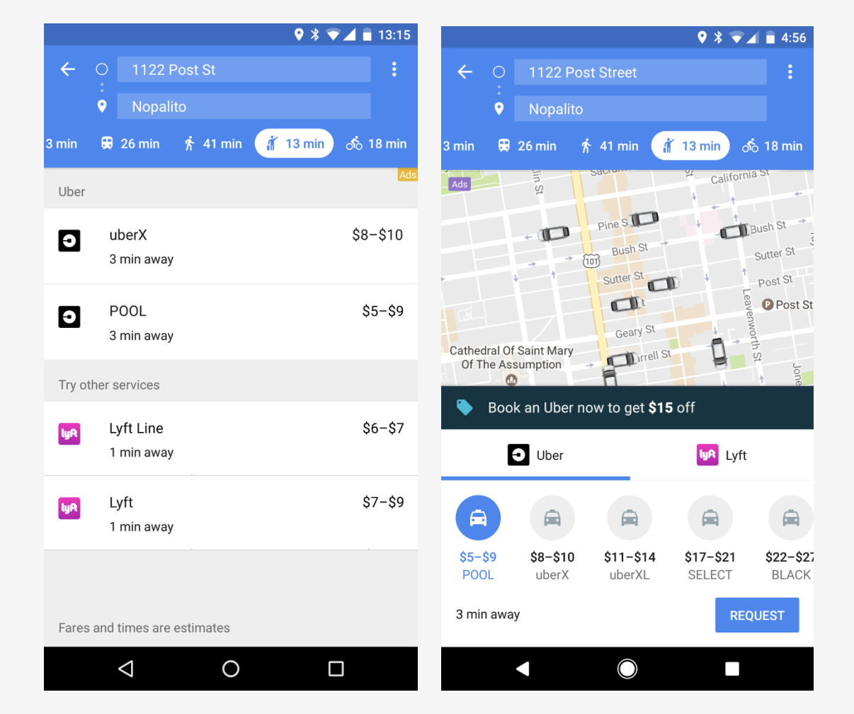
The update will be rolled out for both Android and iOS but in order to use it you’ll have to sign in with your Uber account info, which will pull up your stored payment info and other details.
With this update Google Maps strengthens its leading position among multimodal navigation apps that list all your possible transportation alternatives. It is interesting that the company decided to release the app in parallel on both platforms. Normally iOS users had to wait for at least a couple of weeks to get the latest features available on Android. It seems that the growing competition from HERE and Apple Maps pushed Google to change this strategy.
Interesting times!