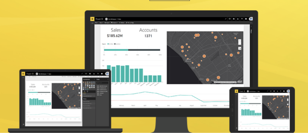


Businesses today have so much data on their hands that they really can’t make sense of it all without leveraging the power of where. Location has become the go-to tool for filling data gaps. Maps are being recognized as a common information language because they provide a context that tables and pie charts simply cannot. So, it was only natural for GIS powerhouse Esri and technology giant Microsoft to forge alliances to bring ArcGIS Maps to Power BI.
Just think about the possibilities! You can geocode your data accurately and make area-based selections. You can add thematic layers to your maps. You can understand the demographics of your interest areas easily. Excited much?
How to enable ArcGIS Maps for Power BI
The map visualization is currently available in ‘preview’ mode in Power BI service, Power BI Desktop, and Power BI mobile. To enable this incredibly powerful spatial tool, go to File > Options and Settings > Preview Features > ArcGIS Maps for Power BI.
After selecting the checkbox, close your Power BI application and re-open it. Now you should be able to see the Esri globe logo denoting ArcGIS Maps in your list of visualizations. Open a report in Editing view and select this icon to add an empty ArcGIS map template to your canvas.
How to import data in ArcGIS Maps for Power BI
Getting raw data translated into geo-enabled data is a breeze in this service. All you need to do is drag your address field into the ‘Location’ field well and ArcGIS Maps will automatically detect if your data is best viewed as a shape or a point on a map.
But make sure that you add only a single value to the ‘Location’ field. So, even if your address data is available in separate columns, you would need to combine the information into a single, comma-separated format (e.g. 35 Crossing Street, Sunset Boulevard, New York).
Alternatively, if your data contains latitude and longitude values, you can fill the respective fields to plot data accurately on the map. ArcGIS Maps for Power BI make use of the Esri World Geocoding Service to locate point features (addresses, cities) and the Esri GeoEnrichment Service to locate boundaries (ZIP Codes, states, provinces, and countries). The visualization tool can support a maximum of 1,500 point features. But, the more address elements you feed the tool, the more accurate your result will be.
Apart from location, you can add like size, color, time and tooltips to the non-location fields to help your map tell the story it’s supposed to convey.
Features and capabilities
- Base Maps: The visual supports four base maps and you can choose any — Dark Gray Canvas, Light Gray Canvas, OpenStreetMap and Esri’s standard ArcGIS base map called Streets.
- Location Type: Though ArcGIS Maps automatically determines whether the data will be best represented as points or boundaries, this tool allows you to fine tune your selections. Keep in mind that boundaries only work if your data contains standard geographic values.
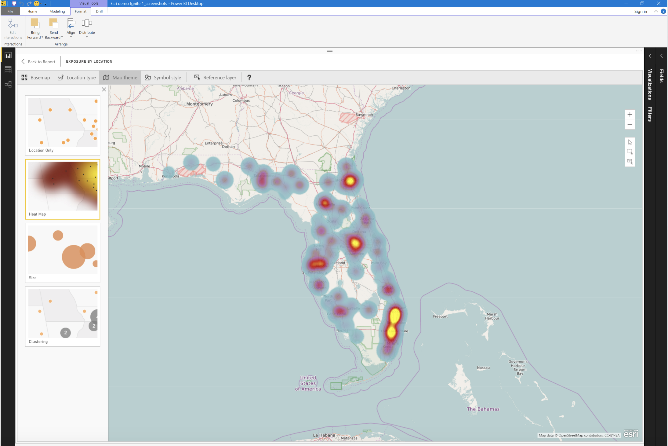
- Map Theme: You can change how your data appears on the map using the following themes:
- Location Only: This one shows each location on the map using the same symbol. It will plot data points or filled boundaries on the map based on the settings in Location Type.
- Heat Map: This is used for plotting an intensity plot of data on the map, and is especially useful when several points on the map are overlapping. For example, this would be a good theme to show how severe earthquakes are in each geographic region.
- Size: This theme plots data points on the map based that are sized based on the value in the size bucket in the fields pane. So, you can easily compare quantities and identify trends.
- Clustering: Use this if you want to plot the count of data points in regions on the map. If you have a high-level view, you can use Clustering to drill down into each region.
- Color: This works best for numeric data where color ramps can be utilized to visualize low-to-high data values, like age and income.
- Symbol Style: Depending on your chosen theme, you can further fine tune your map using symbols. For example, in heat maps, you can change the color; in size-based theme map, you can change the size of the bubble, etc. Mapping nerds would love this level of customization.
- Pins: If you want to attract the user’s attention to a specific part of the map, like a hospital or a school, this feature would be your best friend. After selecting the Pins tab, fill out your location in the search box, and choose the appropriate one from the drop-down menu. Power BI will add a pin to that location. What’s more, you can change the color of the pin too!
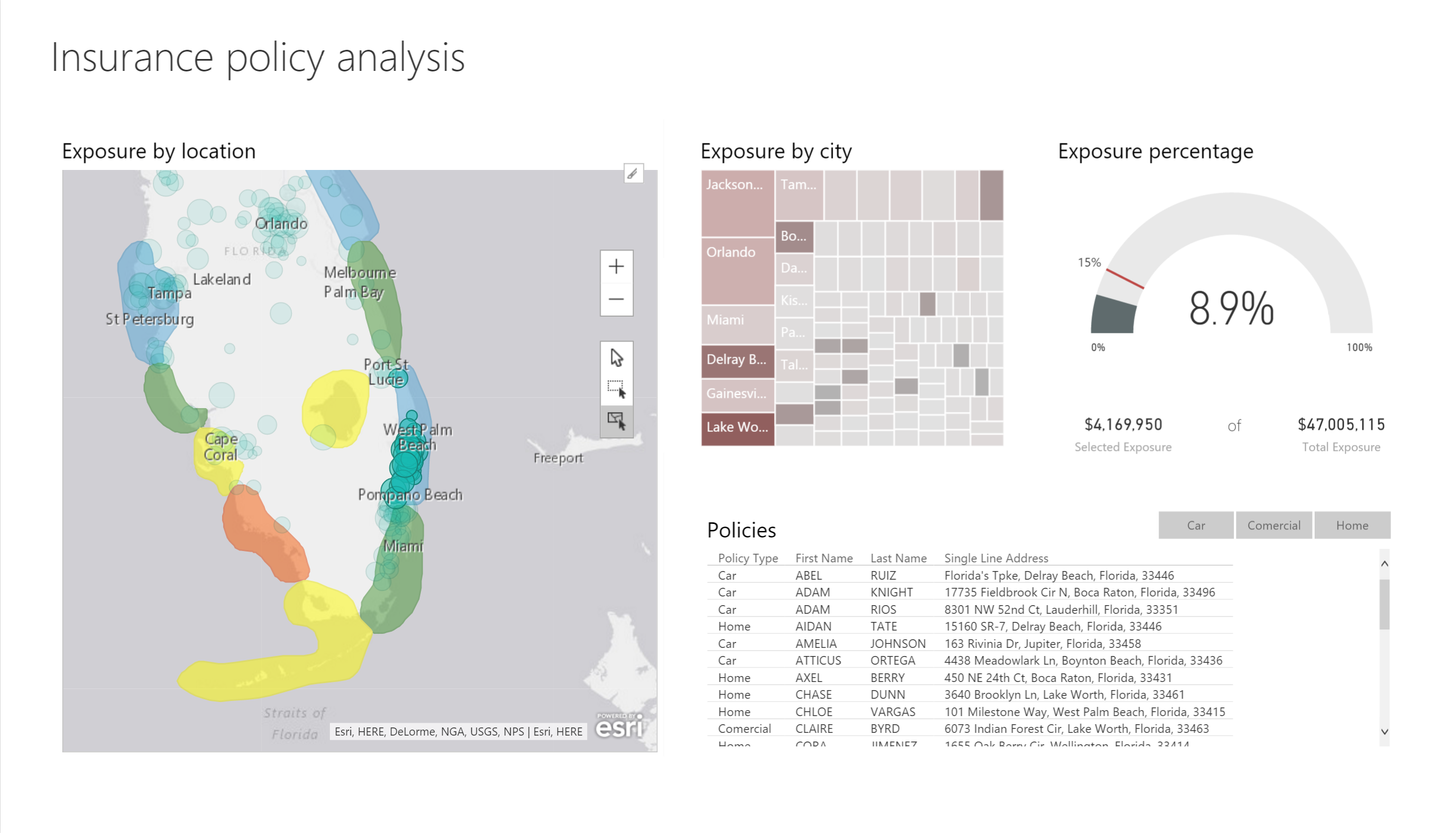
- Reference Layer: This is clearly the best part of ArcGIS Maps for Power BI. Reference layers will help you contextualize your data like nothing else. Right now, there are a host of demographics layers available for the United States, including average household income, diversity index, median age, and population density. Each layer is interactive and will pop up a bubble showing more detail if you click a shaded area. You can also add a reference layer by searching for a publicly shared feature layers on ArcGIS Online. A variety of maps are available for geographies and demographics through Esri’s Living Atlas. If you want to see the details, you can select a shaded area to open the Select from reference layer. Phew!
Wait, there’s more. After combining your Power BI data with these reference layers, you can select which layers you want to include. If you go into the reference layer selection mode, you can select all the data points that fall within a polygon on your reference layer. So, from selecting all the data points in a select geography to picking out the people most likely to be flooded during a typhoon, you can do GIS right within Power BI! Amazing, isn’t it?
And like we mentioned before, ArcGIS Maps for Power BI is still in the ‘preview’ mode. New capabilities are being added regularly. So, expect more features soon. We, for sure, will keep you posted!

#Business


Next article


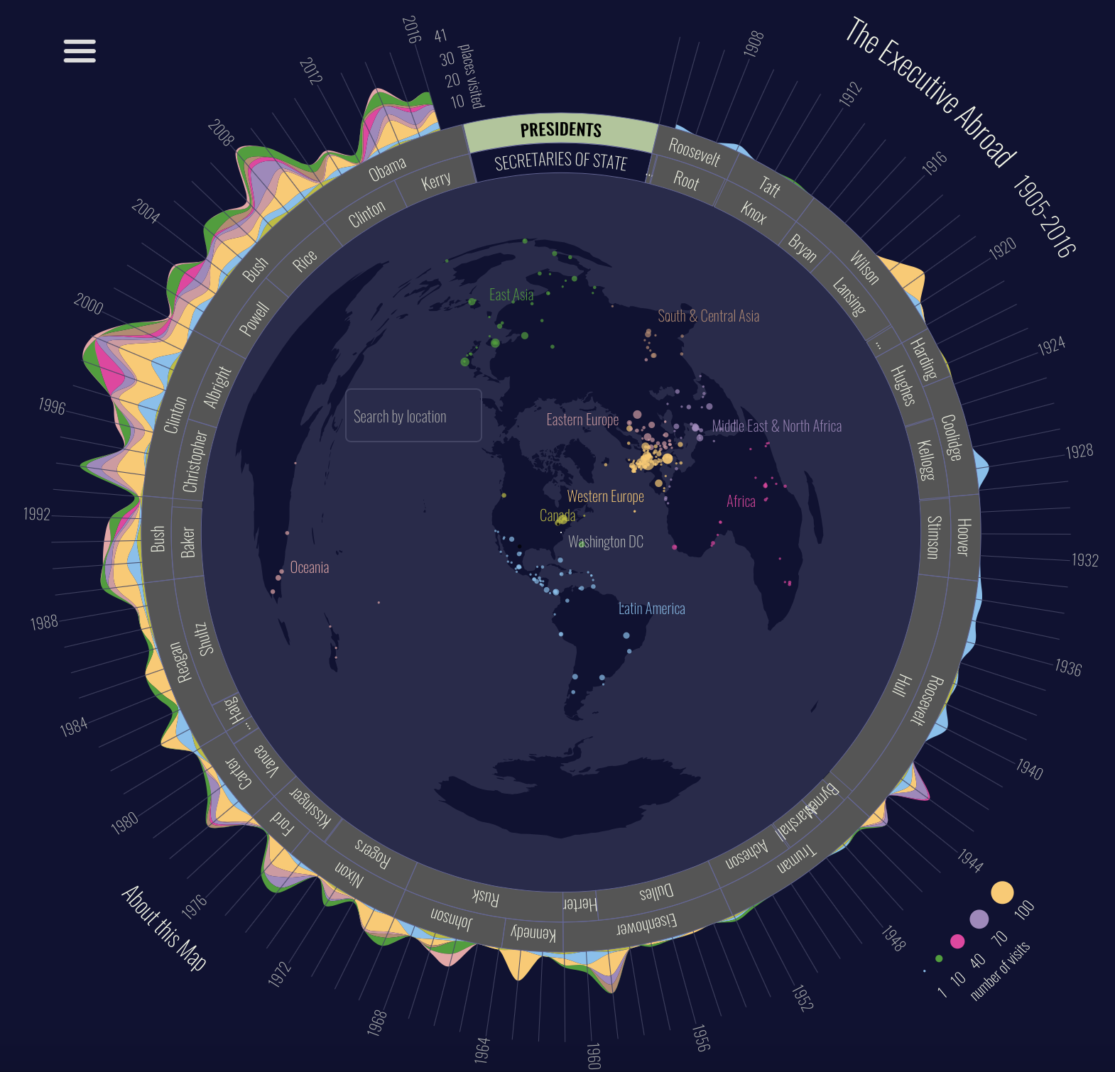
Really interesting mapping project on foreign trips of US Presidents has been recently developed by The University of Richmond Digital Scholarship Lab. The Executive Abroad visualizes the overseas visits of every U.S. President and Secretary of State.
It’s a very interesting story to tell. The first US president who traveled outside the country was Theodore Roosevelt who visited Panama in 1906 to see the construction of the Panama Canal.
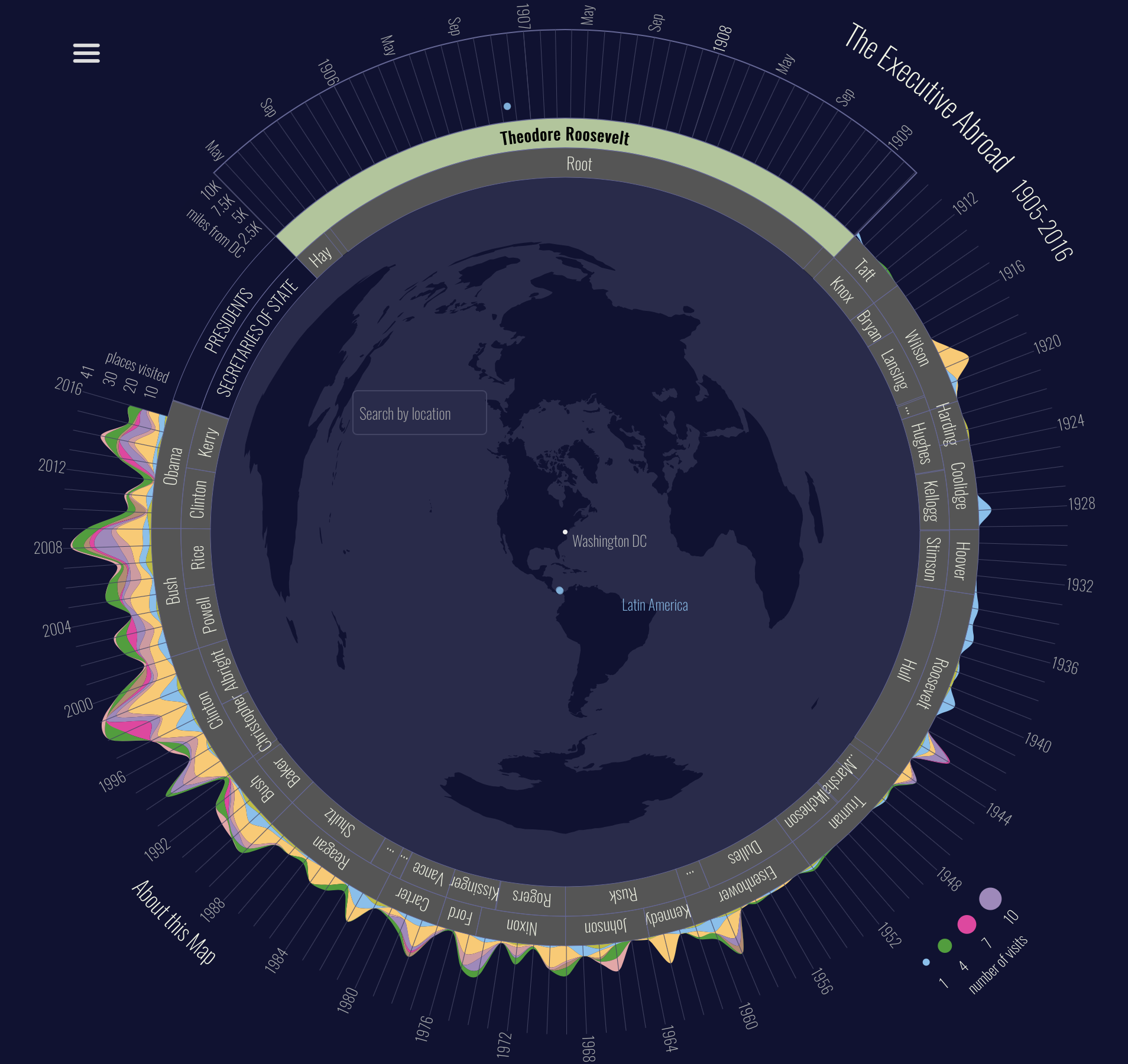
But for us even more interesting is the way the story is told. The designers finally decided to ditch Mercator projection and took a very interesting approach. They decided to put Washington, D.C., at the center of the map. This simple trick smartly highlights the distances to different destinations.

Colored dots on the map correspond to geographic regions. The same color is used on the ring around the map that indicates the total number of trips to a given region within a given time period.
Really awesome mapping project.