
Motion forecasting – i.e., accurately predicting the behavior of other drivers and road users – is one of the biggest challenges faced by researchers working in the field of autonomous driving. And yet, this is a problem that researchers must overcome because it has enormous safety implications.
Crash avoidance is directly proportional to an intelligent driver’s ability to answer questions like:
- Is that pedestrian trying to cross the street?
- Is that car parallel parked, or about to pull into my lane?
- Will that speeding vehicle stop at the stop sign?
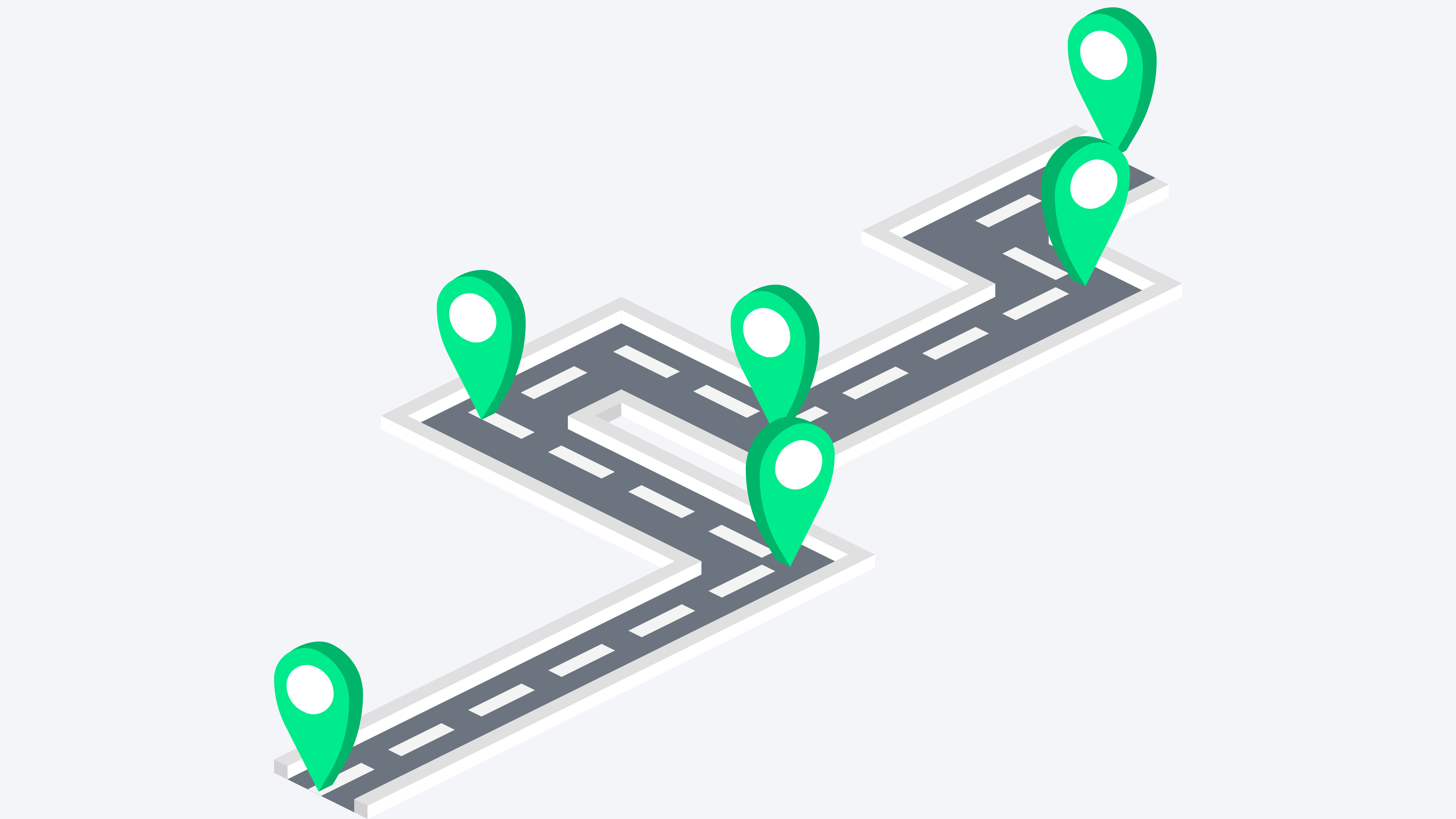
And so, to benefit the driverless research community, Waymo (formerly the Google self-driving project) has just added a new high-quality dataset containing more than 570 hours of unique motion data to its open data repository – Waymo Open Dataset.
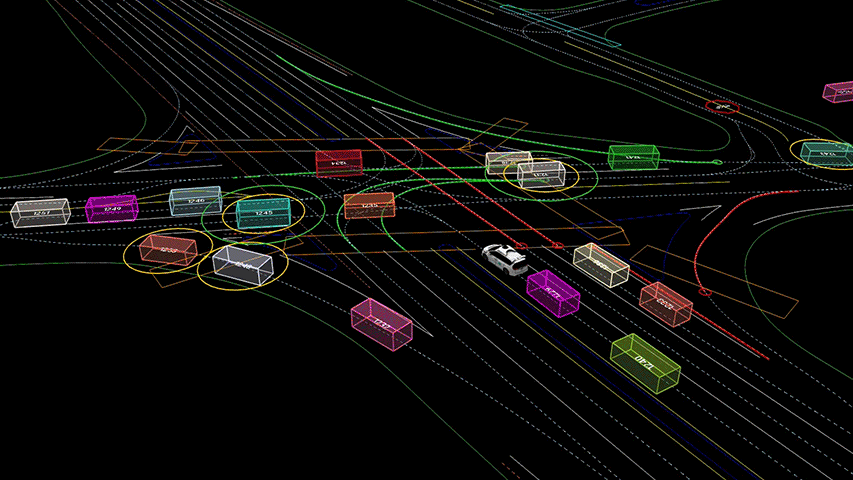
Waymo calls this motion dataset “interesting”. It’s interesting because unlike day-to-day, uneventful driving, this data contains object trajectories and corresponding 3D maps for over 100,000 segments, each 20 seconds long, mined for events like:
- Cyclists and vehicles sharing the roadway
- Cars quickly passing through a busy junction, or
- Groups of pedestrians clustering on the sidewalk
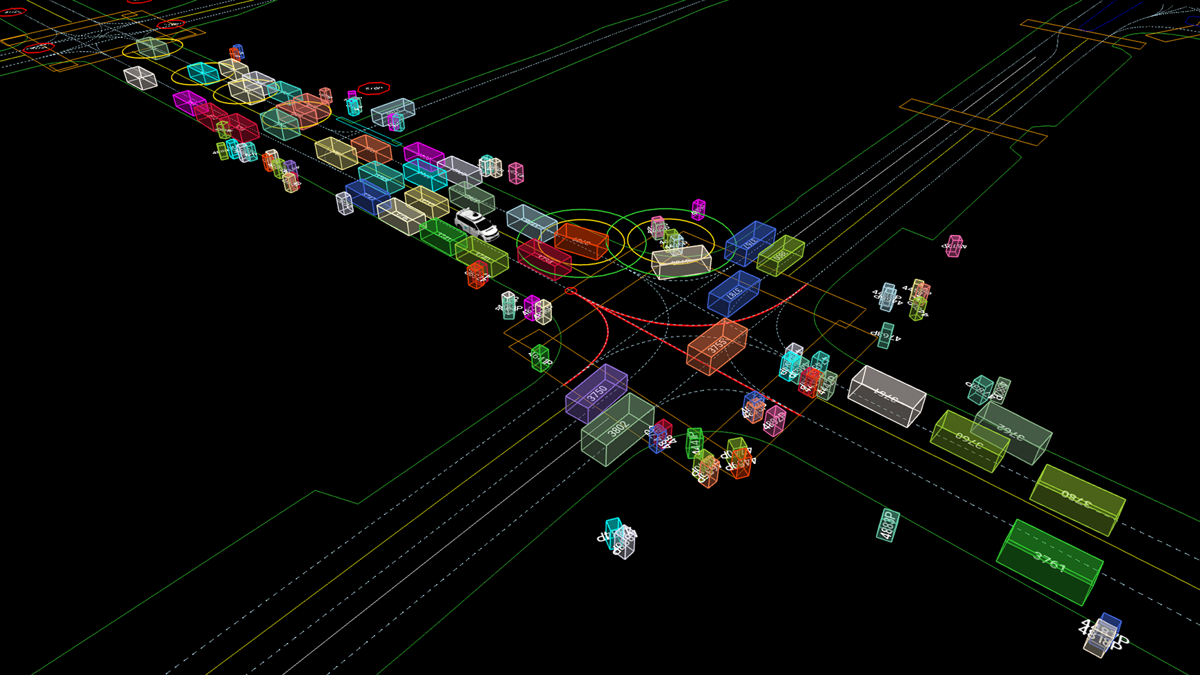
The new dataset includes many examples of interesting interactions useful for motion prediction – like agents interacting at this busy intersection in San Francisco
According to Drago Anguelov, Distinguished Research Scientist, Waymo, “The Waymo Open Dataset is one of the most geographically varied motion datasets yet released, featuring a wide variety of road types and driving conditions captured around the clock in different urban environments, including San Francisco, Phoenix, Mountain View, Los Angeles, Detroit and Seattle, to encourage models that can better generalize to new driving environments.”
Along with the dataset, the company has also announced new open data challenges to encourage research work on perception and behavior prediction. The challenges focus on areas like motion prediction, interaction prediction, and real-time 2D and 3D detection. The winning team walks home with a $15,000 cash award, while the second- and third-place teams receive $5,000 and $2,000 respectively.

#Business


Next article


Image by Gerd Altmann from Pixabay
When and how can we safely reopen our economy?
This is the dilemma facing most governments around the World. Spatial data research is helping policymakers find some answers.
To this end, SafeGraph, a physical places data company, formed a COVID-19 Data Consortium. The Consortium is composed of over 3,000 researchers, non-profits, academic institutions, and government bodies who have free access to SafeGraph’s datasets.
Students at Stanford’s Future Bay Initiative are conducting research based on SafeGraph data to help the Bay Area develop a more accurate and informed approach to dealing with COVID-19. Derek Ouyang, a lecturer at Stanford University, mentors them.
Derek joined Daniel O’Donohue on the Mapscaping podcast for a conversation on the research.
Here’s an overview of what they discussed including:
- Components of the dataset
- Interesting insights from the research
- Challenges faced while working on the data
The dataset
SafeGraph’s data covers the whole U.S. However, Stanford’s research team reduces the data size to the areas of interest. These are; places within the 9 Counties in the Bay Area and the possible origins of visitors to these places.
SafeGraph’s dataset comprises:
Places data
Locations of where economic transactions happen in the U.S., e.g. retail establishments. It also includes building footprints and boundaries.
Patterns data
Monthly/ weekly data of the number of devices that have visited a specific location.
Visits data can be split into:
- Daily and hourly visit data
- Origin and destination of visitors
Safegraph also provides the device pool ratio because their data does not represent 100% of the population. In the U.S., the device pool ratio is 10:1. I.e. If there are 300 billion people in the U.S., then the monthly data that SafeGraph provides represents 30 million devices.
The ratio is used to extrapolate true visit counts from SafeGraph’s sample data.
Insights on the factors affecting disease spread
Having a reliably maintained and produced data set of places, and visit counts to and from those places are providing useful insights. Research with SafeGraph data is building confidence that there is a relationship between human movement, space, and disease spread.
Notwithstanding, SafeGraph’s visits (GIS) data doesn’t tell the whole story. It cannot capture all the factors that affect human wellbeing, human movement, public health, and disease spread. That said, spatial data is an effective communication tool to bring awareness to these other factors.
Below are some drivers of disease spread identified in the research.
Concentration and mixing
Apart from measuring the concentration of people in a certain time and space, SafeGraph data also allows measurements and observations regarding the degree of mixing between people from different locations.
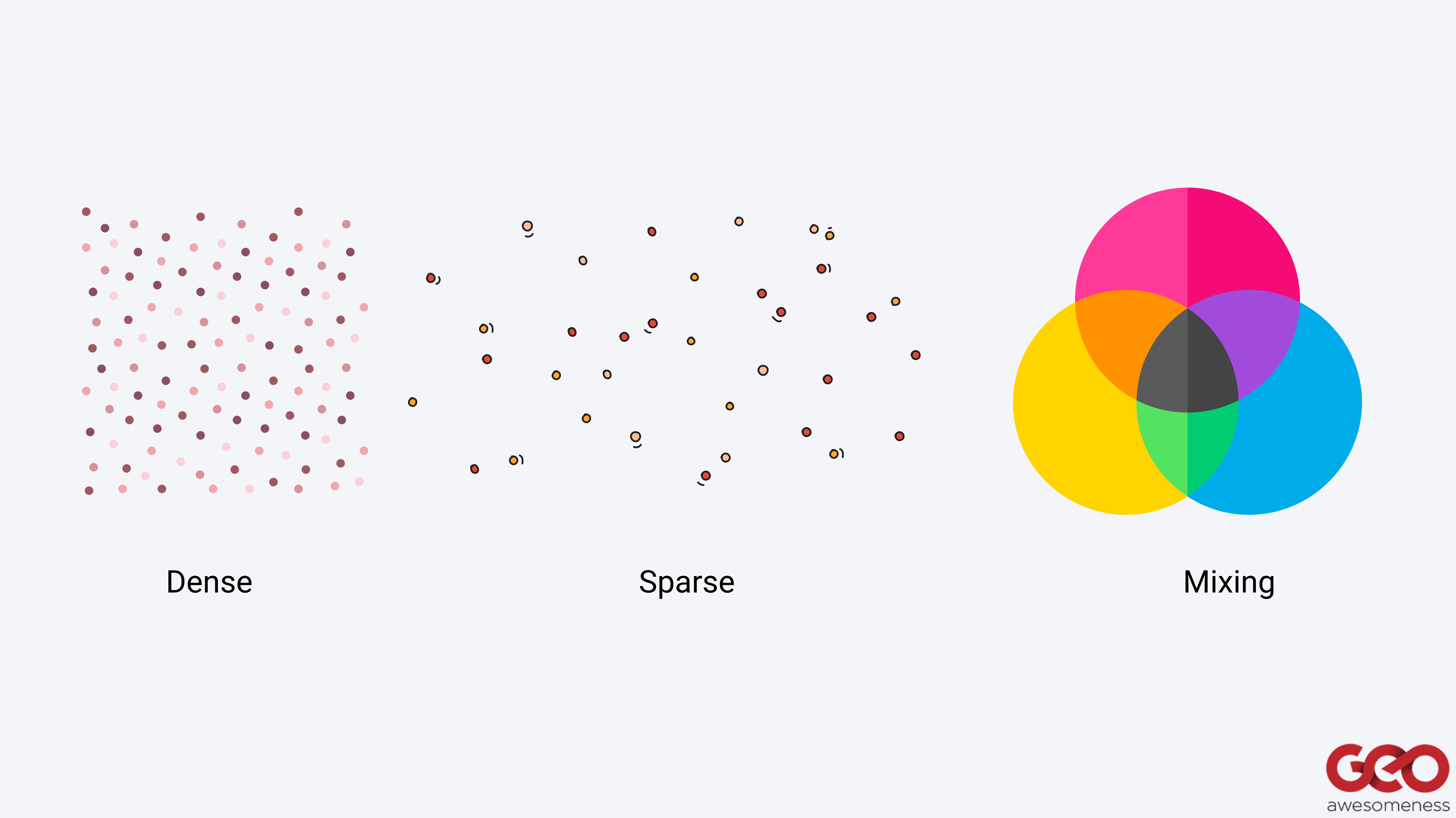
For example, cramming 100 people in a specific space has a different disease spread outcome than having only 10 people in the same space observing social distancing. Likewise, 10 different Census Block Groups frequenting the same location versus only one Census Block Group frequenting the location is likely to reflect a degree of mixing that can also intensify disease spread.
In this way, SafeGraph data is used to trace movement back to specific Census Block Groups. Analysis of the patterns data shows the number of visits that a particular Census Block Group had to specific types of establishments in a week, and how long they were there.
Researchers then compare this data to the disease case growth for the particular Census Block Group some weeks in the future. The results are useful for the construction of movement and case growth indicators.
Access to open space
From an urban planning perspective, the access people have to backyard space for recreation is potentially a huge driver to how likely they are to go outside to parks or into the streets. People without access to open spaces are less likely to shelter-in-place leading to disease spread.
Consequently, there is a need for change in urban planning systems regarding public/ private access to open spaces.
Socio-economic demographics
Past census data about income, age distribution, race, people per household, and ethnicity, etc. in a Block Group has higher explanatory power on where disease case growth happens than SafeGraph visit data.
In the Bay Area, the variation in these socio-economic demographic factors has enabled researchers to explain over 75% of the variation in case growth in ZIP codes/Counties.
“… it appears to be the case that if you have higher income, however, that actually manifests, we are seeing that you have a greater ability to shelter in place and a greater ability to avoid the impact of COVID. Your age distribution in your Block Group, your language ability, in terms of communicating with health departments and government entities. These kinds of fixed community socio-economic demographic characteristics actually tell quite a bit of the story of what an inequitable distribution of impact looks like, not just in the Bay Area, but I am seeing through the Consortium, similar findings across the U.S.,…” (O’Donohue, 2020, 27:07)
Socio-economic demographic data is used to identify which potential community characteristics may lead to increased movement patterns, and thereafter to virus spread.
Systemic issues
The research is bringing systemic issues of inequality to the fore.
Today’s urban spatial arrangements are proof of this. Past spatial planning decisions affected the urban arrangements of housing, development, and transportation. These determined the geography of the places people live in. They work in the background, affecting their opportunities or livelihoods.

According to Derek, spatial data could be the magnifying glass we need for this history.
The research shows that there are higher disease cases and case growths in neighborhoods with predominantly people of color, people of low income, and people with pre-existing health conditions.
“So I would actually say that it’s not a sign of despair, that there are these systemic forces. I think that only doubles down my insistence that if we can put tools in the hands of students, policymakers, community activists to be able to tell the spatial stories here, then we can first just illuminate and make it very clear to everybody, just how inequality takes root in measured outcomes in our societies.” (O’Donohue, 2020, 31:46)
Challenges encountered
Even with good movement and case growth data, the researchers still face challenges when working on the datasets.
Data integration
In the Bay Area, Individual County health departments have dashboards that show daily cumulative cases by ZIP codes. In many other places in the U.S., the lowest case behavior and case growth data are at the County level.
On the other hand, SafeGraph’s places and patterns data are at the Census Block Group level.
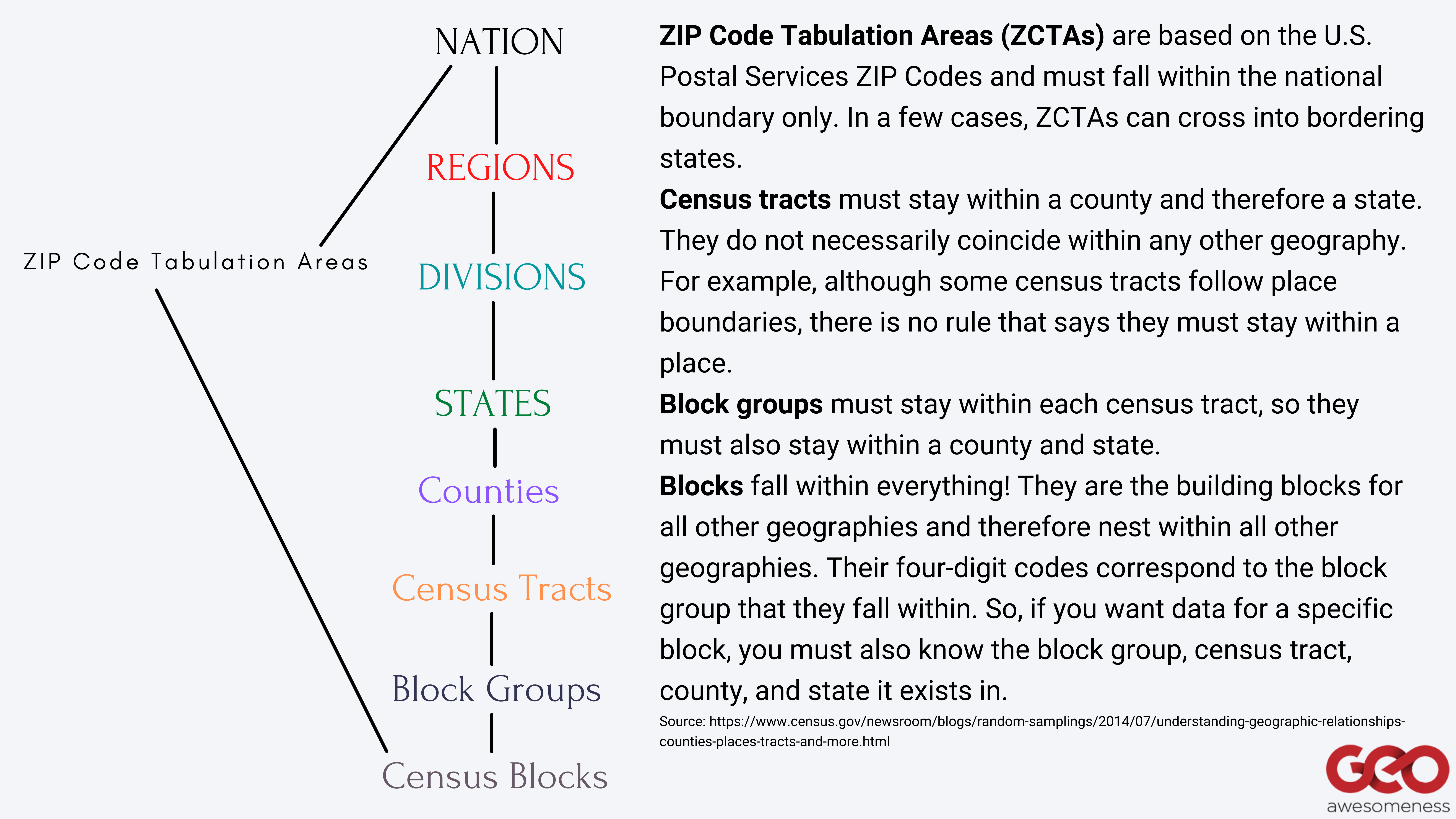
Hierarchy of census geographic entities in the U.S.
Ergo, there is a geospatial disconnect between case growth aggregations by ZIP code/ County, and the richer places and patterns data by Census Block Groups from SafeGraph. So, no matter how good SafeGraph data gets, if it cannot be linked back to the same granularity of case outcomes, there is an inability to refine certain questions.
For the Bay Area, the researchers scale up SafeGraph Census Block Group data to ZIP codes to enable comparison.
Lack of route tracking data
SafeGraph data is focused on indoor human movements. It doesn’t show the route people take from point A to point B. It just shows when and where they may have started from and when and where they end up.
According to Derek, there could be many important factors in the route.
For example, in places where public transit is common, buses and trains are important vehicles for disease spread. Unfortunately, this is invisible in SafeGraph data and would require incorporating insights by the collection of ridership data from a local transit agency or doing network analysis.
Nevertheless, because indoor transmission is likely greater than outdoor transmission, from a disease transmission perspective, indoor data is more important.
Aggregated data
SafeGraph provides movement behavior, aggregated up to the entire size of the business establishment or a Census Block Group. Therefore, you can only know averages or summaries for a large group of people. However, the disease works at the person-by-person level, making the dataset unuseful for individual contact tracing.
That said, the data is useful in showing the geospatial implications of where those interactions happened – whether they were in an indoor tight establishment or an outdoor park.
Next steps: Actionable intelligence
SafeGraph’s data and research is helping to create an objective record of the effects a specific activity or action has had on the disease spread. It is providing “actionable intelligence” — using data to identify the drivers we can change to arrive at the outcomes we want — around how governments can approach their COVID-19 response efforts.
The Consortium is improving the dataset, hence its explanatory power. With more refined insights, we can have more refined policy tools as well. A predictive tool with this kind of explanatory power is better than blindly making policy decisions about shutting off the entire economy or turning it all on at the same time.
Derek hopes that these predictive tools guide policymakers towards making more informed decisions.
Listen to the complete conversation on the Mapscaping Podcast.
You can find further details regarding the research on Stanford’s Future Bay Initiative COVID-19 Rapid Response Project page.