
Mapping resources can be used for any manner of data collection, of which a variety of geostatistical analysis can occur, one of the more familiar of these being graphs. Creating a graph from multiple data sets sourced from multiple maps can be an easy, straightforward process when broken down into steps. The example I’ll be using here is an athletics map, one created to mark the locations of upcoming events for a collegiate sports team. By taking the location data and gathering the information on match wins, it’s possible to take initial points displaying a particular manner of information and extend them to portray a new perspective on the data; more specifically, analyzing the number of wins for a women’s football team in relation to both location (away vs. home) and weather.
This data surveying took place over a span of a month, with individual weeks being broken down into their own respective diagrams.
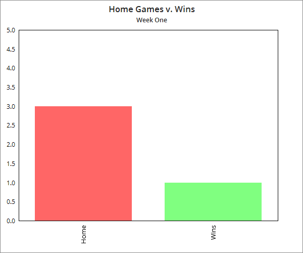
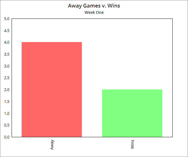
Creating the aforementioned diagrams from this data is relatively easy, and can be shown through any basic bar graph, as displayed. Two were made per each week, one displaying the away matches vs. the amount of wins that were achieved, while the other displayed the same information regarding home games.
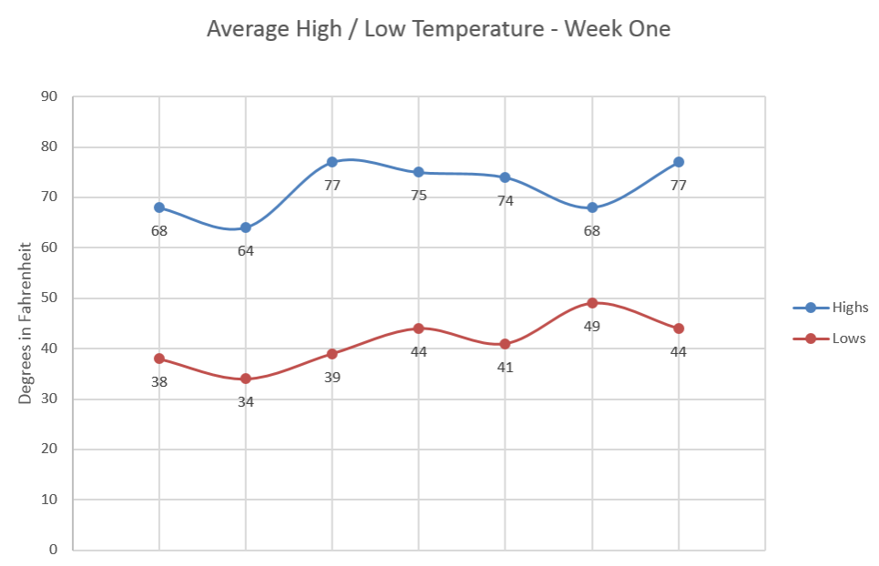
While bringing in this information, I concurrently incorporated data from The Weather Channel’s interactive map. Weather information here could be utilized in two main ways, the first being the weather during the event itself, causing a direct action on the match. The second is the average weather forecast, which could have an indirect effect such as a change in location or other modifications.
When extracting this data and presenting it in a new format, it can then be displayed alongside the match data points, showing possible correlations between wins, location and weather. In this instance, this was achieved by taking the average weather per week, and creating a scatter plot representation that can then be analyzed in correlation with the accompanying match results, as shown below.
There’s a wide variety of visual representations that can be made using GIS data, and being able to create these graphs allows for further analysis that builds on the base map and its core information.


#Ideas


Next article

Tomorrow European Union celebrates the 60th birthday. On March 25, 1957, leaders of six countries – Belgium, Germany, France, Italy, Luxembourg, and the Netherlands – met in Rome and signed two treaties that established the European Economic Community (EEC) and the European Atomic Energy Community, later transformed into the European Union.
Although Europe is experiencing growing turbulence related to migration crisis, terrorist attacks, and Brexit, among others, the EU project is still the best thing that happened to the continent after The World War II. It allowed keeping peace and wealth for long years and we hope that it will stay that way for the next generations.
These maps and charts try to explain the sense of European Union.
1. History of the European Union
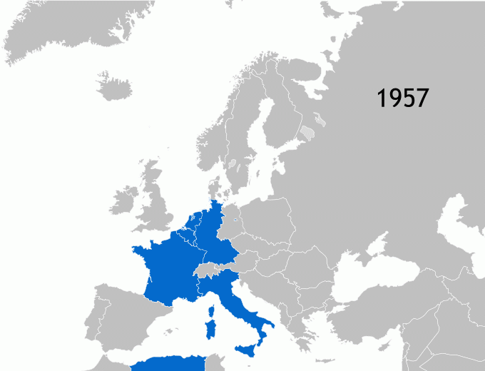
source: Wikipedia
2. EU member states as of 2017

source: Alamy
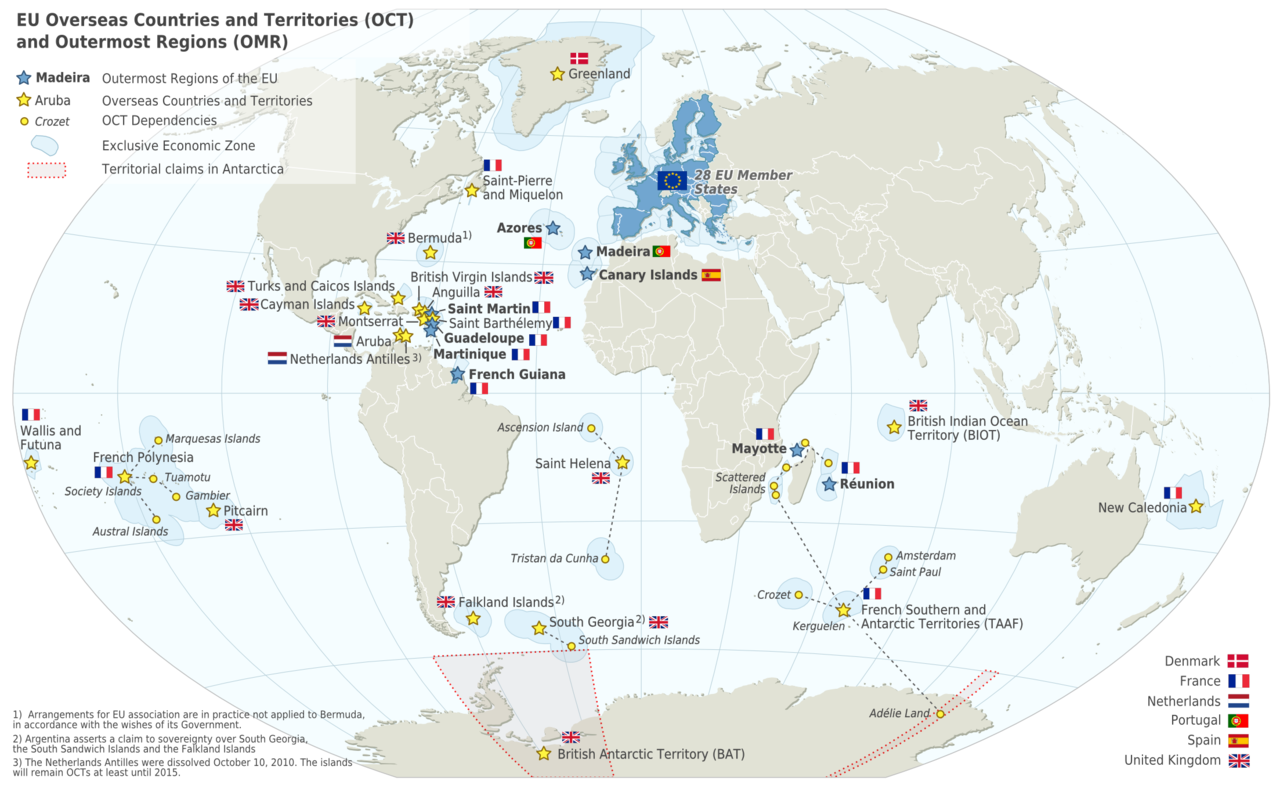
3. EU Overseas Countries and Territories and Outermost Regions
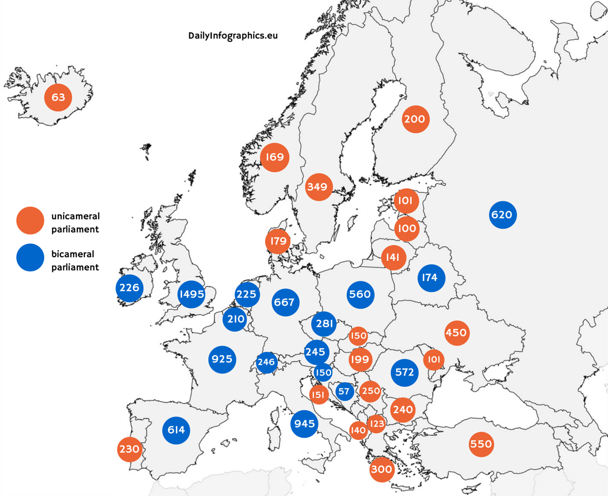
4. Parliamentary Seats in Europe
5. The map of Europe by how right- or left-wing the government is
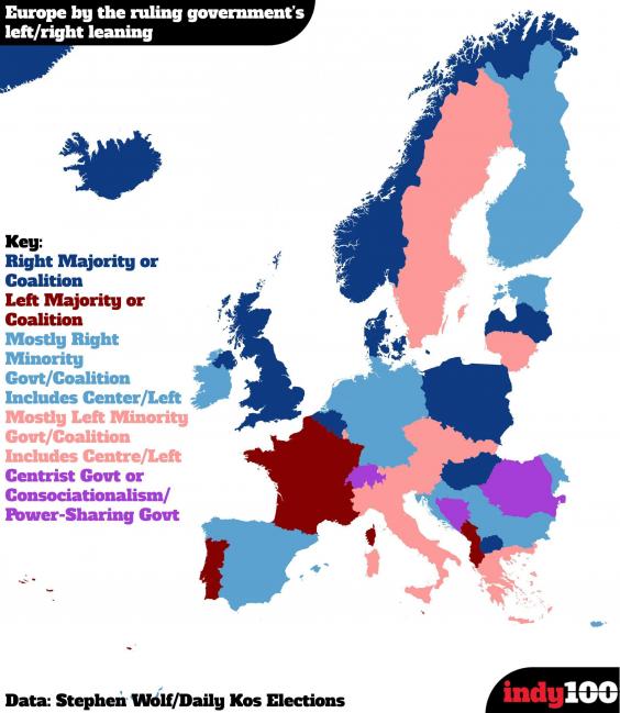
source: Indy100
6. EU Institutions
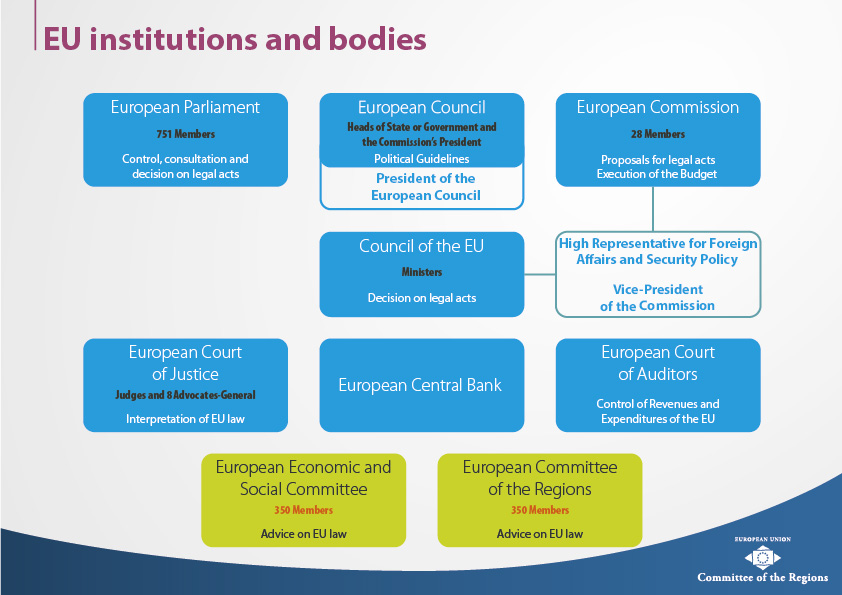
source: EU
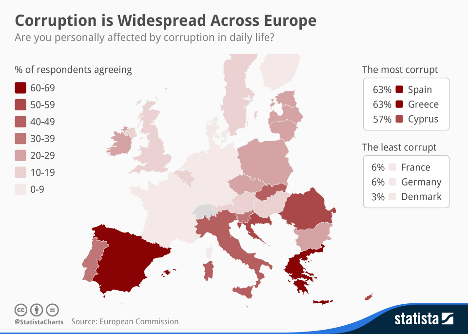
7. Corruption in Europe
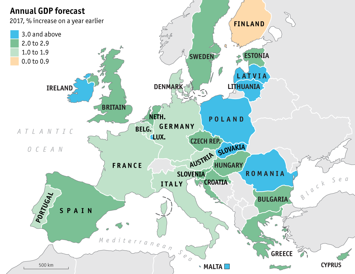
8. 2017 GPD forecasts
source: The economist
9. Average wage rates in EU

reedit: Average wage rates in Europe
10. Currencies in EU
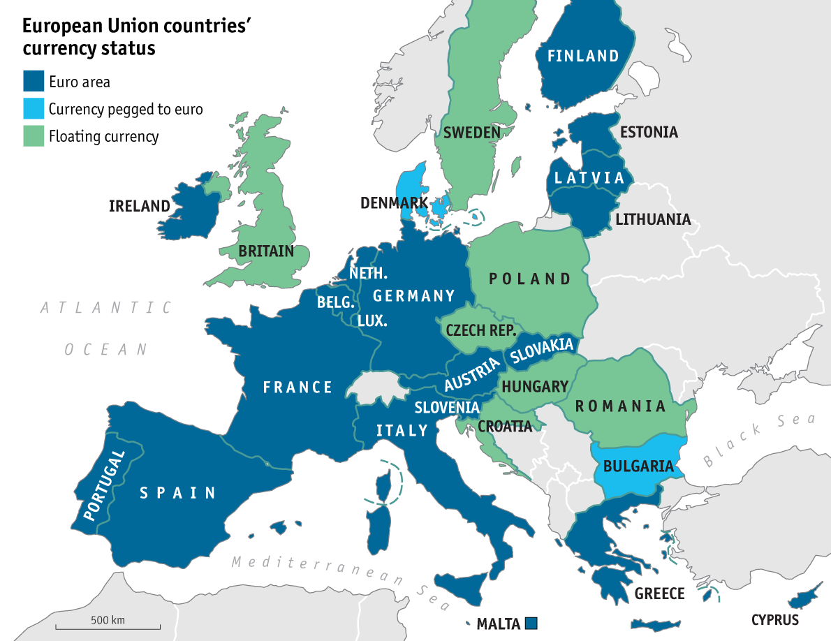
source: The economist
11. Europe’s unemployment vs GDP

source: Geopolitical Futures
12. Youth Unemployment in Europe

13. Europe’s ageing problem
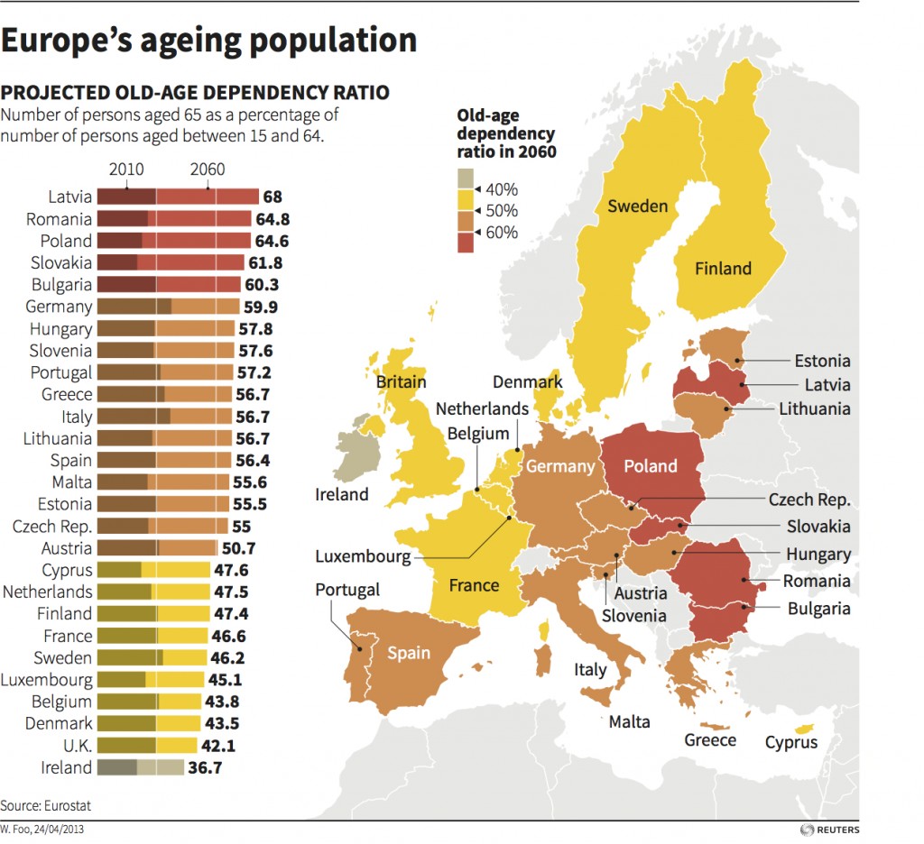
14. Share of population over 65

15. Map of Europe’s population shifts
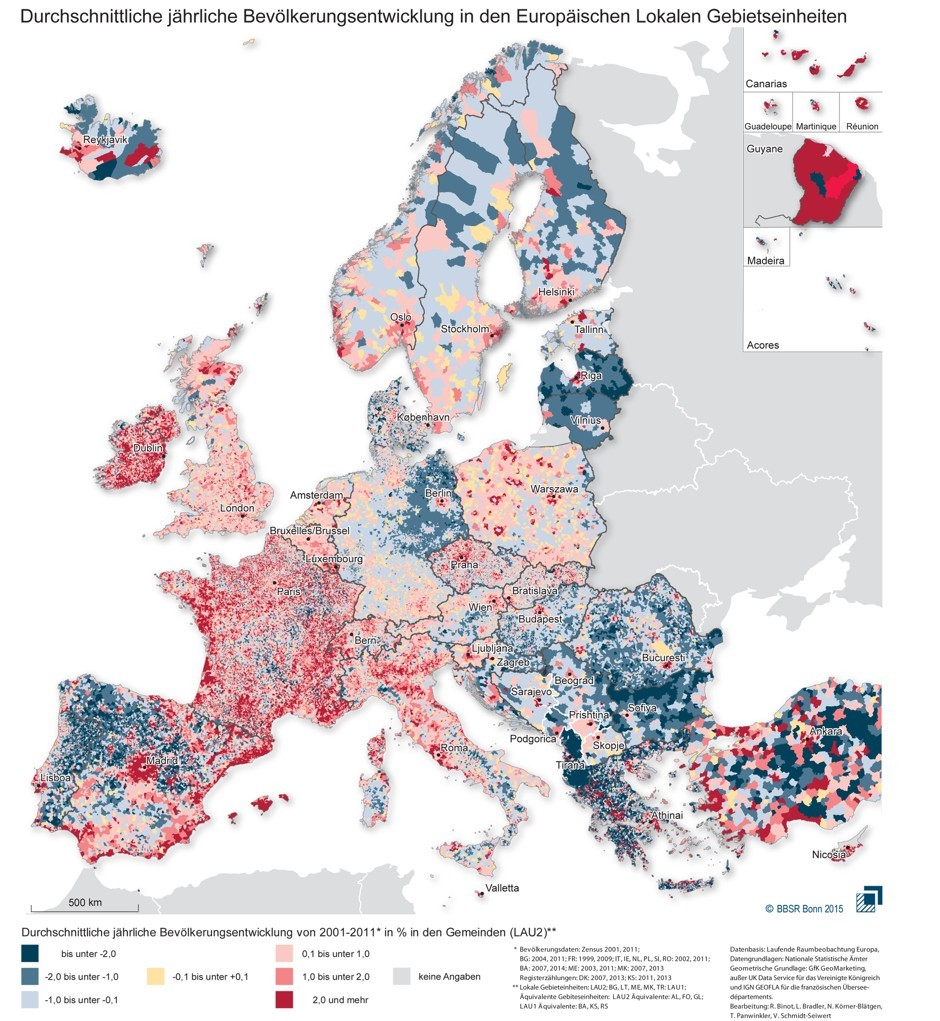
source: Geoaweosmeness
16. EU migration crisis
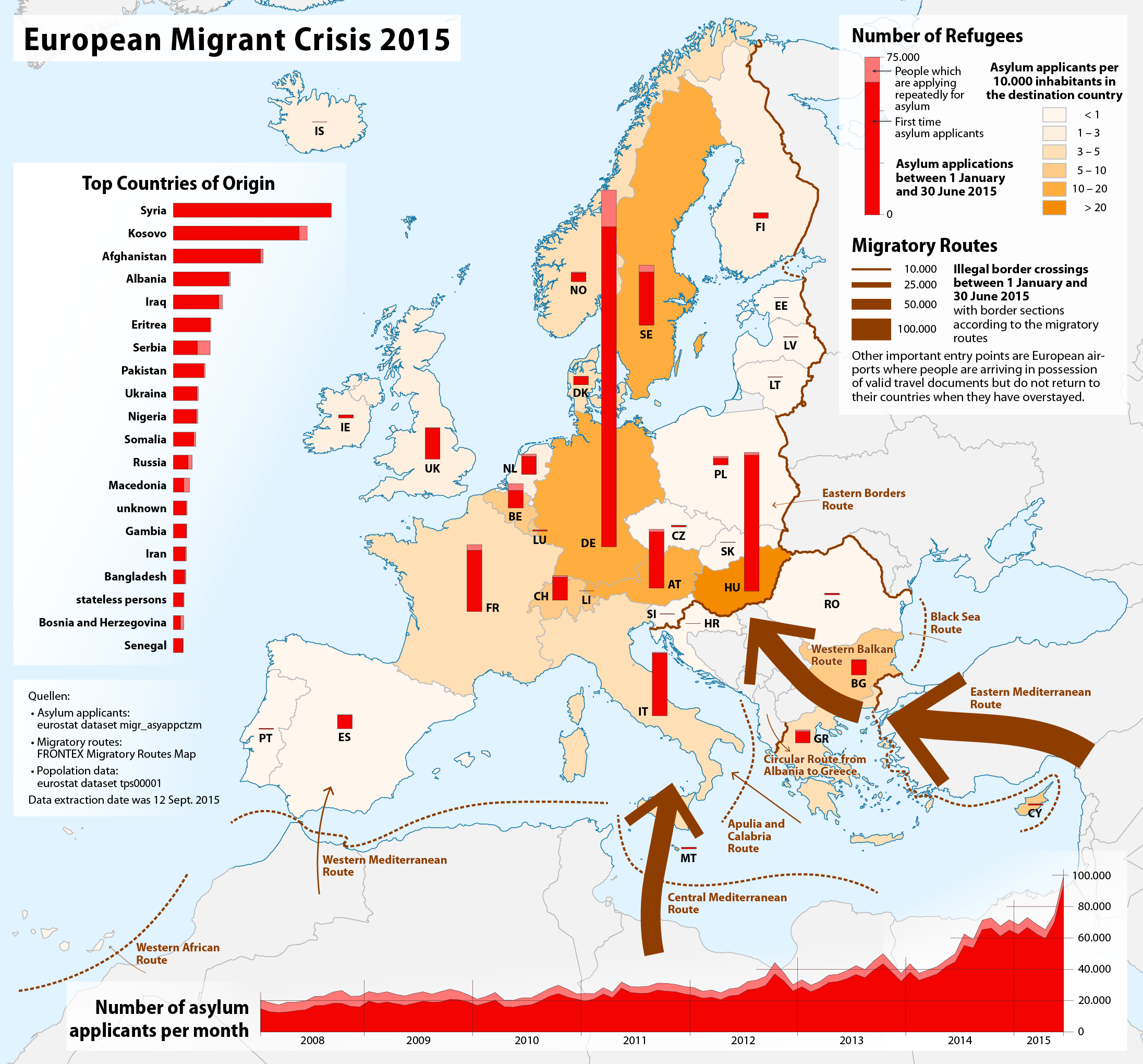
source: WikiWand
17. Most common country of origin of foreign-born population
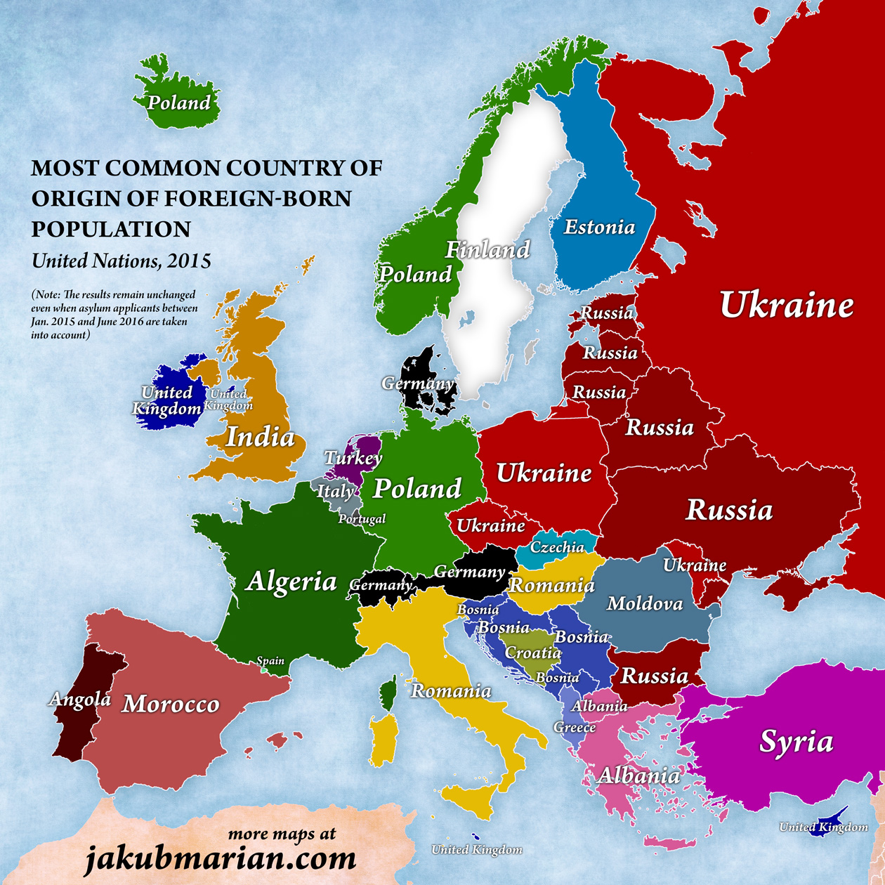
source: Jakubmarian.com
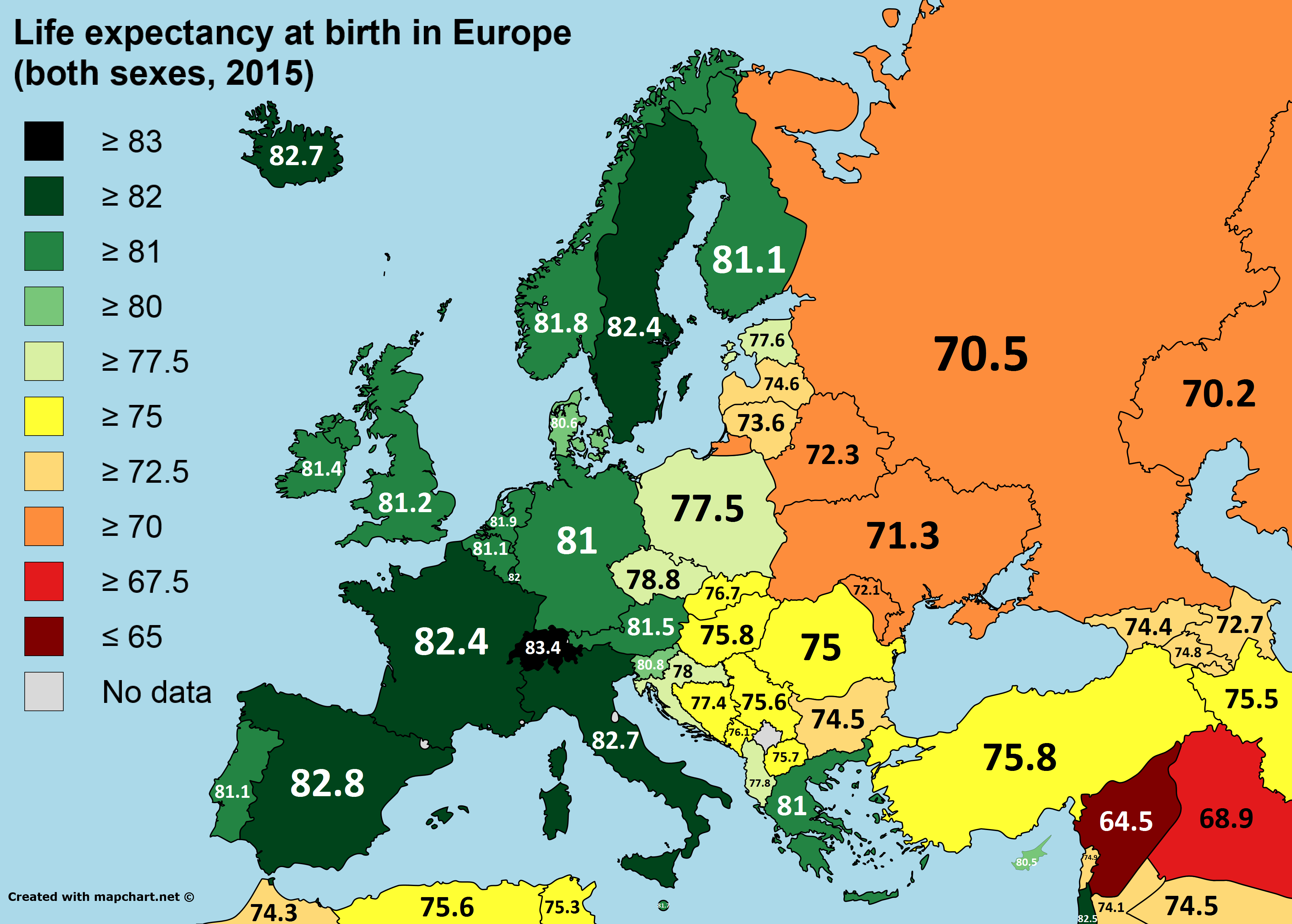
18. Life expectancy in Europe
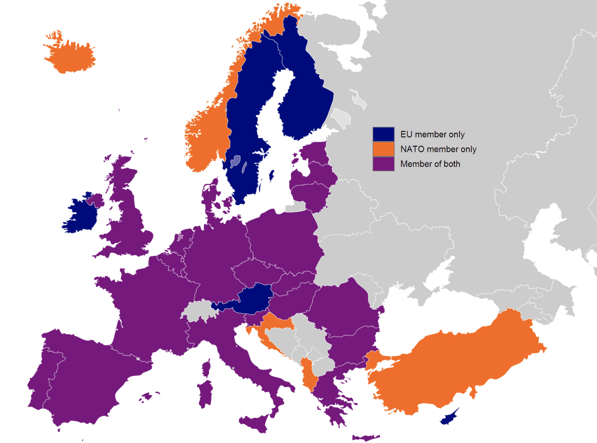
19. EU member states and NATO
source: eu center illinois
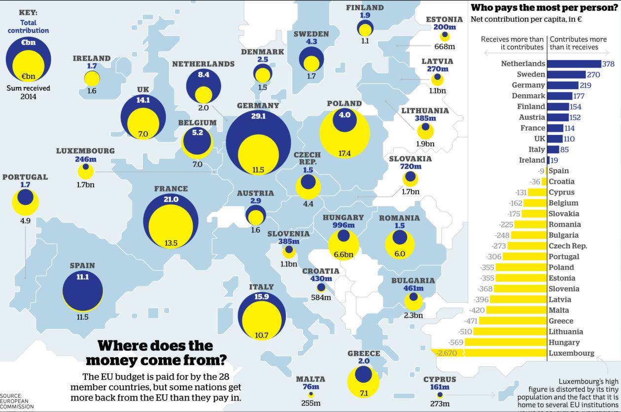
20. Where does the money for EU funds come from?
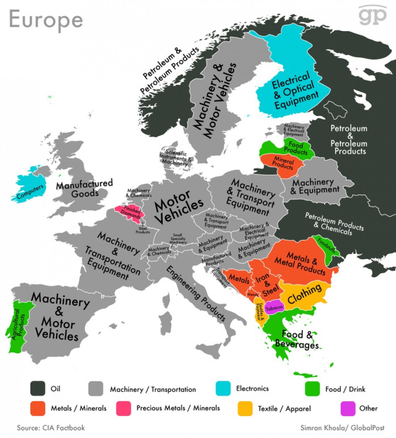
21. EU member states most valuable export goods
source: Time
22. EU import of Russian gas
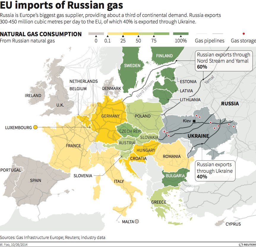
source: Business Insider
23. Europe’s busiest airports
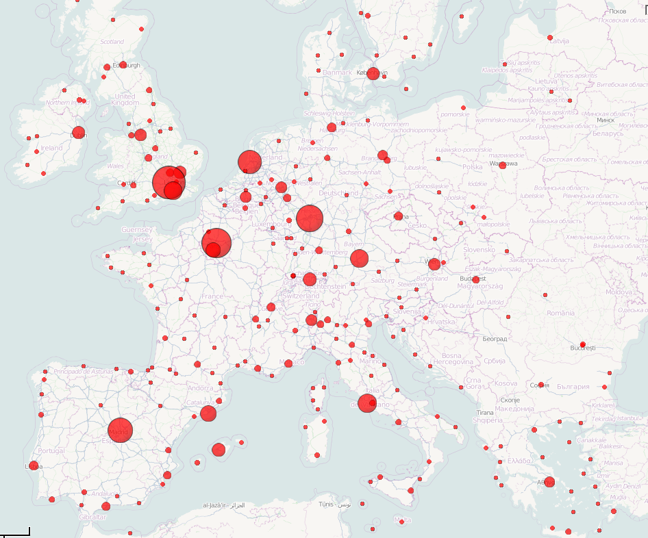
source: Wikipedia
24. Active separatistic movements in Europe
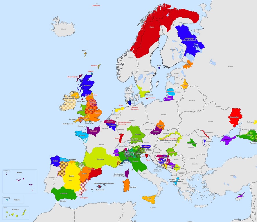
source: reedit
25. LGBT Rights in Europe
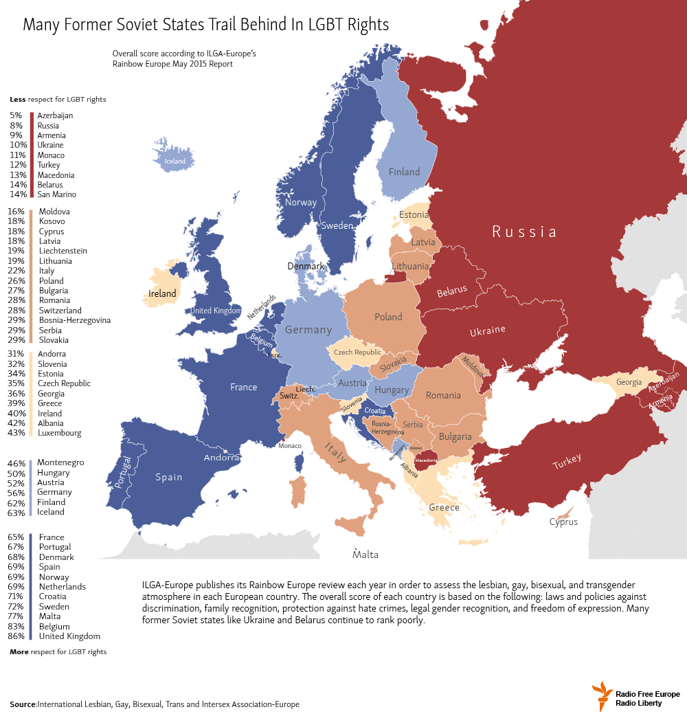
source: one-europe.net
26. How old is each individual country in Europe?

source: Jimmysbook
27. These are the last kingdoms in Europe.
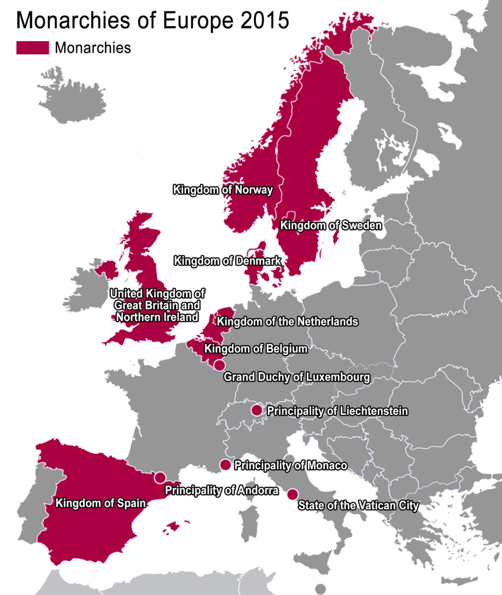
source: Reedit
28. What’s Next after Brexit?
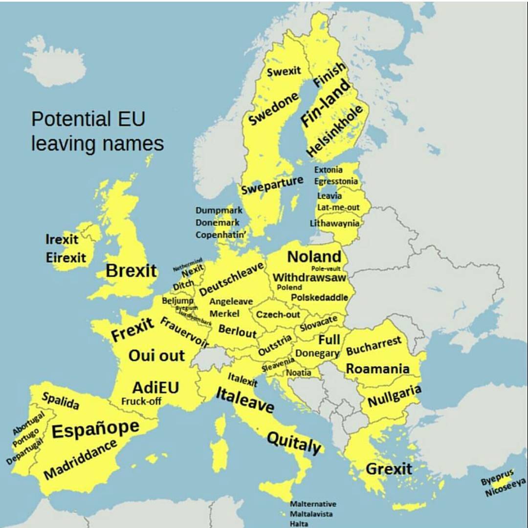
source: Big Think
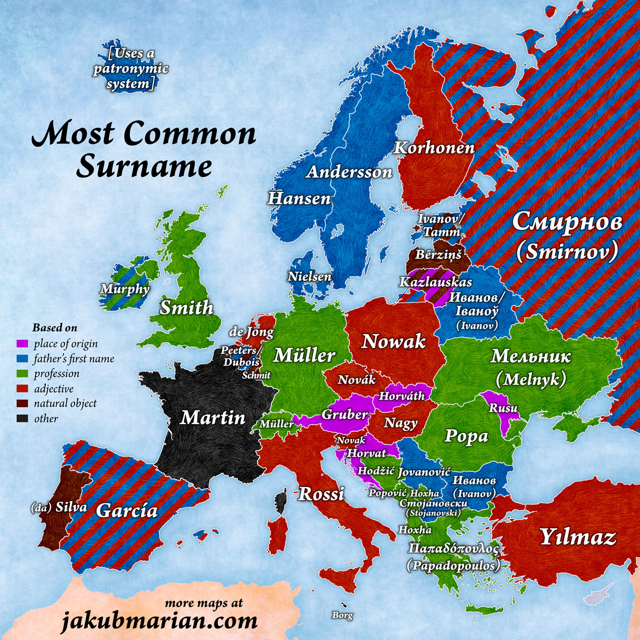
29. Most common surnames in Europe
30. European colonialism conquered every country in the world but these five

source: Vox