

Scientists and politicians all agree – climate change and global warming are not just myths. They are a fact. This compilation of maps will show you what are the reasons behind it and what are the consequences of that process.
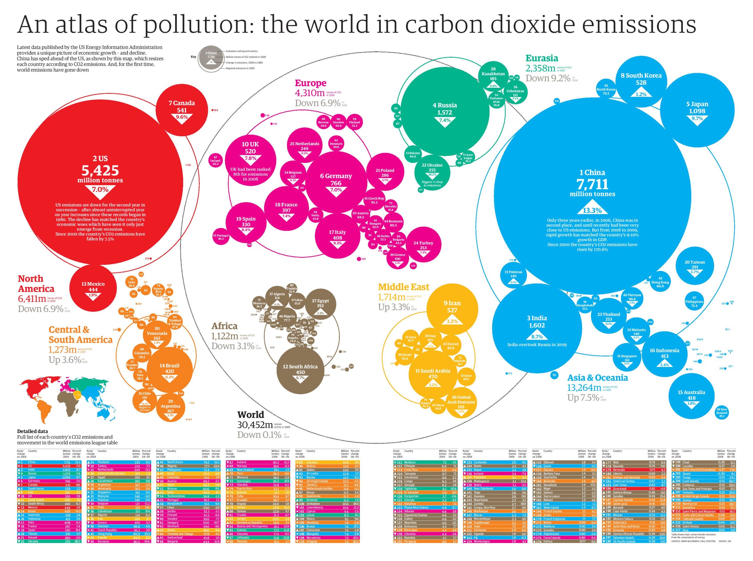
An atlas of pollution: the world in carbon dioxide emissions
China overtook the US as the world’s biggest emitter in 2006. While the emissions in the Europe and the US fell substantially, China still sees a huge double-digit increase.
Global greenhouse gas emissions
Countries around the world are trying to get their greenhouse gas emissions under control. However in order to make it work everyone needs to be on board.
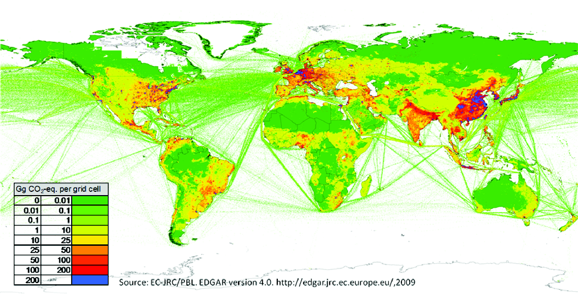
source: EU
NASA visualizes the year of Earth’s CO2 emissions
Cool visualization by NASA shows the annual CO2 emission cycle around the Earth. The study shows that most of the CO2 emissions are generated on the Northern Hemisphere which corresponds to the location of the most industrial centres. The gases travel around the world to be largely absorbed by new vegetation in the springtime. In the winter the emissions start to take over the planet again.
source: Geoawesomeness
Deforestation
Between 2000 and 2012 2.3 millions km² of forest have vanished. The greatest amount of loss still occurred in the tropics that count for 32% of all losses. While in Brazil due to political efforts the rate of loss reduced slightly (though after 2012 the restrictions for deforestation were loosened up again), the deforestation rate in Indonesia doubled after 2003 from 10.000 km² to more than 20.000 km² forest cut per year.
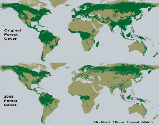
source: Earth Engine
Global Temperature Rise
This cool infographic combines 167 global temperature maps—one for every year from 1850 to 2016—into a single chart. Blue signifies cooler temperatures (relative to a 1961-1990 reference period) and red warmer ones. If a cell is grey, it indicates there was insufficient data to determine its color for that year.
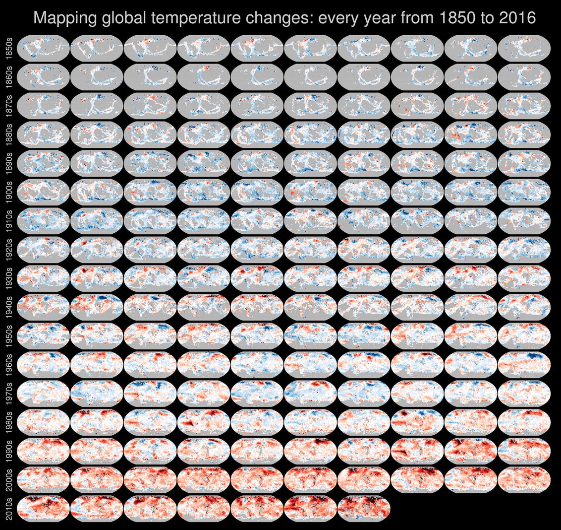
source: Wired
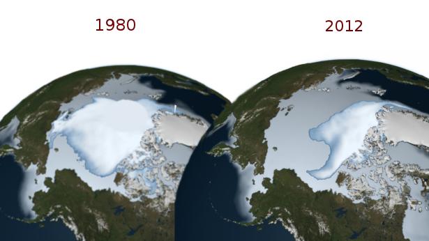
Ice cover is melting
Ice cover on the Poles and Greenland is quickly melting. In a few years most of the European glaciers might disappear.
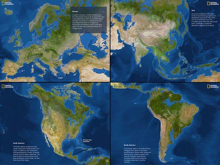
Rising sea level
216 feet (66m) overall! Yup, that’s the level by which the sea levels are predicted to increase if all the ice melted into the oceans.
source: Geoawesomeness
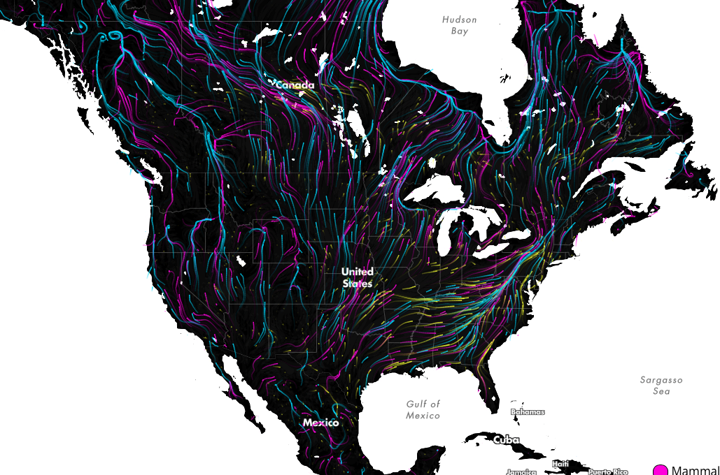
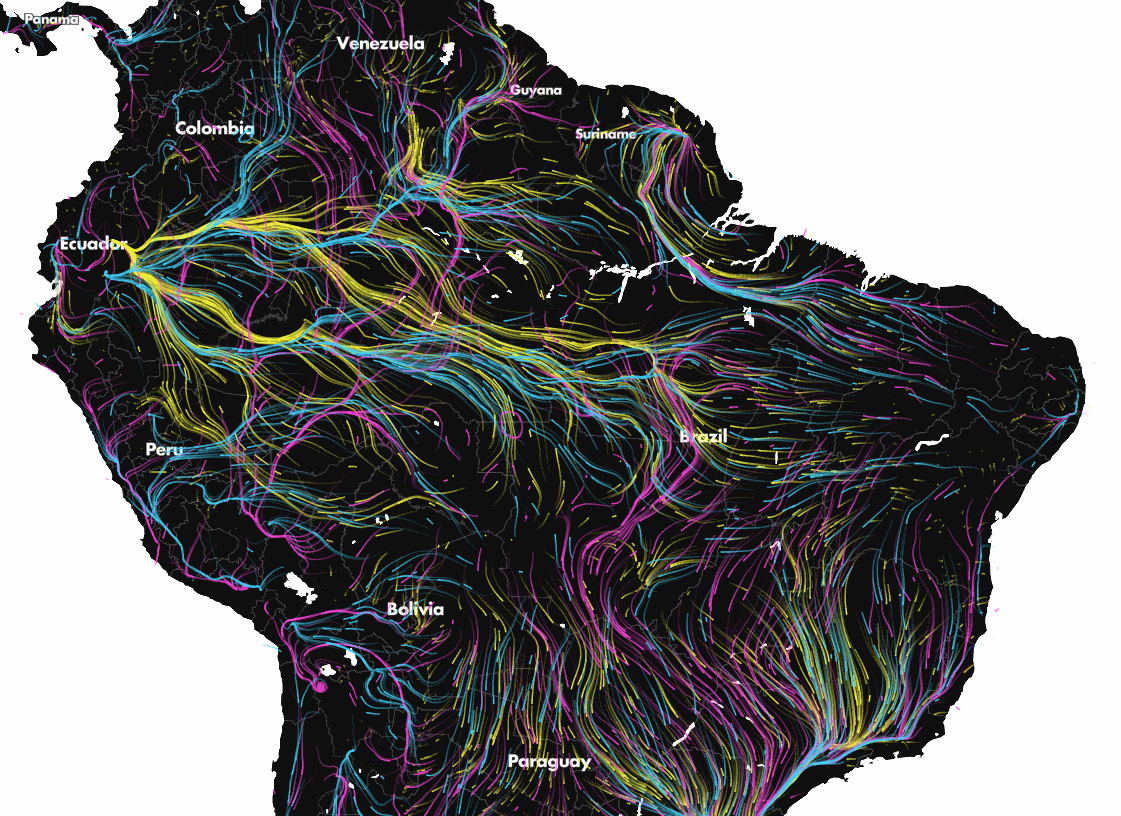
Animal migration because of the climate change
Global warming means the rising of the sea level but scientists predict that it will initiate a chain reaction of micro and macro effects in many different areas of life on our planet. One of them is the migration of animals. In order to survive over the next century many species will have to move to cooler or more suitable habitats. This map shows the trajectories that species are expected to take in the course of the coming decades as the climate changes.
source: Geoawesomeness
Climate destabilization
Map shows the threat of global warming around the world.
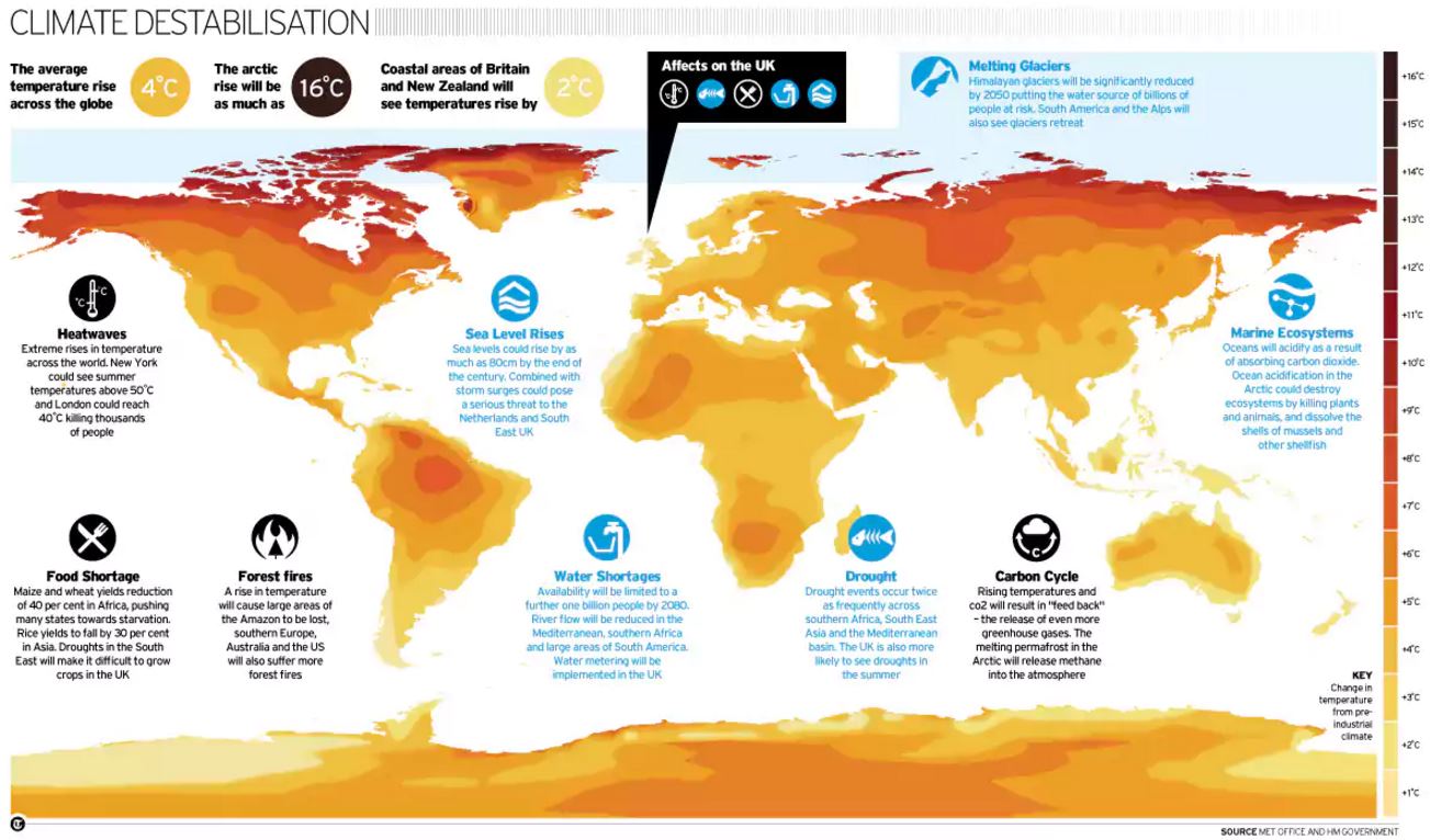
source: Telegraph
Natural disasters
The world getting warmer already cause disasters that devastate lives and cost hundreds of billions of dollars.
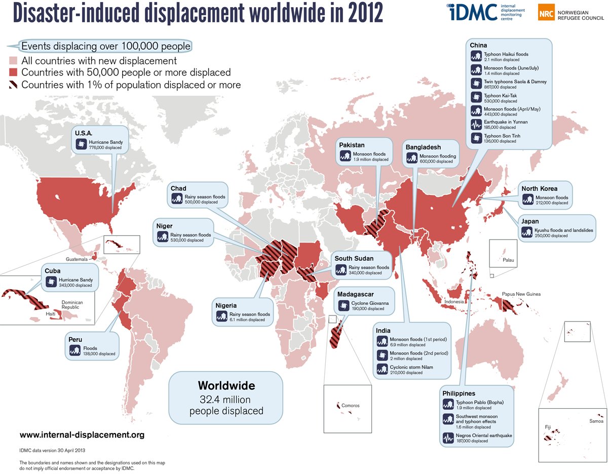
source: Business Insider
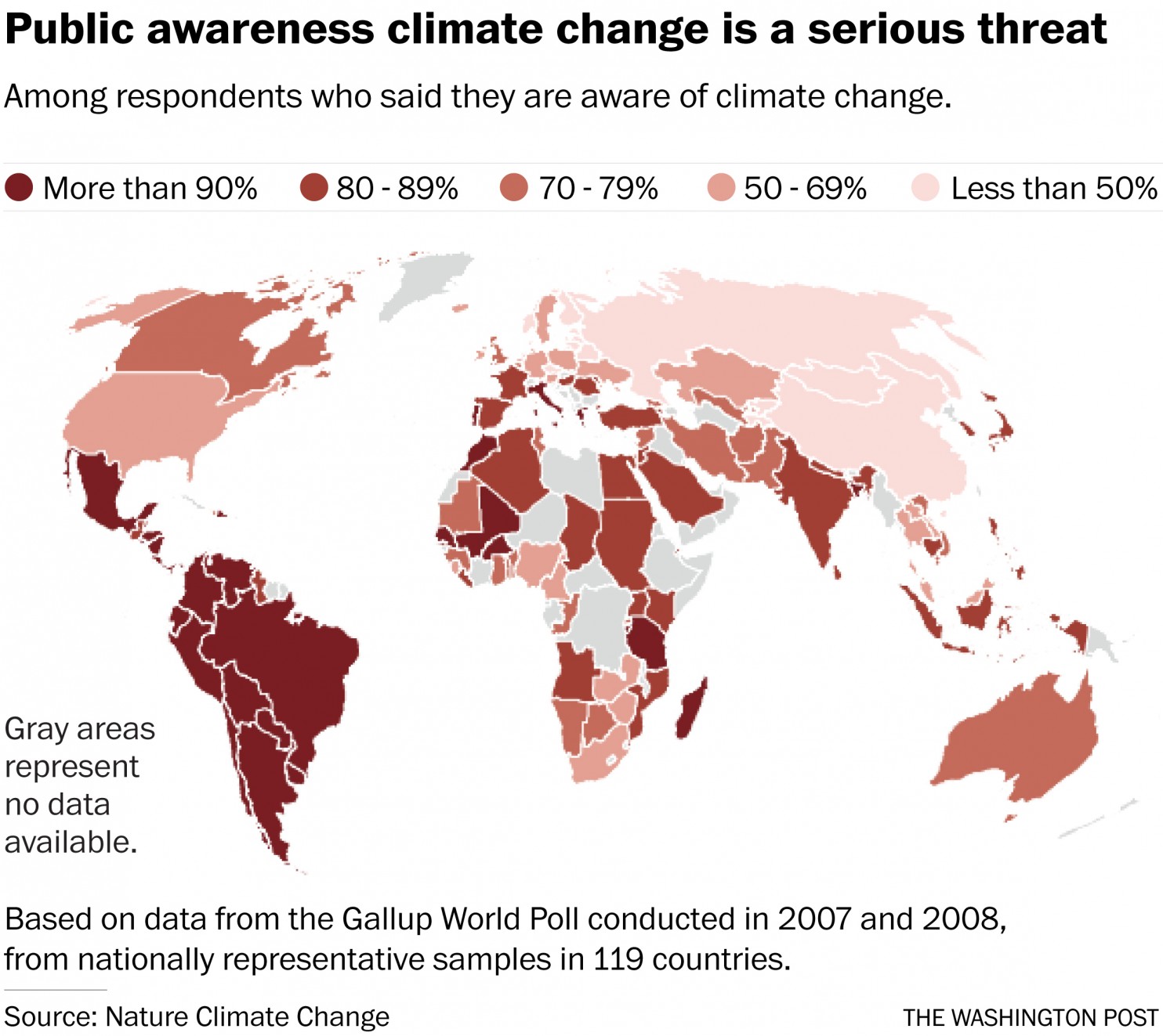
Climate change awareness
As much as 40 percent of the world’s adult population is unaware of climate change, according to a recently study. The awareness of threats related to that process is even lower.
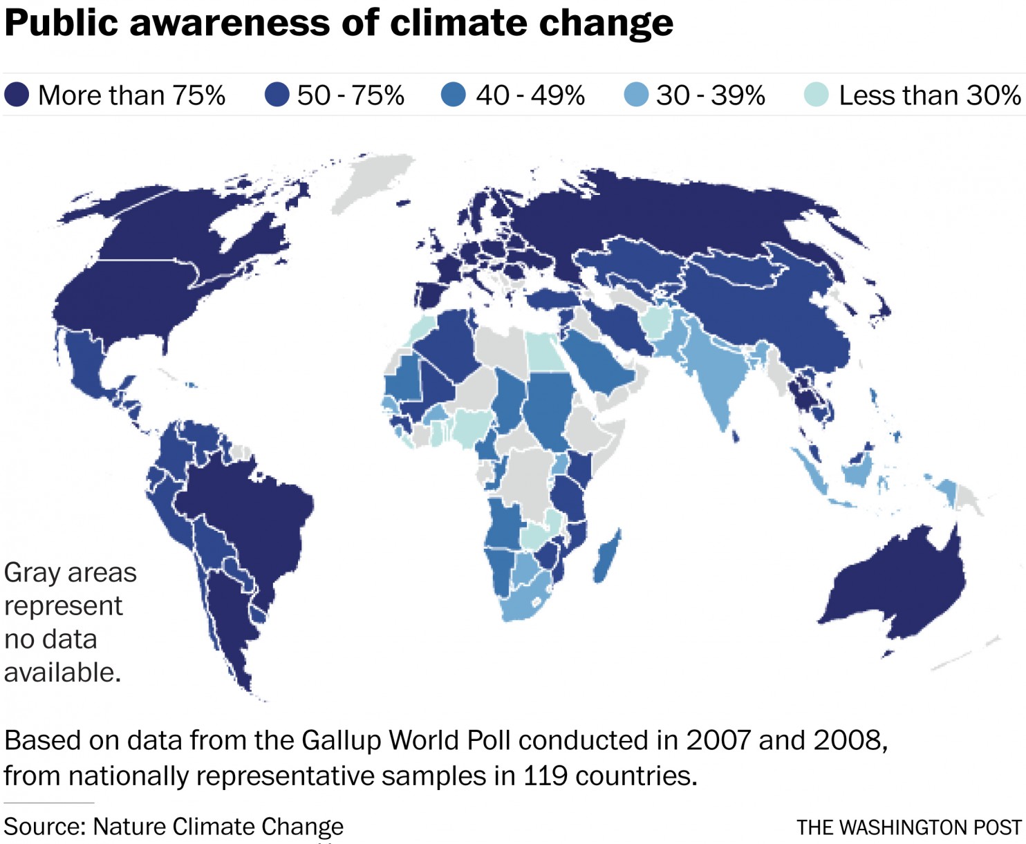
 source: Washington Post
[td_smart_list_end]

#Fun


Next article

Waze, the crowdsourced navigation app has partnered with Esri to make it easier for Governments to access anonymized traffic information from the Waze Connected Citizens Program.
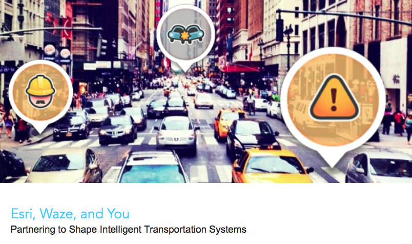
Esri + Waze = Open Data for Intelligent Transportation System
The partnership makes it easier for Governments already using the ArcGIS platform to access traffic data from Waze to improve the transportation system, while making it easier for them to provide information about construction and road closure data to Waze. The Connected Citizens Program, a two-way data exchange, from Waze has already been adopted by over 60 cities across the world (mainly in USA and Europe) and the integration with ArcGIS will make it more easier for Governments to make use of the data.
“Municipalities can now leverage real-time reports without having to invest in sensor networks or an Internet of Things infrastructure,” said Andrew Stauffer, manager of civic technology at Esri. “Waze allows local governments to share open data with a purpose—in an application that is already popular with constituents, commuters, and tourists.” – TechCrunch
All the crowd-sourced, open data that Waze will provide Governments as part of the CCP program will now be available inside ArcGIS, making it easier for them to run GIS analysis for reducing congestion and for shaping the development of Intelligent Transportation Systems, especially in cities where Waze is used a lot by its residents.
“It’s shocking how much open data will fix things,” Andrew Stauffer, Civic Technology at Esri to TechCrunch