
There are many ways to draw driving-time polygons on a map: desktop, web or cloud-based platforms all enable the creation of isochrone maps using APIs. For this article, we only focus on GIS-based tools that use different APIs to create isochrone maps and compare them with each other.
Today, many mapping solution providers offer isochrone mapping services. Here, we only focus on GIS-based isochrone mapping tools that use API calls for input data to create driving time isochrones. This means we do not use cloud-based or web-based mapping tools, but only cover desktop mapping software where the driving-time isochrone maps can be created and visualized.
The tools chosen here are the TravelTime plugin for QGIS, the Generate Service Area tool in ArcGIS Pro and the Hqgis plugin for QGIS. Also, it should be noted that the tools described here offer more functionality than just creating isochrones, such as geocoding and routing. Additional functionalities are not covered here, the sole focus here lies on creating driving-time isochrones.
After giving a short introduction of each provider’s service, we’ll provide the following information:
- how driving time data is collected and used
- how travel time polygons are drawn
- how long it takes to draw the polygons
- what are the available transportation modes for each solution
- How much is charged for using the API
What are travel time polygons?
Travel time polygons or isochrones show the area that is reachable from a starting point in a given amount of time, for a certain method of transport. Polygons are 2D shapes consisting of five or more vertices. The three providers covered here all offer travel time polygon drawing services in a GIS environment. We’ll now have a look at some travel time isochrones and different product features for each solution provider.
TravelTime
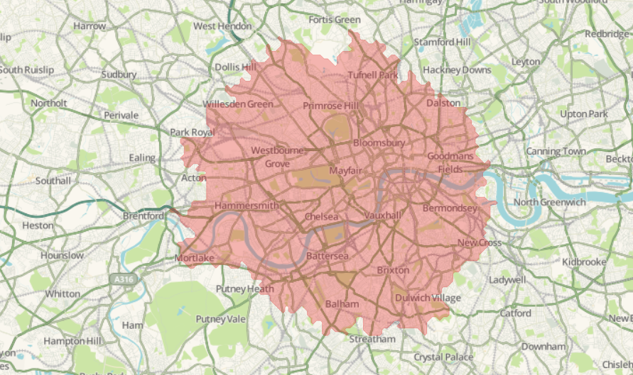
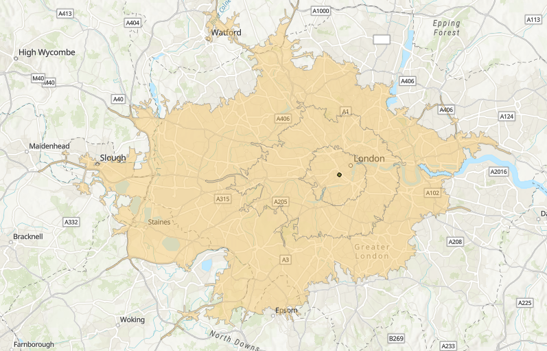
TravelTime makes locations searchable by travel time. They offer analytics integrations with QGIS, ArcGIS and Alteryx, as well as location site search for e-commerce, website and apps via an API. Here’s an example of a 45-minute driving time map of London, created with the TravelTime plugin for QGIS:
Driving models
TravelTime has built its own proprietary model for predicting and calculating drive times.
This is built around peak and off-peak hours, rather than real-time traffic data, in order to provide reliable, consistent results. The model itself takes a range of data sets such as OpenStreetMap and country-specific data, and then constructs speed profiles based around road types, the surrounding area, and features of the road itself. These speed profiles are then benchmarked on test maps, fine-tuned, and then set live. Once live, the models are regularly re-tested and updated.
How the polygons are drawn
Isochrones can be created by clicking the Quick Time Map query on the TravelTime platform menu, the third icon from the left on the image below:
![]()
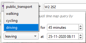
The tool has four parameters: you are required to enter a date/time, mode of transport, time limit for the isochrone and whether you are leading or arriving:
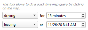
By taking into account the amount of traffic for that moment when creating the resulting travel time polygon, the results are more realistic and reliable. Next, you can click on the map to start creating the isochrone from any location. The advanced isochrone functionality, discussed below, works the same way but can use point layers as departure/arrival locations.
The resulting polygon, displayed at the beginning of this section, shows a polygon with multiple vertices. Using the toolbox, we can create a better result as there are more tool parameters, such as more transportation types aggregation of the results (available are Normal, Union and Intersection). Here’s an overview of all tool parameters:
A detailed image shows the many vertices in the resulting driving time polygon:
Isochrone performance
Using the Quick Time Map query tool, the results are generated instantly and added to the map. The algorithm works fast and returns many isochrones at once for entire point layers within seconds.
Available transport modes
As displayed below, the Quick Time Map query tool offers four transportation modes, public transport, walking, cycling and driving:
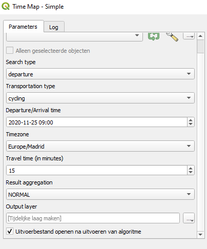
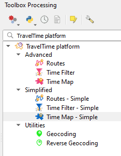
More options are available by clicking the “Show the toolbox” button on the menu on the far left (selected):

Clicking this button will open up the following toolbox on the right of the screen:
Selecting “Time Map – Simple” under “Simplified”, we can now select more transportation modes:
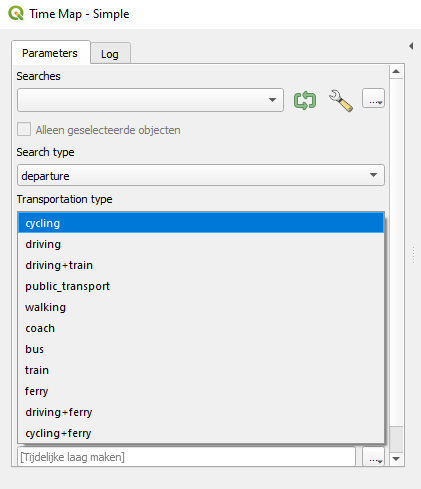
We can see that apart from walking, cycling, driving, public transport, the tool offers multimodal transport as well, combining different transportation modes.
Pricing
TravelTime’s licensing differs per use case. There are multiple options for using the TravelTime API for adding polygons on a customer-facing website, app or software: Standard (£600 / month) enables 100k searches / month, where a single search equals making a single isochrone with 1 departure or arrival time & 1 transport mode. Standard Plus (£1000 / month) enables 200K searches / month. API pricing for an internal business app is £250 / month. The same amount is charged for an API key for Esri, QGIS, Alteryx and API/SDK integrations.
Want to try for yourself? Sign up for a TravelTime API key here. Creating isochrone maps in QGIS is similar in ArcGIS using the TravelTime add-in for ArcGIS.
Esri
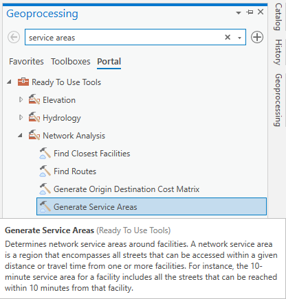
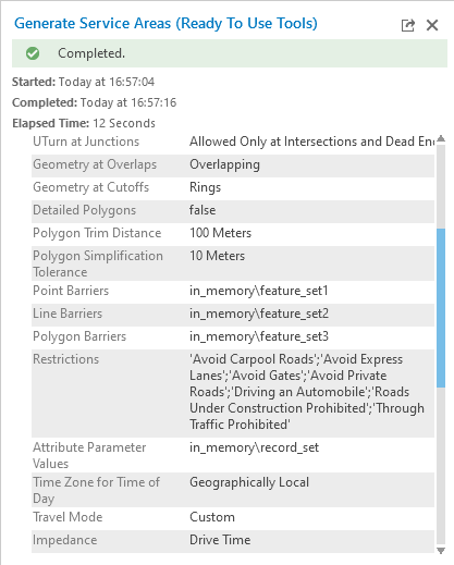
Esri offers the creation of service areas based on driving time through the >Generate Service Areas tool, which can be accessed in ArcGIS Pro. This tool uses the ArcGIS REST API for creating driving time isochrones and is accessible through the Ready To Use Tools under Network Analysis tools, and requires a Portal Extension and ArcGIS Online organizational account. When running the tool, Esri credits are consumed. Here’s an image that shows where to find the tool:
This is the result for 15/30/45 minute driving time isochrones for a point location in Central London:
Driving models
The online tool documentation states that the tool determines network service areas around facilities. The tool creates drive-time areas if the value for the Break Units parameter is set to a time unit, or drive-distance areas if the Break Units are distance units. Travel time data is based on information from data and services providers such as HERE.
How the polygons are drawn
This tool has a lot of parameters that can be set to create driving time polygons. The image below only shows a few of them, but the tool takes into account many details not present in similar tools from other providers, such as multiple restrictions and the way the polygon is created (polygon trim distance, polygon simplification tolerance).
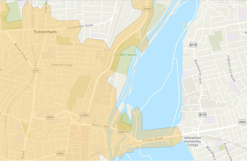
Because there are many parameters to the tool, the results are very refined. If you look closely at the close-up image below, you can see that the isochrones follow geographical boundaries and features such as roads very closely:
Isochrone performance
The image above shows that it took the tool 12 seconds to create and draw the multiple isochrones.
Available transport modes
If we open the tool and click “advanced analysis”, we can define the transport mode under “restrictions”. The default option is “driving an automobile”, but other options are driving a motorcycle, bus, taxi, truck, emergency vehicle or simply walking.
Pricing
The price for creating a single service area is 0.5 ArcGIS Online Credits, which translates to $0.05. Of course you need to pay for Esri software and cloud infrastructure too to be able to use the service, so that the overall price will be higher.
Hqgis
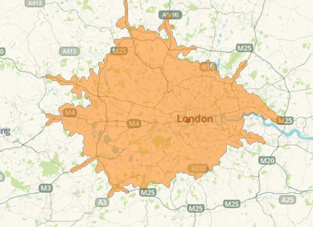
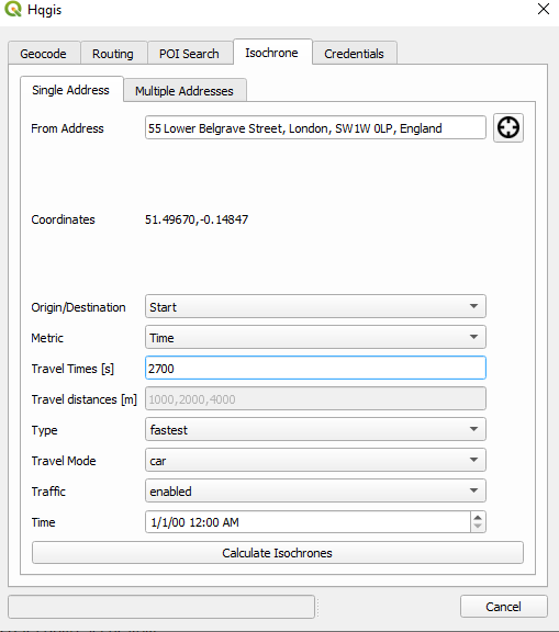
We chose the Hqgis plugin for creating isochrones inside QGIS. Hqgis is a python-based plugin for QGIS that offers access to the HERE API and combines different traffic/routing/geocoding actions in one plugin. Here is a 45-driving isochrone map for a geocoded point in Central London:
Driving models
Isochrones, or lines of equal (travel) times are calculated using different modes and types as well as for different times of the day. This can be done for a single address/map point or using a point layer. The plugin requires a HERE API key, which I was able to get for free after creating one here. After signing up, you need to get credentials for using HERE’s Location Services REST APIs. The API credentials need to be loaded in the plugin, after accessing the plugin through the Web tab in QGIS.
On HERE’s REST APIs webpage, you get an overview of the data that their REST APIs provide. I assume for this particular plugin, multiple APIs will be called, including the Routing API and the Traffic API.
Looking at the required tool parameters, we see that the tool requires one or multiple addresses, an origin or destination, metric (time or distance), travel time in seconds, travel distance in meters, an isochrone type (fastest, shortest or balanced), traffic (enabled/disabled), travel mode and date/time. For a 45-minute car drive with traffic enabled from the Central London geocoded Point address, the parameters will look like this:
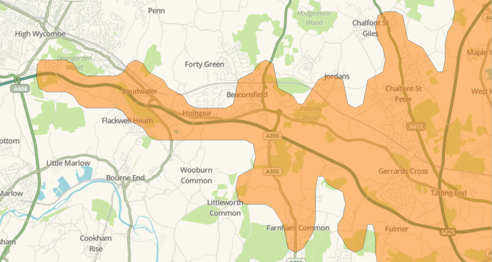
How the polygons are drawn
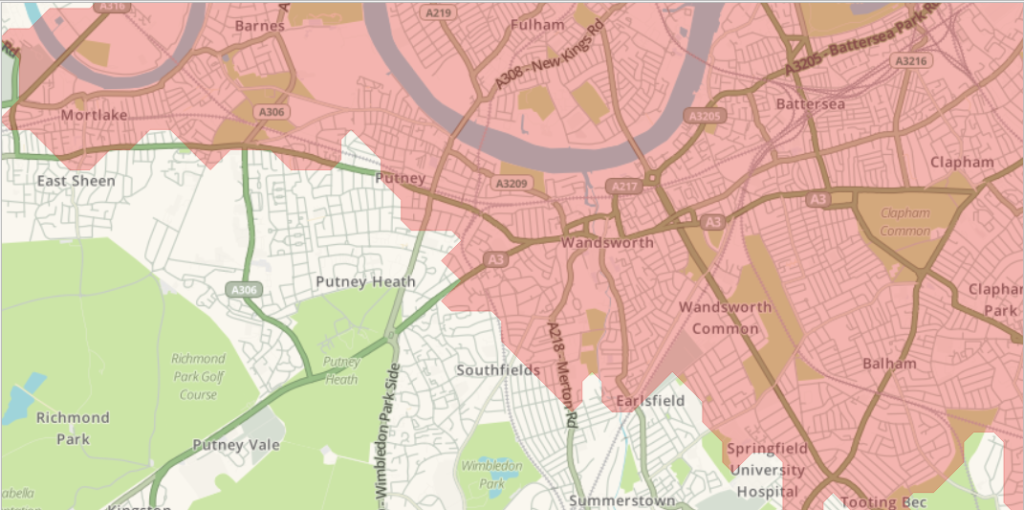
A detailed look at the map shows that the resulting polygon has many vertices and follows the underlying road data quite accurately:
Isochrone performance
The API works quickly and the results are added to the map instantly.
Available transport modes
There are four available transport modes for creating isochrones: car, car hov (high-occupancy vehicle lane), pedestrian and truck.
Pricing
The pricing here concerns the HERE REST API usage when creating isochrones. The Freemium plan includes 250k data transactions for API calls in HERE Locations Services. There’s an Add-on option for €45 per month and Pro license for €449 per month, including 1 million Transactions per month.
A closer look at the features of all three solutions
Now that we’ve covered the three different solutions, let’s have a closer look and compare what is possible with each solution. The schema below offers a comparison per solution provider for various isochrone functionalities. Notice that only TravelTime supports public transport data, multimodal and cycling isochrones:
| Functionality | TravelTime QGIS plugin | Esri (Generate Service Areas tool) | Hqgis QGIS plugin |
| Calculate isochrones from manually entered address | Yes | No | Yes |
| Calculate isochrones from a dropped pin | Yes | No | Yes |
| Calculate distance isochrones (as well as time) | No | Yes | Yes |
| CarHOV isochrones | No | Yes | Yes |
| Truck isochrones | No | Yes | Yes |
| Public transport (and combinations of) isochrones | Yes | No | No |
| Cycling isochrones | Yes | No | No |
| Walking isochrones | Yes | Yes | Yes |
| Create Union and Intersection isochrones from multiple locations | Yes | Yes | No |

#Business


Next article

“What do we know about the universe, and how do we know it? Where did the universe come from, and where is it going? Did the universe have a beginning, and if so, what happened before then? What is the nature of time? Will it ever come to an end? Can we go back in time? Recent breakthroughs in physics, made possible in part by fantastic new technologies, suggest answers to some of these longstanding questions. Someday these answers may seem as obvious to us as the earth orbiting the sun – or perhaps as ridiculous as a tower of tortoises. Only time (whatever that may be) will tell.” wrote Stephen Hawking in his 1988 Book ‘A Brief History of Time’.
Thirty-two years later, at 12:00 CET on 3 December 2020, the European Space Agency (ESA) released to the public data measured by its spacecraft Gaia and subsequently processed and validated by Scientists and Engineers. This is the first of a two-part release with the full data release planned for 2022. The data is expected to result in unlimited scientific discoveries, one of which is information on the history of our galaxy. Could this new data be the answer to some of Hawkins’ so-called “longstanding questions”?

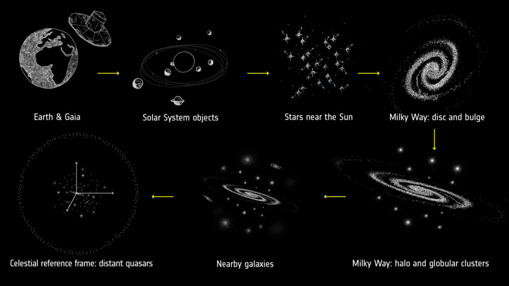
Summary of cosmic scales covered by the dataset
Credit: https://www.esa.int/ESA_Multimedia/Images/2018/04/Cosmic_scales_covered_by_Gaia_s_second_data_release, CC BY-SA 3.0 IGO
What is contained in the released Gaia data and what discoveries have been made so far?
Gaia’s new data is the largest and most precise information on our galaxy to date. The data contains a census of up to 300,000 stars in the solar neighbourhood; stars location, motion, and brightness measurement that are more precise than previous data; structures in the two galaxies near the Milky way; observed motions of extremely distant galaxies; just to name a few.
According to ESA’s Gaia Deputy Project Scientist, Jos de Bruijne, “The new Gaia data promise to be a treasure trove for astronomers.”
Gaia’s new data has provided insights on the evolutionary history of our galaxy and could predict its future. This is because it has enabled astronomers to trace the populations of old and new stars and study the pattern of moving stars at the edge of our galaxy. The motions of 40,000 stars 1.6 million years into the future have been predicted.
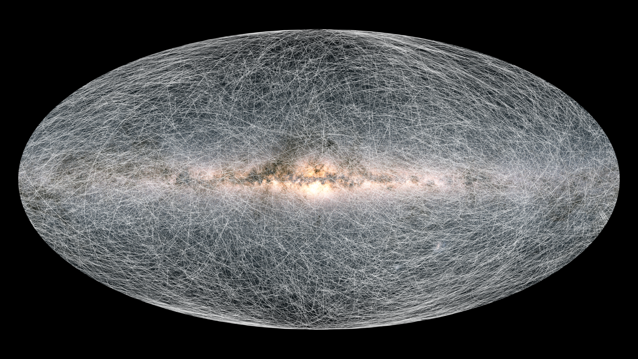
The trails on this image show the displacement of stars on the sky 400 thousand years into the future.
Credit: ESA/Gaia/DPAC, CC BY-SA 3.0 IGO
Gaia has made possible the measurement of the acceleration of the Solar System to the rest frame of the universe, besides providing details on the shape of the Solar System’s orbit around the centre of the galaxy. Gaia has measured that our galaxy has a spiral structure and that the solar system moves on an orbit around the galactic centre. The new data has also revealed that the Sun’s path is not straight but slightly curved.
There are many more discoveries relating to the origin, structure and history of our galaxy-and by extension the universe, that stand to be made from the Gaia data.
How can one access the data?
Gaia data can be accessed on COSMOS: The portal for users of ESA’S Science Directorate’s Missions. The Gaia DR3 datasets are based on data collected between 25 July 2014 (10:30 UTC) and 28 May 2017 (08:44 UTC), spanning 34 months.
Gaia’s journey so far and the future
Gaia was launched in 2013 to make the largest, most precise 3-dimensional map of our Galaxy by surveying more than a thousand million stars. The spacecraft has been mapping the stars from its orbit at a distance of 1.5 million km beyond the sun’s orbit. The mission was planned to end after 5 years of operation (July 2019), but the mission was extended to 31 December 2025 (subject to a mid-term review in 2022).
In conclusion
“… let the scientists search it … let the scientists use it … let the scientists boogie,” says a quote on the header of ESA’s Gaia Early Release 3 COSMOS portal.
We look forward to the galaxy’s mysteries this data will help uncover.
Sources
Hawkins, S. (1988). A Brief History of Time (1st ed.). Bantam Dell Publishing Group.
Patel, N. (2020). This is the most precise map of the Milky Way galaxy’s stars ever made. MIT Technology Review. Retrieved 09 December 2020, from https://www.technologyreview.com/2020/12/03/1013001/this-is-the-most-precise-3d-map-of-the-milky-way-ever-made/.
Gaia’s new data takes us to the Milky Way’s anticentre and beyond. The European Space Agency. (2020). Retrieved 08 December 2020, from https://www.esa.int/Science_Exploration/Space_Science/Gaia/Gaia_s_new_data_takes_us_to_the_Milky_Way_s_anticentre_and_beyond.
European Space Agency. (2020). Exploring Gaia’s 2020 data release [Video]. Retrieved 10 December 2020, from https://www.esa.int/ESA_Multimedia/Videos/2020/12/Exploring_Gaia_s_2020_data_release.
Gaia Early Data Release 3 overview – Gaia – Cosmos. Cosmos.esa.int. (2020). Retrieved 10 December 2020, from https://www.cosmos.esa.int/web/gaia/early-data-release-3.
ESA Science & Technology – Fact Sheet. Sci.esa.int. (2020). Retrieved 10 December 2020, from https://sci.esa.int/web/gaia/-/47354-fact-sheet.