
Two of our favorite GIS technology stacks are joining forces to turbo boost location intelligence, and we couldn’t be more psyched!
In a new partnership aimed to take location analytics mainstream, CARTO and Mapbox are integrating their services with one another. The CARTO platform will now run Mapbox’s maps, search, and navigation APIs and SDKs under the hood as default for all geocoding and routing services (unless, of course, specified otherwise by the user).
In a blog post detailing this alliance, Mapbox explains, “They’re leveraging our geocoding for location search and our routing for analytics like isochrones so customers can understand the impact of location on their businesses.”
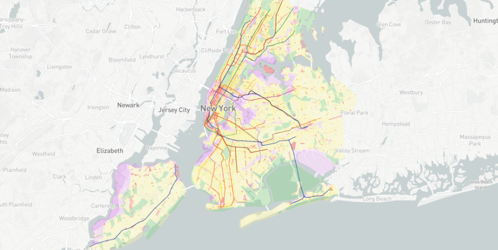
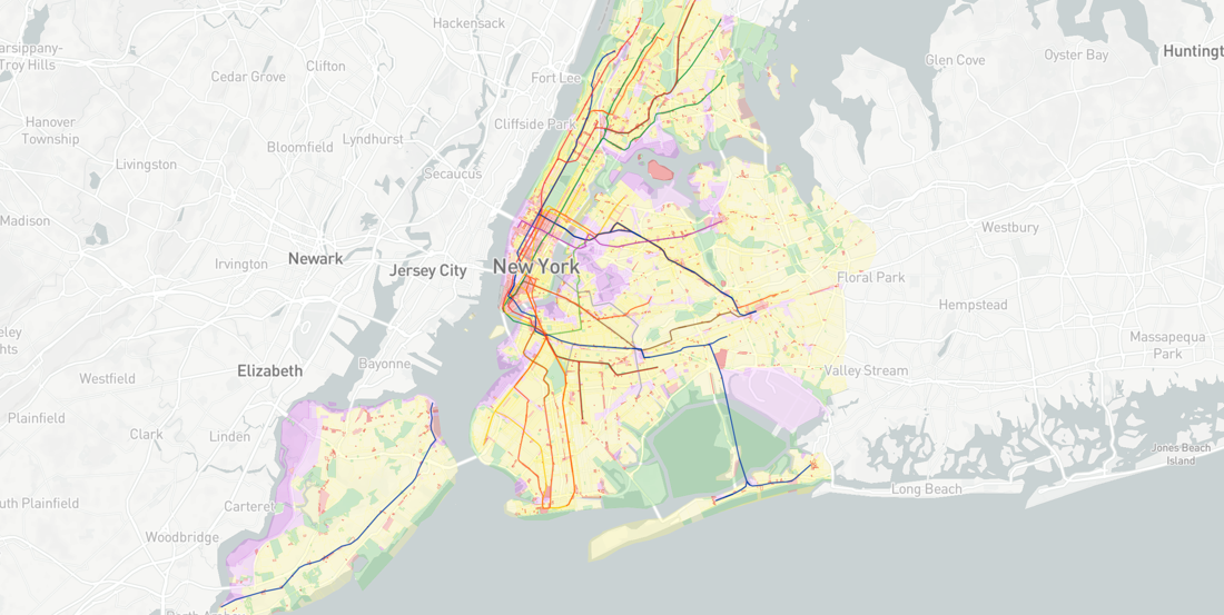
Essentially, the modern location technology stack will go beyond visualizing historical geographical information on a 2D map à la legacy GIS. It will be able to process new data streams coming from connected vehicles and millions of devices powered by the Internet of Things, and portray them using an easy-to-use graphical user interface (GUI). So, CARTO users will be able to visualize huge datasets at 60 frames per second – that’s the frame rate goal most video games today aim to achieve!
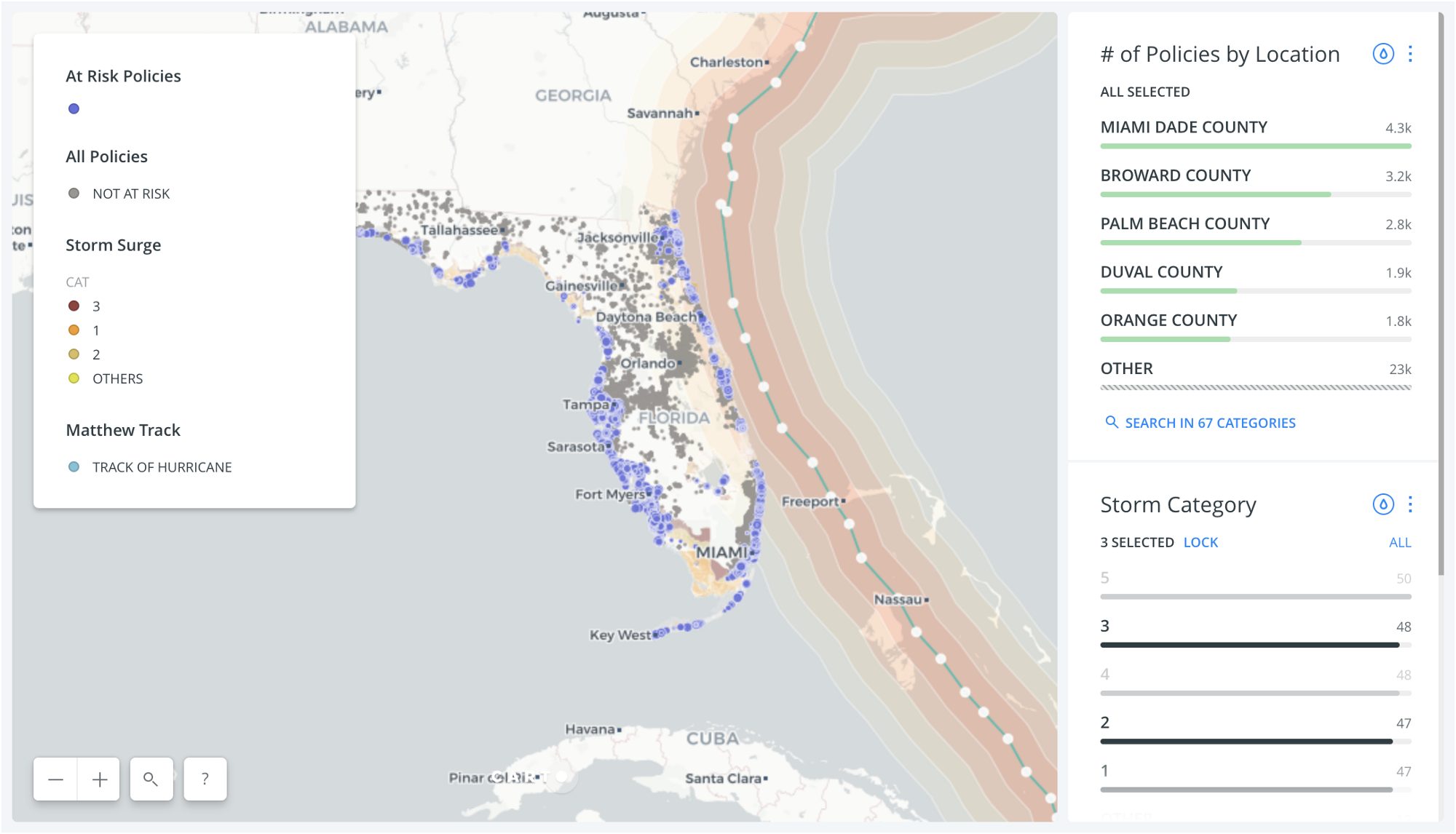
This CARTO dashboard shows a projected storm track with simulated policyholder data to showing at-risk properties
For Javier de la Torre, Founder and CEO at CARTO, change has been long overdue in the GIS industry. “For the last 15 years the GIS Industry has been defined (and confined) because of a partnership between traditional LBS vendors and specialized software companies catering to an exclusive community of GIS developers and analysts,” he says.
With this coalition, CARTO and Mapbox expect that even non-technical users without a master’s degree in GIS will be able to leverage location intelligence for making forward-looking decisions. They also hope to expand the scope of spatial technology to include those users who were previously unable to incorporate geo data directly into their workflows. For this, they are betting on open data and open source code to make location technologies more flexible and practical. More power to them!

#Business


Next article

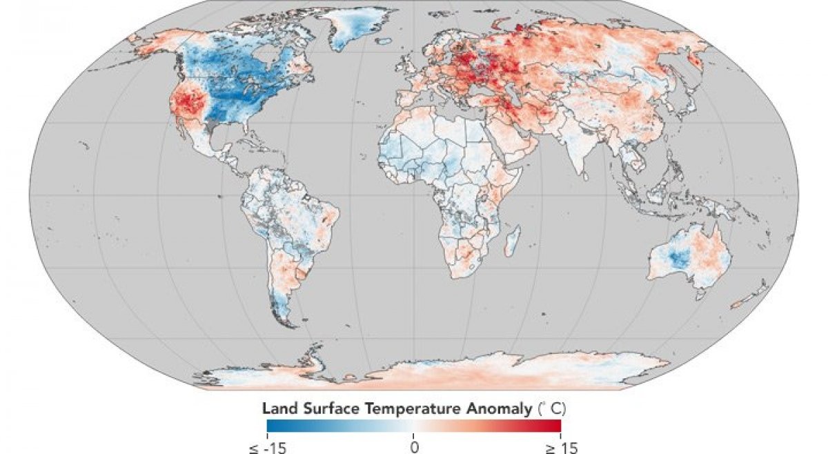
Katy Perry could well have been talking about the weird winter we are having right now when she sang Hot N Cold. NASA’s Earth Observatory has put the current weather situation in perspective by plotting global land surface temperatures on a map.
So, while people in Midwestern and Eastern United States, along with Canada, have been shivering through a winter storm called the bomb cyclone, parts of Western US, Alaska, Europe, and Asia have been on fire. Not to mention the rare snowstorm the Sahara desert witnessed earlier this week!
The NASA map takes into account data collected by the MODIS (Moderate Resolution Imaging Spectroradiometer) instrument aboard its Terra satellite between late December and early January. The regions in blue are the ones that have been colder than average between the eight-day period of Dec 26, 2017, to Jan 2, 2018. The areas in red, meanwhile, have been found to be hotter than average when compared to the 2001-2010 temperatures.
Also read: NOAA’s new satellite might just put an end to weather jokes
While land surface temperatures are not the same as air temperatures, the map does underscore how December and January have been unusually warm for most of the world. Another stark reality that the map brings to fore is how America has been divided into two parts based on the weather it is experiencing. Take a closer look at the map of North America below:
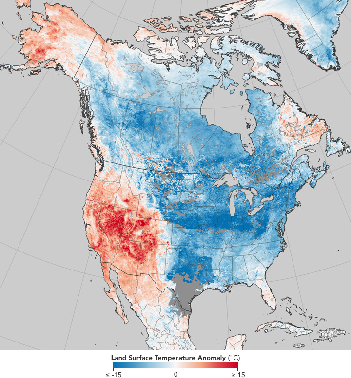
NASA says that these extreme weather conditions can be attributed to the Rossby waves — jet streams that are formed when polar air moves toward the Equator while tropical air is moving poleward.
According to NASA, “As the crest of a Rossby wave — a ridge — pushed unusually far toward Alaska in December, it dragged warm tropical air with it. In response, the other side of the wave — a trough — slid deep into the eastern United States, bringing pulses of dense, cold Arctic air south with it. The Rocky Mountains have boxed in much of the coldest, densest air, serving as a barrier between the cold and warm air masses.”
This is also the reason why wildfires have been ravaging California in what should have been a wet season and why residents in Alaska’s largest city have been jogging in short sleeves and ice-skating in T-shirts!