
Nerve of EU Countries (Part – 1)
…. Why don’t you ask the kids at Tiananmen Square; @Hypnotize. An awesome song by “System of a Down”. It’s about the Tiananmen Square Massacre of 1989.THE “protest”, started with student demonstrations afterward hunger strikes, military action, death toll and ended with remembrance. Protest, the action of expressing objection and these objections might tell us about the political dissent which can be caused be leadership change, policy change, crisis or when it’s become a question of human right.
Politics; it’s exciting and a very mature word. Of course it’s just not a word rather the answer to several conflict questions, specially where peace is questioned. Under such political process, protest is a form of action expressing objection to something. Understanding the pattern of protest we can settle tomorrow’s peace today. Protest pattern study can be a clue to unlock the question to several political process as well.
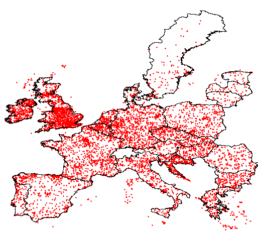
Here the following plot shows the distribution of protests all over the EU countries and the density as well. accordant to the density statistics 547.531 square units and per square unit and the mean density is about 140 per unit area. this plots were created based on Global Data on Events, Location and Tone (GDELT) data sets.
-
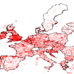
- Protest distribution in Eu Countries (1979 – 2012)
-
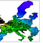
- Protest density in Eu Countries (1979 – 2012)
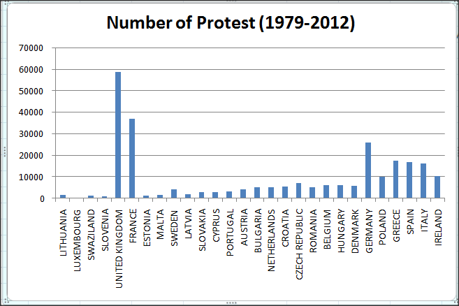
Here’s the another GDELT protest time series for the all EU countries form 1979 – 2012. there are in total 265, 122 protest in those 30 years. there is also another plot showing the total number of protest according to countries.
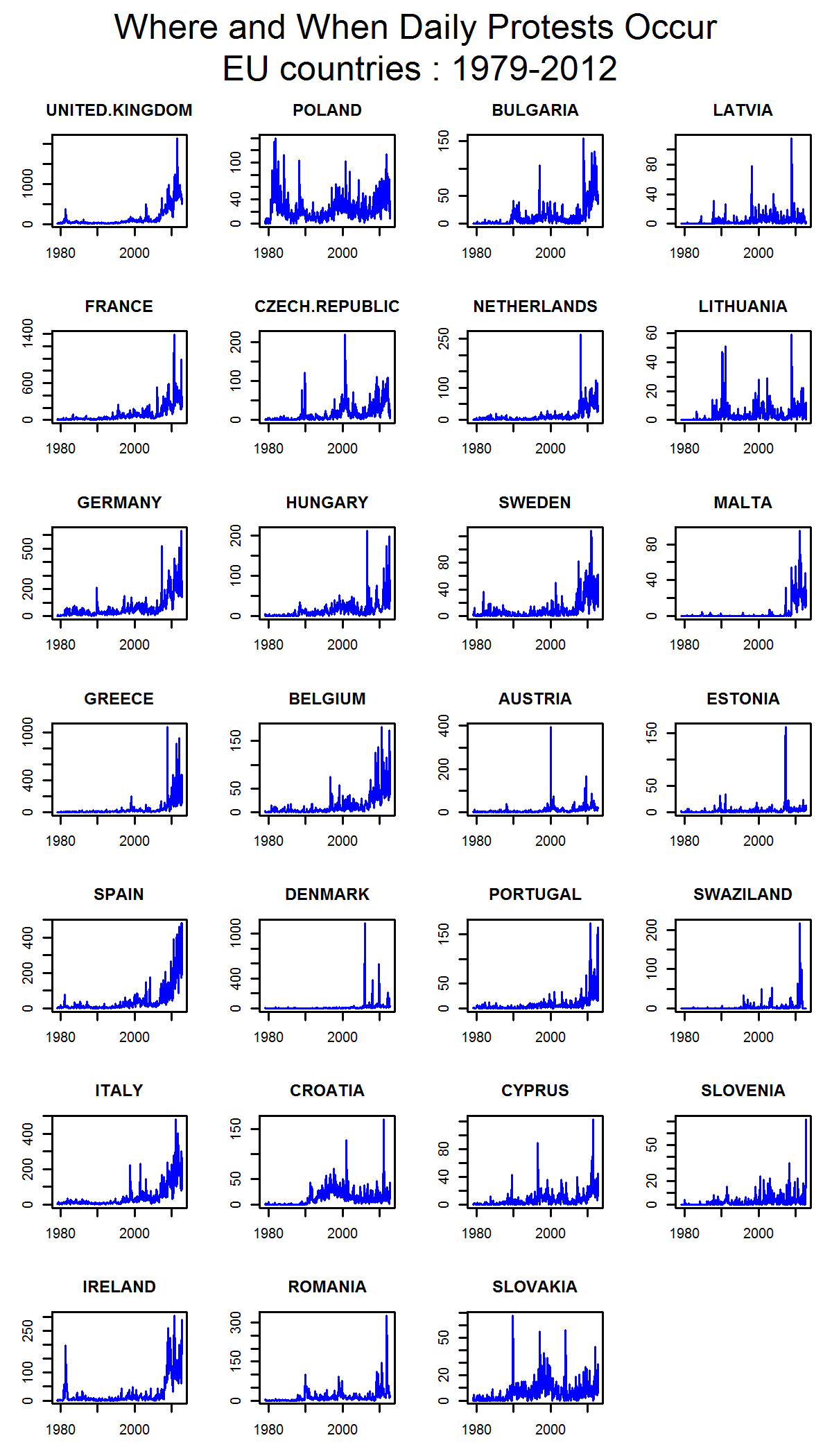 from the country wise plot we can see that the height number of protest were observed in UK, France, Germany. Greece, Spain, Italy and Ireland (though the data is not normalized but still it gives a signal of number of occasions and frequency of activities). besides the time series plot also shows that there is a increased number of protest in most of the countries after 2005 and that is because of increasing data availability. but in most of the countries we can observe a change after 2009 (increased number of protest) and we also can observe a similar kind of patter after 2008 in Greece, Ireland, Portugal, Spain, Cyprus, Italy and so. I assume it’s because of the “Euro Crisis”. Besides euro crisis at the same time there was also 2008, Irish banking crisis, Automotive industry crisis of 2008 etc. Most interestingly i have found that there are always highest number of protest in Poland, though I have no clue why is that. do you have any clue about that?
then I though about going a little bit detail after the year 2006 (… as the data availability has been increased by then). and here you can see another time series plot for the period 2006 – 2012. in those plots we can see several peaks in particular time. so I started googling to find some answers to those peak. here’s what I have found in the internet:
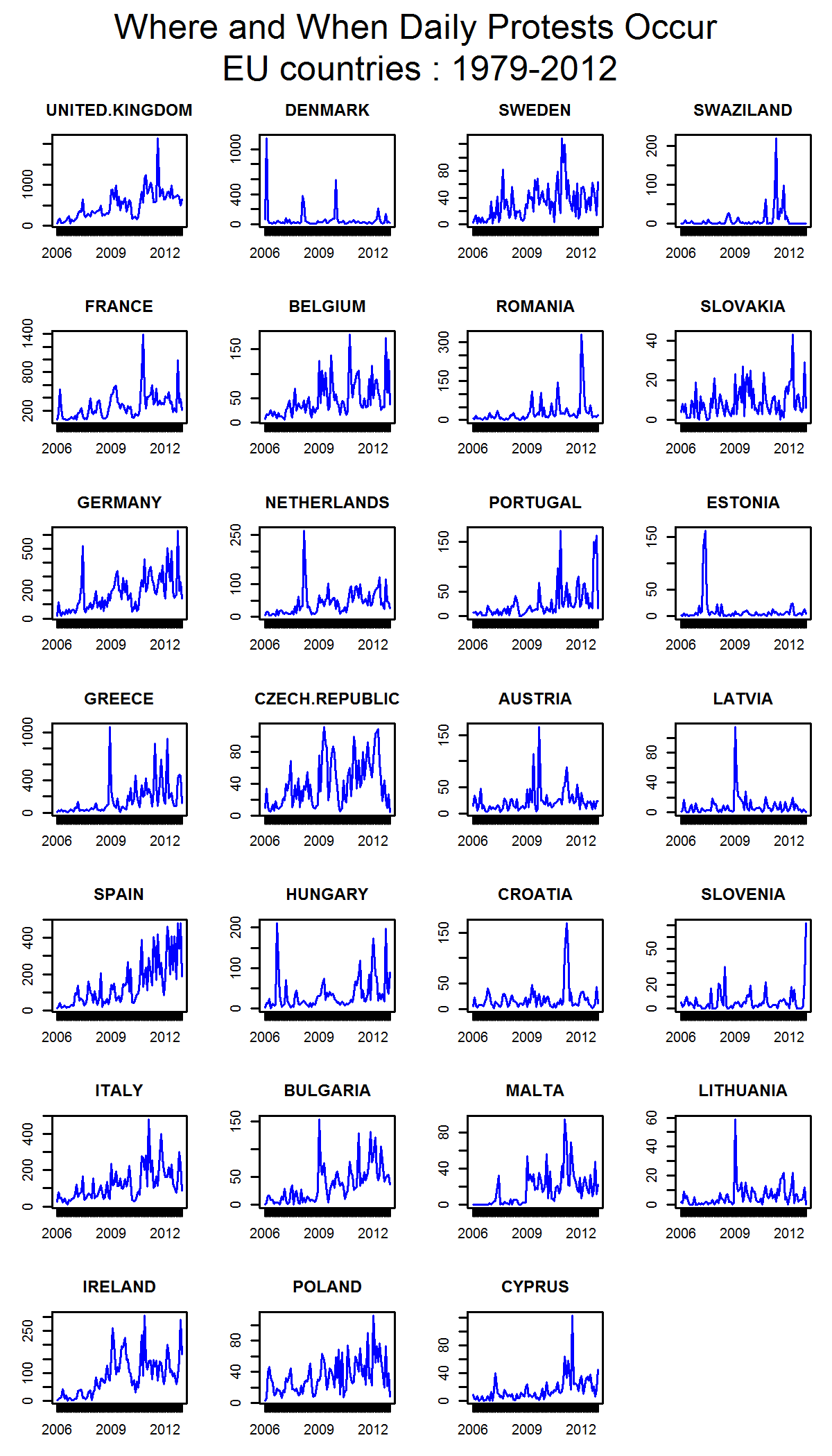
Denmark and Netherlands (march, 2008) : Shouting angry slogans against Denmark and Netherlands for insulting Islam
France (October, 2010): hit by new wave of mass pension protests
Romania (January, 2012): a series of protests and civil manifestations triggered by the introduction of new health reform legislation (reduced state funded health benefits)
Estonia (march, 2007): Protests against the removal of the Soviet Bronze Soldier statue have turned into clashes between protesters and police, as well as Estonian nationalists.
Greece (December, 2008): The 2008 Greek riots started on 6 December 2008, when a 15-year-old student, was killed by two policemen
Austria (October, 2009): student protests in Austria against restrictions on the access to higher education
Croatia (April , 2011): failure of political promise, Economic slump and institutionalized corruption
Slovenia (December, 2012): protests against the Slovenian political elite members; accused by corruption
Bulgaria (January, 2009): anti-government protest turns into riot Started with economic crisis and became violent as protesters clash with police (January, 2009)
summing up, if we put our finger on EU nerve we find it weaker than before. there are unrest. unrest because govt. failed to keep the promises, Police had lost control accidentally and triggered the human right activist, euro crisis pushing the crisis tolerance boundary, policy change or authority change can cause harm to the stability.
By the way, if you liked reading it, keep an eye on Geoawesomeness. Soon, I will appear with some more findings.


#Business


Next article


National Geographic calls Geography Literacy: “the ability to use geographic understanding and geographic reasoning to make far-reaching decisions”. It relies on three conceptual pillars:
- Interaction: The world is made of systems that are connected to one another & interact permanently in multiple ways, at multiple scales (of time & space).
- Connection: Peoples & places are connected to one another to form a global complex and dynamic network
- Implication: The way we interact & build our world, so the decision-making process related to land & resource management as well as urban & rural planning, depends on how well we know the interactions and connections happening in our world.
The PhD and Vice President of National Geographic Education makes a simple yet disturbing statement: “We have not invested in helping children understanding the world the way they will need to understand it in their adult’s life”. As revealed in this 2006 National Geographic study about young American geographical knowledge, “majorities of young adults fail at a range of questions testing their basic geographic literacy”:
Only 37% of young Americans can find Iraq on a map—though U.S. troops have been there since 2003.
6 in 10 young Americans do not speak a foreign language fluently.
20% of young Americans think Sudan is in Asia. (It’s the largest country in Africa.)
48% of young Americans believe the majority population in India is Muslim. (It’s Hindu—by a landslide.)
Half of young Americans cannot find New York on a map.
Even if geographical knowledge goes far beyond the ability to place things on a world map (remember, it’s about understanding interaction, connection & implication), those numbers establish a very worrying baseline.
Basically, we are illiterate when it comes to know the world we are living in. So we make decisions to manage it (resources, land, transportation, energy, cultural relations, etc.) based on a very partial knowledge that does not recognize Interaction, connection and implication as key principles of it, from political level to individual one.
THEN, WHY IS GEOGRAPHY LITERACY SO BAD AT THE MOST CONNECTED ERA OF ALL TIMES WHEN EVERYONE HAS GOOGLE MAP ON THEIR PHONE ?
We actually know why. Imperialists nations have always cared a lot about geography, for conquest and colonization purposes. European people for instance started very early to map the world, explore it, describe and define it as accurately as possible to assess the values of lands in terms of military resources needed VS commercial potential. A lot of the geographical knowledge was built in that context (anthropology, botanic, species inventories, climatic event description, etc.).
When the last decolonization started in the early 1950, the western world entered a phase of recoil. Colonizing nations faced powerful forces pushing them out. Their empires fall apart, forcing European nations to withdraw on their home countries, and to abandon their overseas land possessions. The competition among nations became a technological one to replace the territory-size contest: most countries of the western world shifted all their efforts to industry, technology and technical innovation to keep their leading advantage over ex-colonies.
As a result, mathematics, physics and computer science became the most valued options in the academic & corporate worlds. Geography went into an existential crisis at that time, especially in the 1960′s: if we know everything about every places of the world now, what use can we make of such a field? Where can it stand in a world obsessed by productivity and technical progress?
Geography had to redefine itself. And it is not something that happened in six months. It took a couple of decades for geography to be re-born as a much wider discipline, now studying all forms of multiple and complex interactions people & societies have with their spaces, places and territories.
During that “redefinition period”, we were still teaching an old dusty geography, about where capital cities and biggest rivers are, where coal resources can be found on the planet, that kind of things. Nothing, in that catalogue of factual information, is neither scientific (there is no mechanism, no causal links established between phenomenon), nor useful as a set of skills.
NO ONE FEELS SMARTER AFTER LEARNING BY HEART A LIST OF ALL THE CAPITAL CITIES OF THE WORLD. AND THAT’S WHY THE WAY WE DEFINE AND TEACH GEOGRAPHY TODAY, IN THE 2010′S, HAS TO CATCH UP WITH ACTUAL COMPLEXITY & INTERACTIVITY OF THE WORLD TO BECOME USEFUL AND RECOGNIZED AGAIN.
HOW TO FIX IT?
Well, I am not pretending to answer such a complex question by myself today, but here are a few simple statements we can start from, and some in the geographer community already did:
Stop reducing geography to maps: maps are a tool to illustrate and communicate information. It’s a subjective representation of the world. A monkey drawing a map is not necessarily a geographer. It takes a deep understanding of the mechanisms behind the map to actually be able to produce a relevant one.
Stop pretending that math can explain everything: human behaviours do not get explained by so-called rational over-simplified formula. The least effort principle does not explain how human work and make decisions every day. Reality is much more complex (too complex for us to modelize it with algorithms for the moment) and permanently changing. By the time you would finish your calculation, your conclusions would be obsolete already, because people act & react constantly in an infinity of ways.
Admit complexity & find a way to process it: While we will see the world as the over-simplified flat rectangular world map we all have in mind when thinking about “the world”, nothing will move. To embed interactivity, connectivity and implication in our knowledge, we need to process complexity, which means massive amounts of data, both qualitative & quantitative. Counting things one by one won’t work. It’s about opening new dimensions in terms of tools and theories.
Integrate everyone’s world in “the world”: The very image of what “the world” is should be more of a 3D interactive movie than a flat boring map hanging on the classroom wall. The bus ride you took in the morning to go to school, the landscape you’ve seen from the window, the place described in the novel you were reading, the place you dream about when you’re bored, the imaginary map of your video game, THEY ARE ALL FORMS OF GEOGRAPHY LITERACY.
YOU KNOW MORE ABOUT THE WORLD THAN YOU THINK. NOW IT’S JUST A MATTER OF BEING PROVIDED WITH THE RIGHT EDUCATIONAL RESOURCES TO HELP DEVELOP & COMPLETE THAT KNOWLEDGE: TO BUILD CONNECTIONS WITH OTHER’S WORLD, INTEGRATE INTERACTIVITY & UNDERSTAND THE PATTERNS BEHIND IT – THEN WE WILL BE ABLE TO MAKE INFORMED DECISIONS.