

Pebble – a company that invented a smartwatch has just released a new gadget which will be appreciated by every GeoGeek.
Pebble Core is a GPS tracking wearable for runners. It’s a small, square-shaped dongle, of a size a bit bigger than iPod shuffle, that can be attached to user’s clothes, bike or bag with a magnetised leather clip.

The device has no display but it can store up to 4GB of music and act as an MP3 player. But that’s not all. The Core is equipped with a 3G modem (for micro SIM card) that allowed Pebble to introduce several features not available on any other device of that size.
 The company partnered with Spotify to offer music streaming over 3G (or WiFi). You can also call a Uber, or send an SMS and location-based emergency SOS alert. It’s already pretty impressive. When you add to this equation that Core is compatible with the majority of fitness tracking apps like Runkeeper, Strava, Under Armour Record, MapMyRun and Google Fit, the device becomes easily on the most interesting gadgets in that segment competing directly with TomTom and Garmin.
Pebble Core launched on Kickstarter last week and will sell for $79 to start (and then retail for $99). The company expects to ship in early 2017.

#Business


Next article
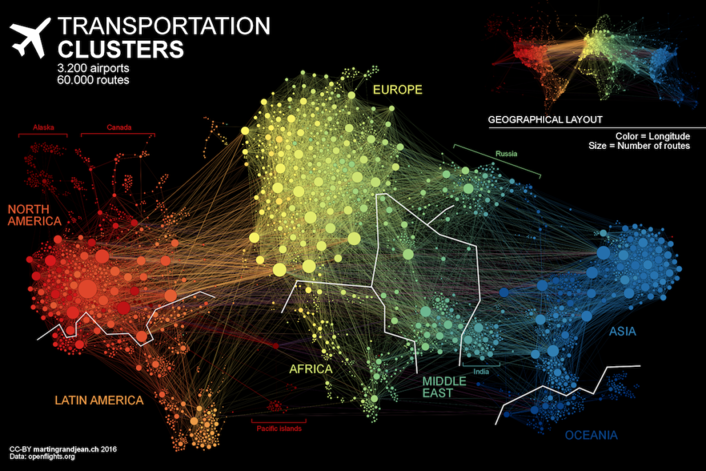

Everyday 100,000 airline flights take place around the world. This means that every second there is a plane taking off from one of 3,275 airports on the planet. Martin Grandjean a researcher from The University of Lausanne, Switzerland decided to analyze the network created by these flight routes.
He took a data from OpenFlights.org and generated a graph that visualizes 37.153 single flight routes. Martin points out that although global transportation maps that represent the flight connections are beautiful pieces of art, they do not represent the data itself, but rather some idea of the complexity and quantity. We can read in a blog post.
This map is an attempt to make explicit the network behind air transport. The structure of the relationships has an impact on the spatial distribution of nodes in a graph. Let’s see how this landscape is reorganized without geographical constraints.
The visualization has been created in an open source graph visualization software: Gephi (gephi.org). It’s not a GIS but it has some basic mapping functionality. The overall effect is truly amazing!