
“The blue marble” – one of the most iconic images in all of human existence, a symbol of our adventurer spirit and the constant inexplicable urge to explore the unknown. There is something ingrained into our DNAs that makes us want to travel the cosmos, to quote Moby Dick, “I am tormented with an everlasting itch for things remote. I love to sail forbidden seas, and land on barbarous coasts.” – from Herman Melville’s “Moby Dick”.
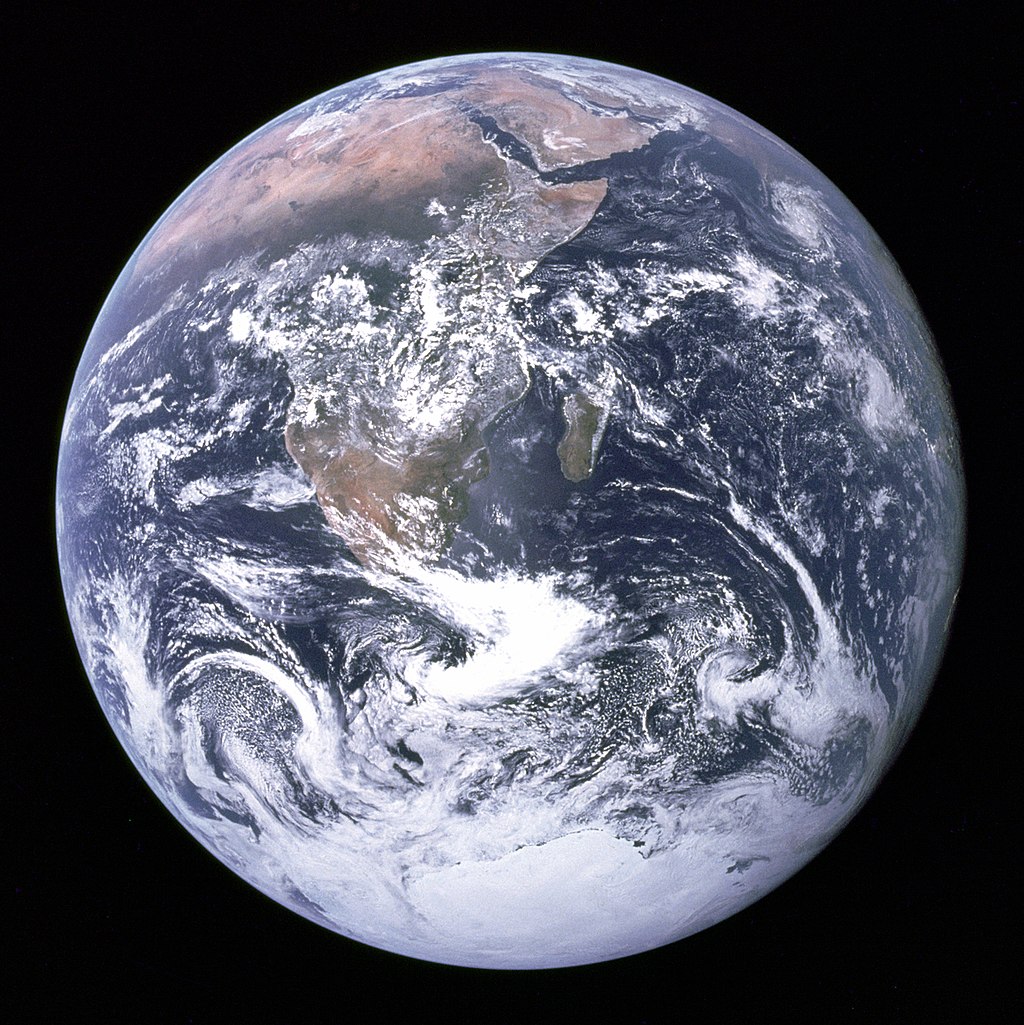
The Blue Marble, photographed on 7th December 1972, by NASA/Apollo 17 crew; taken by either Harrison Schmitt or Ron Evans
And yet the first thing that strikes us about the “Blue marble” is its beauty and fragility. Seeing the earth from space, totally changes the way we look at our planet. It provides a altogether different perspective. It provides what Frank White termed as the “Overview Effect”
“We came all this way to explore the Moon, and the most important thing is that we discovered the Earth.” – Bill Anders, Apollo 8 Astronaut.
Only 555 Astronauts have ever flown into space so far and for the less fortunate among us Earthlings, Benjamin Grant’s instagram feed “Daily Overview” provides a fascinating insight into how we, humans are shaping the planet!
Overview by Benjamin Grant
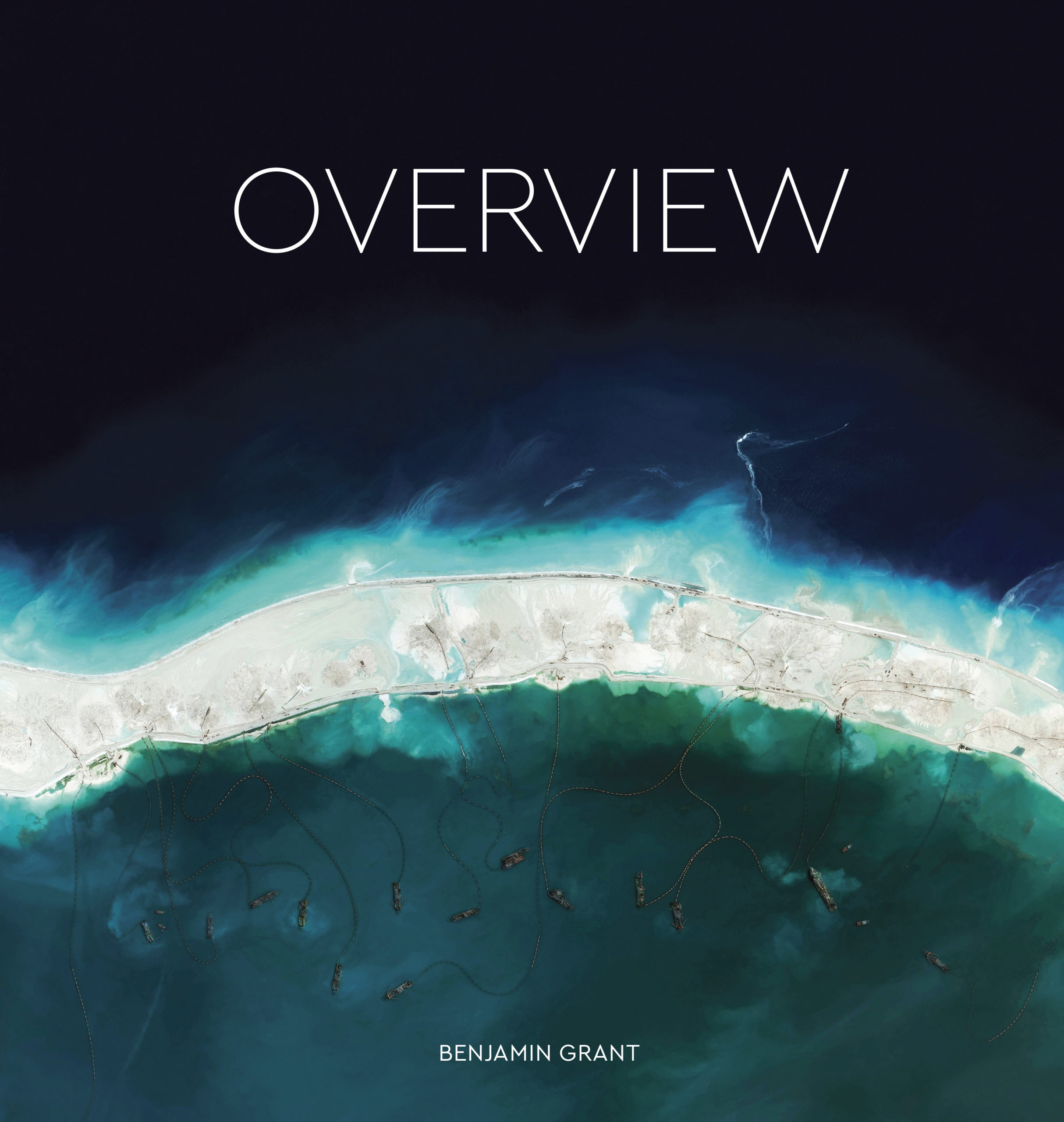 Benjamin started the instagram account back in December 2013, positing a new view of our beloved blue marble from space every day and in the years since, the project has been viewed in more than 230 countries and his instagram account has over 439K followers. He started looking for such images, after searching for “Earth” on Google earth lead him to find this striking image of circular irrigation fields in Texas. The best images from his curated instagram collection of more than 950 images appear in his new book titled “Overview: A New Perspective of Earth”.
The book is a reflection of the many ways we as a society and as a species have shaped the world and continue to do so. Rows of brightly colored containers in a shipping yard in Belgium. The tulip gardens in Netherlands. The groves of green olive trees in Spain. The Angkor Wat in Cambodia.
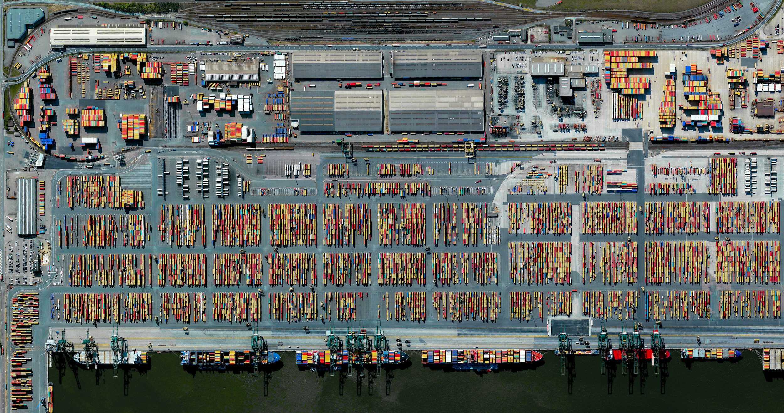
PORT OF ANTWERP 51·320417°, 4·327546°
Reprinted with permission from Overview by Benjamin Grant, copyright (c) 2016. Images (c) 2016 by DigitalGlobe, Inc. Published by Amphoto Books, a division of Penguin Random House, Inc.
The pictures in the book are breathtaking and truly amazing. Yet, as much as they are beautiful, they are sometimes also deeply troubling – the gridded lines on a arid red martian looking terrain is the Dadaab Refugee Camp in Kenya, home to more than 400,000 refugees. It’s deeply disturbing to see that we are able to point on a satellite image and say that it is home to hundreds of thousands of refugees.
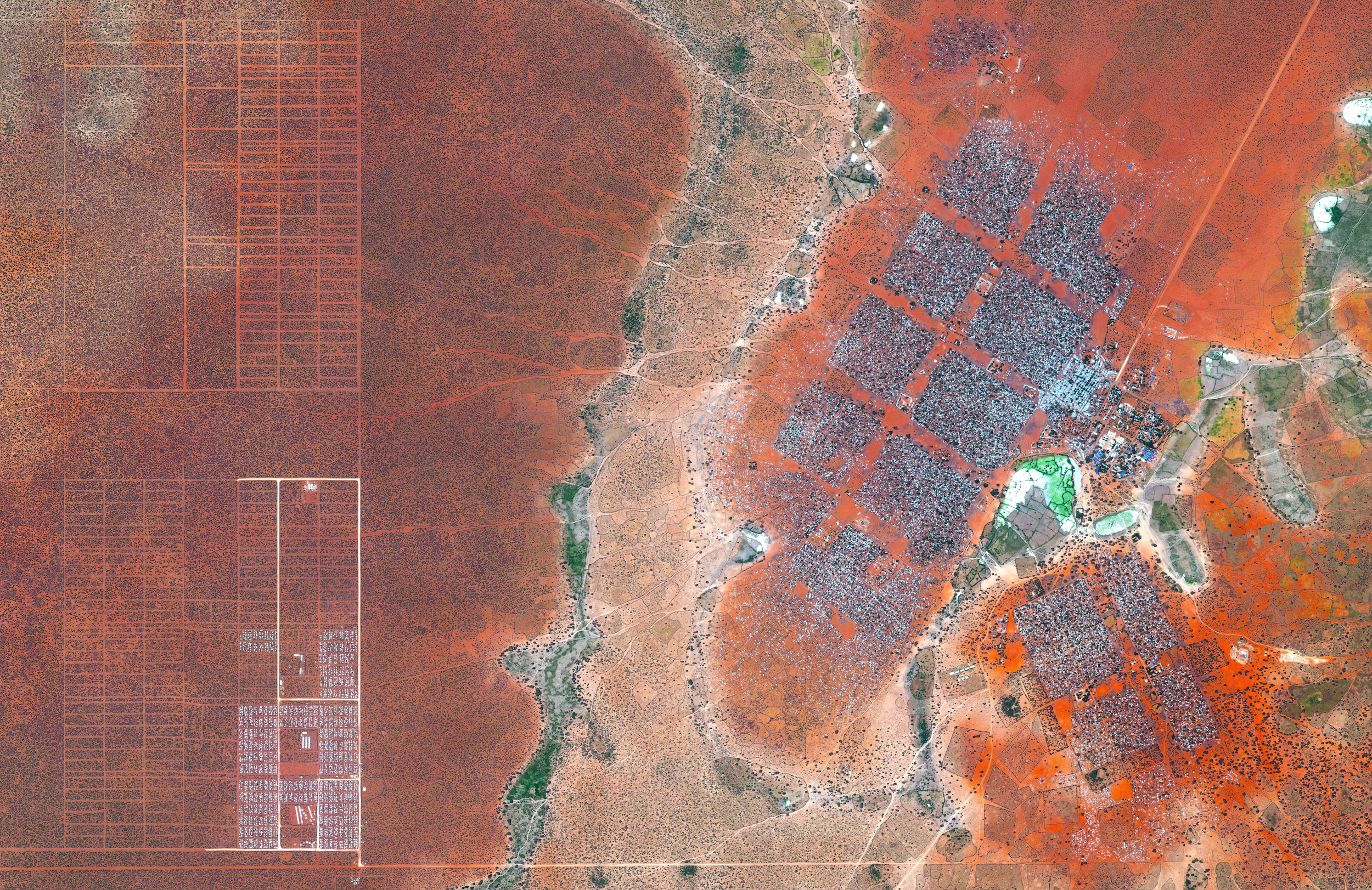
DADAAB REFUGEE CAMP –0·000434°, 40·364929°
Reprinted with permission from Overview by Benjamin Grant, copyright (c) 2016. Images (c) 2016 by DigitalGlobe, Inc. Published by Amphoto Books, a division of Penguin Random House, Inc.
The book is a work of art, striking and insightful and for a few minutes, one experiences the same overview effect that Astronauts do when flying over our beautiful blue marble. It’s truly something! It’s something that is going to ignite a lot of conversations with your friends and family, a truly thought-provoking coffee table book if you will.
One of the most striking images for me, was the picture of the lagoon in Shadegan by Musa bay in Iran. The image wasn’t the only one that looked totally out of our world but the colors paint a poignant picture, similar to the one that evokes the overview effect among astronauts. A beautiful yet fragile ecosystem.
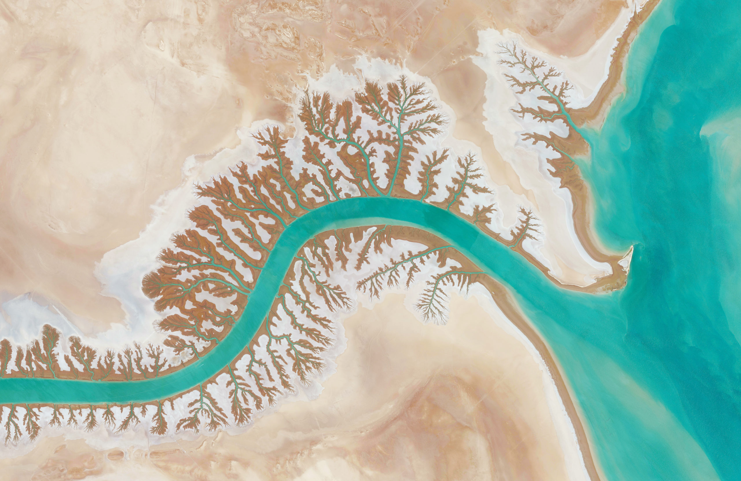
SHADEGAN LAGOON 30·327274°, 48·829255°
Reprinted with permission from Overview by Benjamin Grant, copyright (c) 2016. Images (c) 2016 by DigitalGlobe, Inc. Published by Amphoto Books, a division of Penguin Random House, Inc.
“Overview: A New Perspective of Earth” by Benjamin Grant is now available for sale on Amazon and other outlets.


#Business


Next article

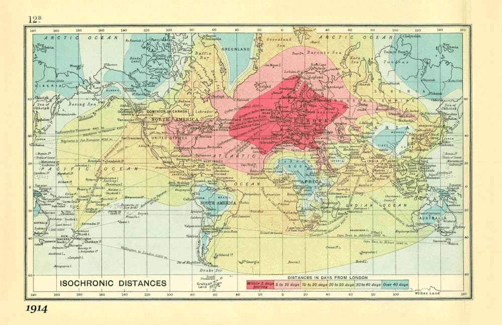
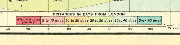
A few months ago we wrote about an amazing map created by British cartographer John G. Bartholomew in 1914. The map shows isochrones of travel from London to locations around the world.
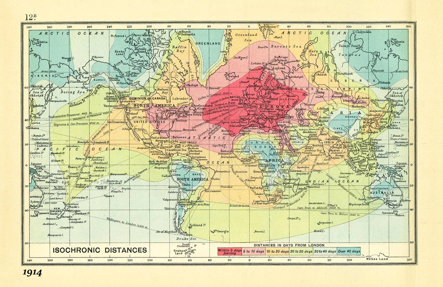
It is striking that 100 years ago travelling was taking days or even weeks. You could travel the whole Europe within less than 5 days, getting to New York would take you up to 10 days and in order to get to Singapore or Australia you would need around 1 month.
The map is so brilliant that guys from Rome2rio, a start-up that specialises in helping people get anywhere on the planet, decided to update it based on 2016 data. It is truly amazing how the mobility of people evolved together with the technological development. Today you can get almost anywhere in the world within 24h. There are a few places on the planet where it would take you more than 1 day to get to.
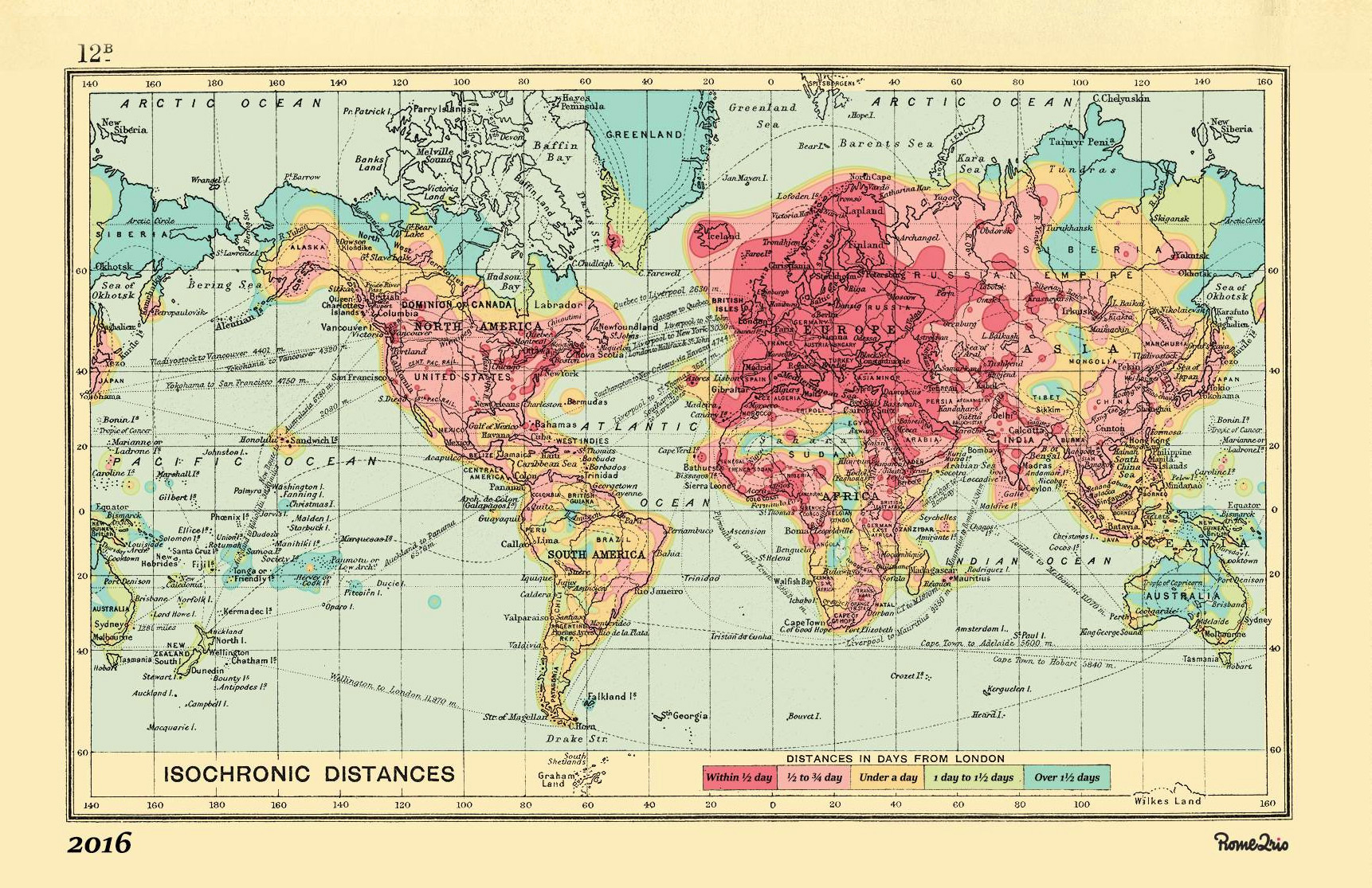
Based on these two maps I’ve decided to boot the overall impression and I’ve combined them into a small visualization that highlights where the biggest change occurred. Of course the map itself is amazing but what strikes me most is actually not the map but the legend of isochrones. Over just 100 years we’ve changed the unit of travel time from a day to an hour.
It’s amazing!