
Finding the ideal Christmas present can be stressful and challenging task. Especially when you need to buy something for a geo-geek or you want to impress the special people in your life with a smart but not boring gift related to your biggest passion – geography. If you are in one of these places, I believe that we have just found the idea for your perfect Christmas present – MapWheel.
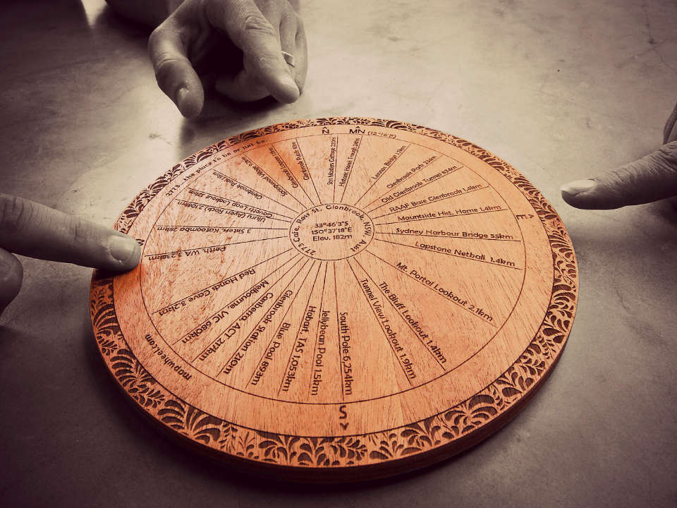
MapWheel is a custom-made, beautifully crafted, laser-engraved direction plaque (aka orientation table, toposcope or topograph) that shows the exact direction and distance from a your chosen home location to your selected points of interest. So the world being a big place, there are infinite possibilities! It’s a perfect gift to share your memories, plans and passions – simply every meaningful place that has a physical location on the surface of the earth.
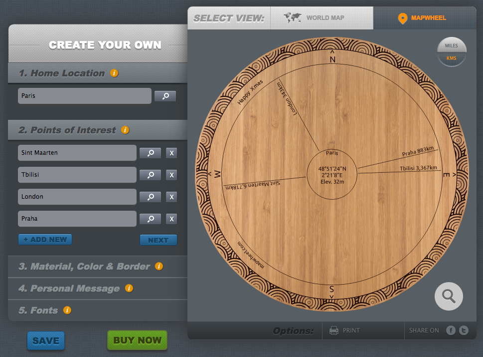
But the coolest part of the project is MapWheel online generator. It’s a web tool which allows you to customise your MapWheel by choosing central location, points of interest, materials, fonts and border patterns. It gives you a precise preview of how your custom-made plaque will look like. You can print it or share it on Facebook and Twitter. One word: cool!!! Actually I found myself playing for hours with the tool. Watch out it might be contagious!
The project has been started by Russell Bolden and Jesse Little – two guys from Australia who decided to move from cool idea to the real business. The sales launched in October and while they wanted to contain it to their home country during the first stage, they have already taken orders from all around the world.
MapWheel costs $119.90AUD per unit including international shipping but Russell and Jesse offered Geoawesomeness readers $30-off coupon code: GEOAWEso in total it should be around $75 USD or €60 EUR) and a guarantee that all orders issued by 13 Dec will be deliver by 23rd Dec including international orders.
Finding a proper gift for my family and friends was always a challenge. Something personal and useful but at the same time beautiful and smart. And today I finally found it (and I’ve already ordered one).

#Business


Next article
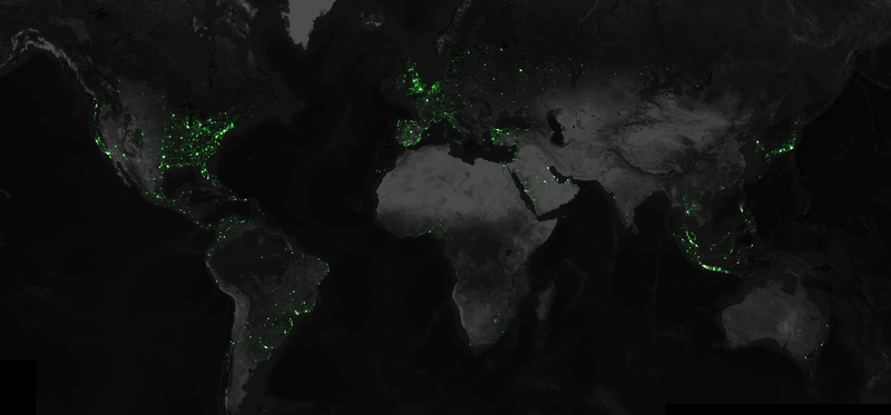
Data artist and software developer Eric Fischer, who used to work as an engineer on Google’s Android team, put together an amazing mapping project. Using Twitter’s public API he collected every geotagged tweet sent in the past three and a half years. Twitter API allows to get access to maximum a few days worth data, therefore Eric has been compressing and saving all the data in JSON format creating a repository of tweets weighting 3 terabytes and growing 4 gigabytes a day. In total he gathered 6,341,973,478 of geotagged tweets . Than he used the Mapbox API to visualize all these data points on a map.
Ultimately, only nine percent of the six billion tweets were represented as dots on the map. This is due to filtering that removed duplicate coordinates, mapping unique latitude and longitudes only once on the map:
For instance, every Foursquare check-in to a particular venue is tagged with the same location, and it doesn’t help the map to draw that same dot over and over. Showing the same person tweeting many times within a few hundred feet also makes the map very splotchy, so I filter out those near-duplicates too.
The whole process behind the project is described in Eric’s blog post.
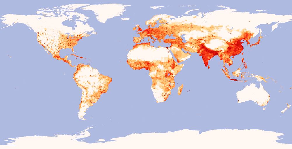
Now let’s compare the tweet map with population density map. The conclusion is simple where there are large concentration of people and money there is higher density of tweets. When you look at India and China (where Twitter is banned) the map is practically blank. On the other hand we’ve got Brazil and Argentina with huge usage of Twitter compared even with Germany.
source: Mapbox