
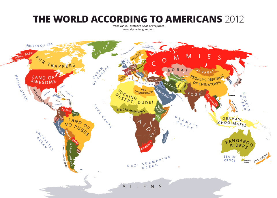
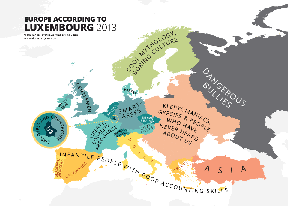
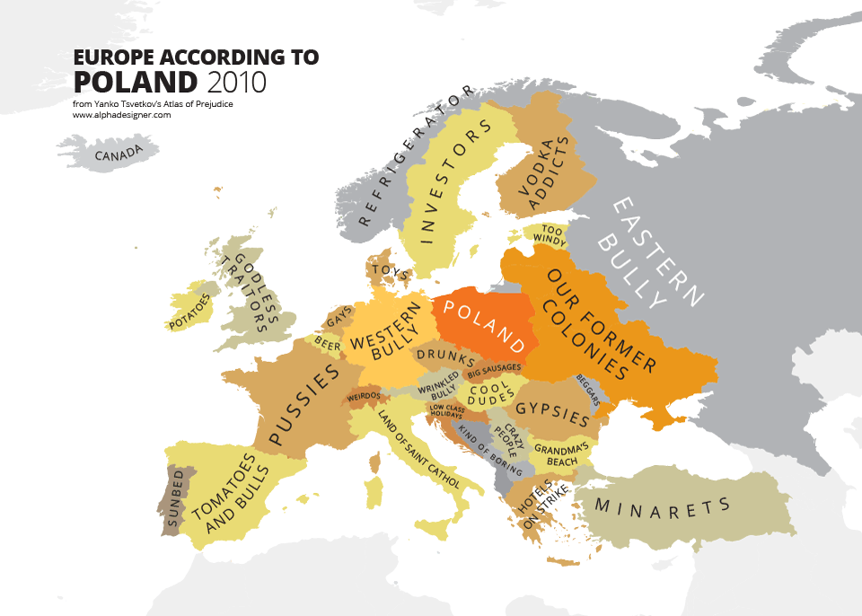
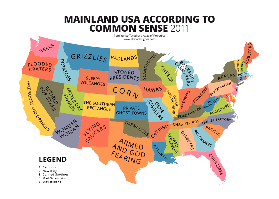
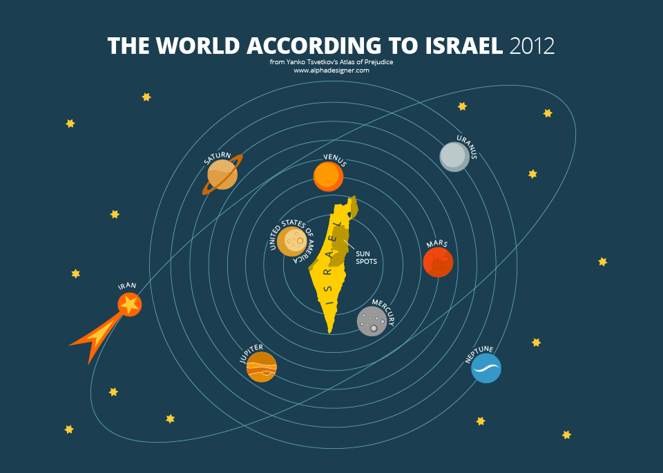
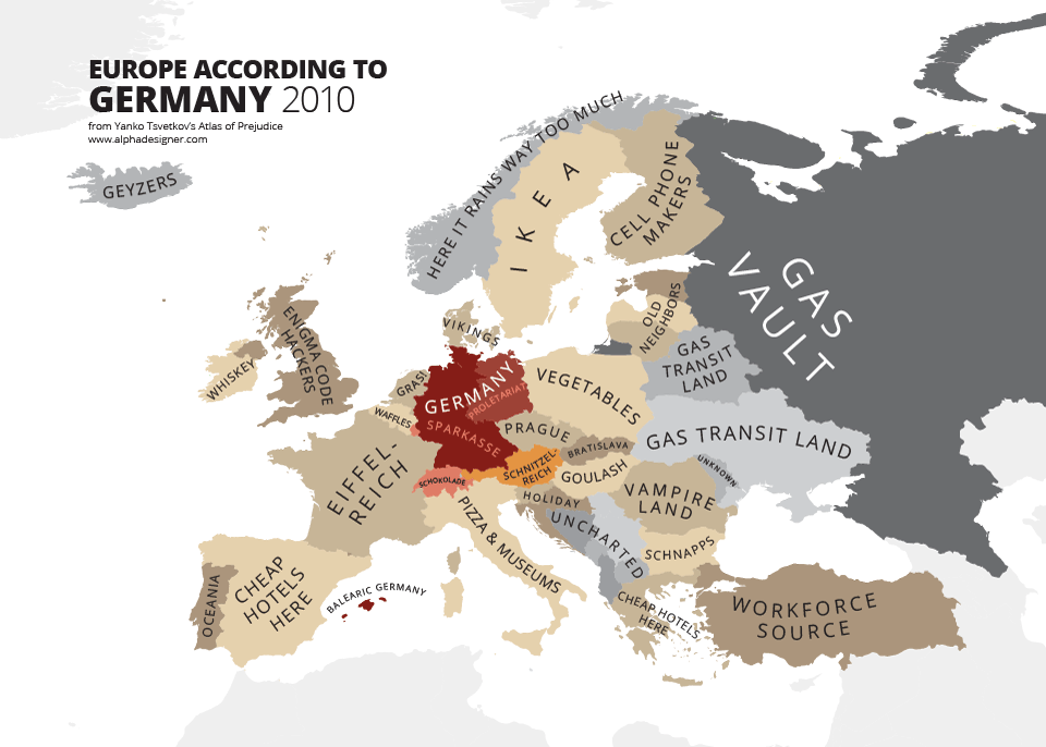
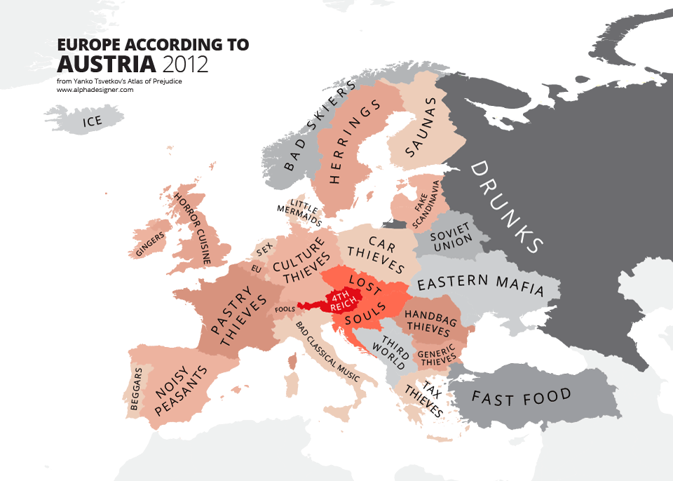
Stereotypes are oversimplifications of people groups widely circulated in certain societies. We all have them about others, others have them about us. We can fight with them but sometimes the best way is to simply laugh at them. Bulgarian designer Yanko Tsvetkov decided to take this approach and created Stereotype Maps project.
Tsvetkov was initially inspired by the 2009 political crisis in Europe, as grim as it may have been. Rather than focusing on the negative, he had the idea to replace names of countries on a map with funny phrases that described how they handled the crisis. He posted it to Flickr and the image quickly went viral in Europe. Up-to now he created over 40 different maps.
Check some of them below and all of them at Yanko’s website. How do you see other countries?

#Ideas

Next article
When you think about the word “analysis” you understand it as taking some complex issue and breaking it to smaller parts to gain a better understanding of it. But when you look it closely ‘the analysis’ is always relative, which basically means that you have to compare the thing you’re studying to something similar in order to get some results. This can be applied to anything in the world. When you analyse geographic location, you will notice that it’s always in relation to something: 5m from the window, 3h ride from your home… even ‘lat’, ‘long’ are relative (so in a way compared) to a reference system. You know that your behavior was wrong, because you compare it to behavior commonly accepted by your society. You know that something is bitter, because you compare it with other flavors… Do you get the idea?
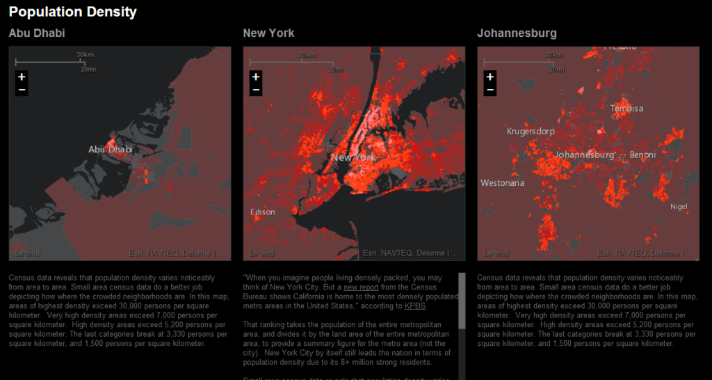
Now imagine the complex ecosystem of the city. You know which one is the biggest, the highest , the most populated… but is it really data that brings value to decision makers, urban planners or citizens? No… they need something more…
 Jack Dangermond – the CEO and founder of ESRI together with Richard Saul Wurman, the founder of the TED Conference, created a project called Urban Observatory which aims to collect and create indicators about cities in a way that you could easily compare them with each other. It incorporates a lot of public information on urbanization, healthcare policy, education, crime, transportation, traffic and other data and basically presents it on the map unleashing the power of ‘geo’.
Richard Saul Wurman, the 78-year-old founder of TED has been trying to develop a tool that would fairly compare urban centers for decades, beginning with scale models made out of clay in the 1960s and ending with a handful of other attempts in the 70s and 80s. “Unfortunately, no two cities in the world collect information in the same way. The result—despite vast stores of data captured, collated, and stored, there is limited knowledge and understanding” the Observatory team explains.
Finally with the power of web-mapping tools this kind of analysis became possible. Essentially what you get is a simple interface that lets you compare 35 different aspects of 16 cities (with more to come), ranging from the weather to crime. Users are able to do side-by-side comparisons of three cities at a time, supplemented by text explanation that appear below the maps.
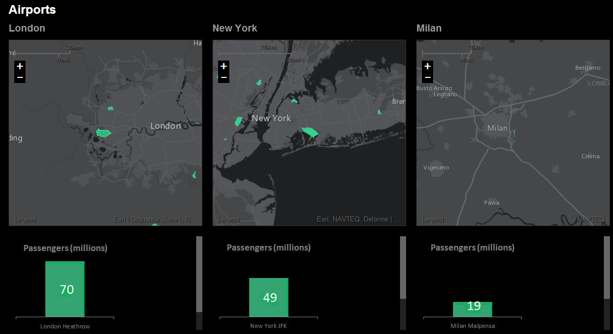
In my opinion is one of the best mapping project from a long time. It is attempting to establish a universal language that can compare and contrast those problems of cities around the world. For now it is still just a pilot on a small-scale, but I believe that it has a potential to change the way we think about the regions, cities and our own neighborhoods.
source: Gigaom