
Life amidst the COVID-19 pandemic has been somewhat surreal. Though I have been fortunate enough to be able to work from home during these unusual times, certain aspects of sheltering-in-place have felt palpably more bizarre – such as listening to birds instead of the car traffic during the morning ‘rush hour’.
Wanting to capture this strange moment in time, I set about to find a way to measure the impact of the novel coronavirus on my neighbourhood. Having done a fair bit of research on how COVID-19 was influencing mobility patterns all over the world already, there were a few good options.
From the geospatial science perspective, the most generic way to model it would be to measure the spatial aspect of the impact based on ground sensors such as mobile phones. Unfortunately, such datasets are reserved for the big players in the industry such as Google, Facebook, TomTom, HERE, or Mapbox. Satellite data, on the other hand, is much more accessible (even in high-res) if you know where to look.
I decided to analyze the change in the number of cars detected in an area as my unit of measurement. It’s not a perfect metric, but in principle, it should give fairly reasonable results for a larger urban area.
Now I had to find access to satellite data and object detection algorithms which I would be able to deploy quickly and effectively. In the past, I have been playing around with ArcGIS Pro Deep Learning toolbox but my 60-day trial expired, and buying a subscription is far too expensive for an individual. Also, I was looking to run a DIY geospatial experiment on a weekend using something that had the complexity I need, while being accessible.
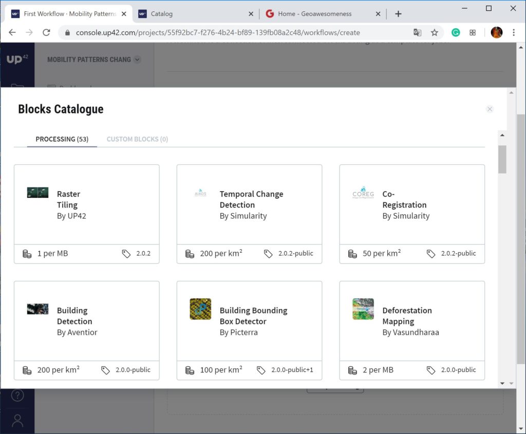
After a bit more searching around, I stumbled upon UP42, who we have covered a few times on Geoawesomenss. The startup is a marketplace for geospatial data and dozens of analytical algorithms, where you simply combine blocks with data sources and algorithms and run the analytics directly in the cloud.
One of the pre-build algorithms I found is the “Small Vehicle Detection” model, so exactly what I was looking for. Additionally, UP42 gives you some free credits to get started which should let you analyze at least a few squares kilometres worth of satellite data. Now I was good to go!

I selected around 1 sq km area around the temporarily-closed Mall of America in Bloomington, Minnesota, as my test location. It took me around 15 mins for the setup of the “blocks” on the UP42 platform and ~1h of data processing in the cloud, and again 15 mins to analyze the results.
Overall, I’ve learned that year-to-year (April 16, 2019, to April 19, 2020) the number of vehicles parked and driving around the area has dropped around 3 times!
To make the analysis scientifically correct, I should be looking at a longer observation period to account for different hourly and weekday patterns. However, I believe that even data from a simple model is better than no data at all! So check out the following simple and straightforward method to measure the geospatial impact of COVID-19 in a neighbourhood — for free.
This is how you can do it yourself:
- Create an account on UP42 and you will receive 10,000 free credits that you can use on the platform
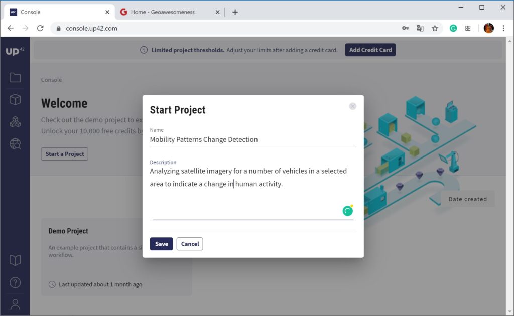
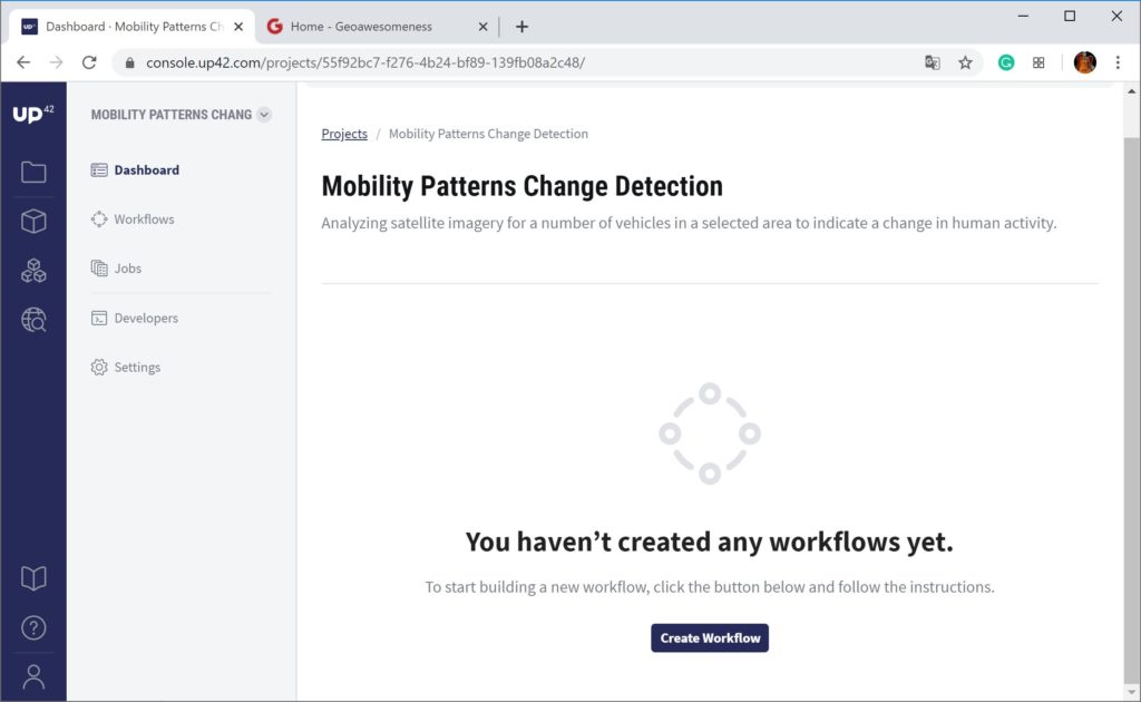
2. Go to Console and create a new project
3. Click to Catalog and select your area of interest
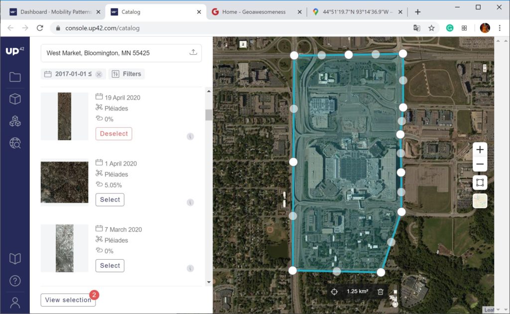
4. Select the satellite scenes you want to use in the analysis. I chose to use the imagery from high-resolution optical Earth-imaging satellites Pléiades
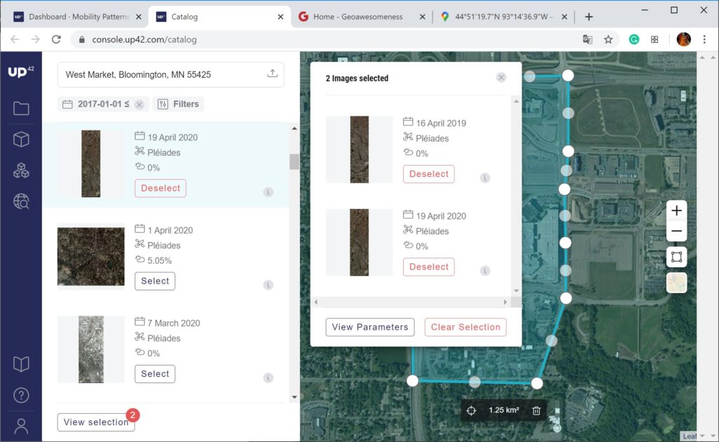
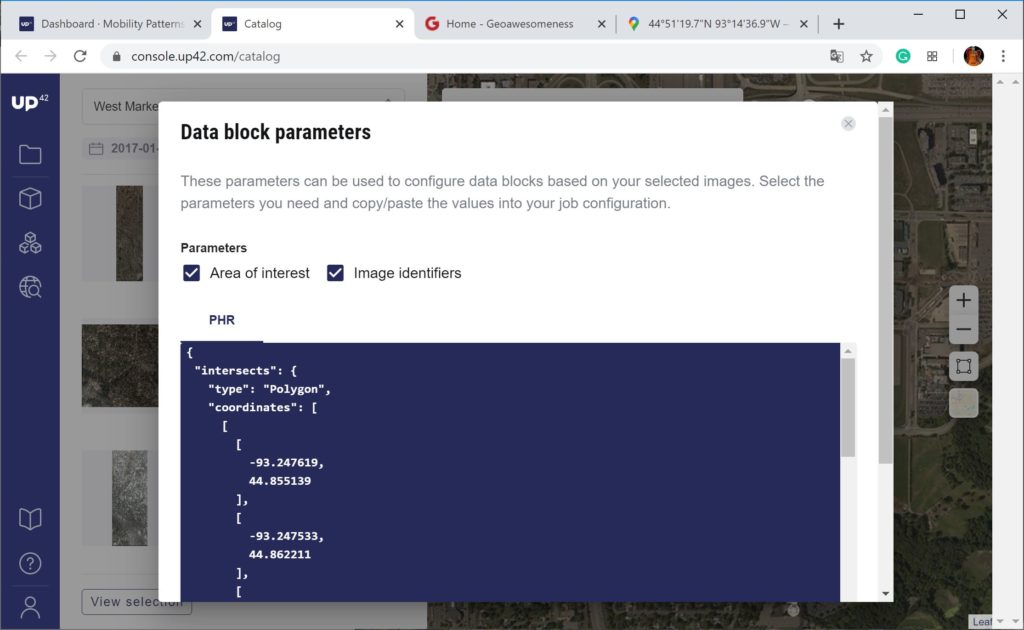
5. Go to View Parameters to find coordinated of your bounding box and ID of selected satellite imagery. Keep the “Catalog” open
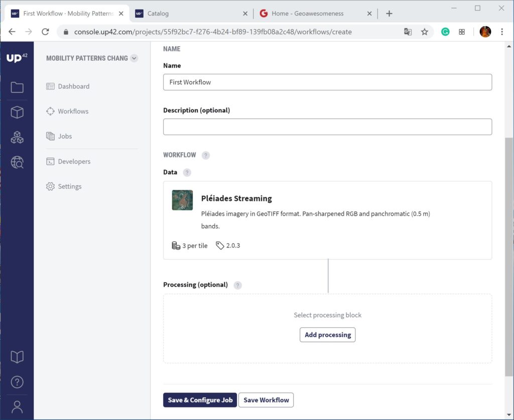
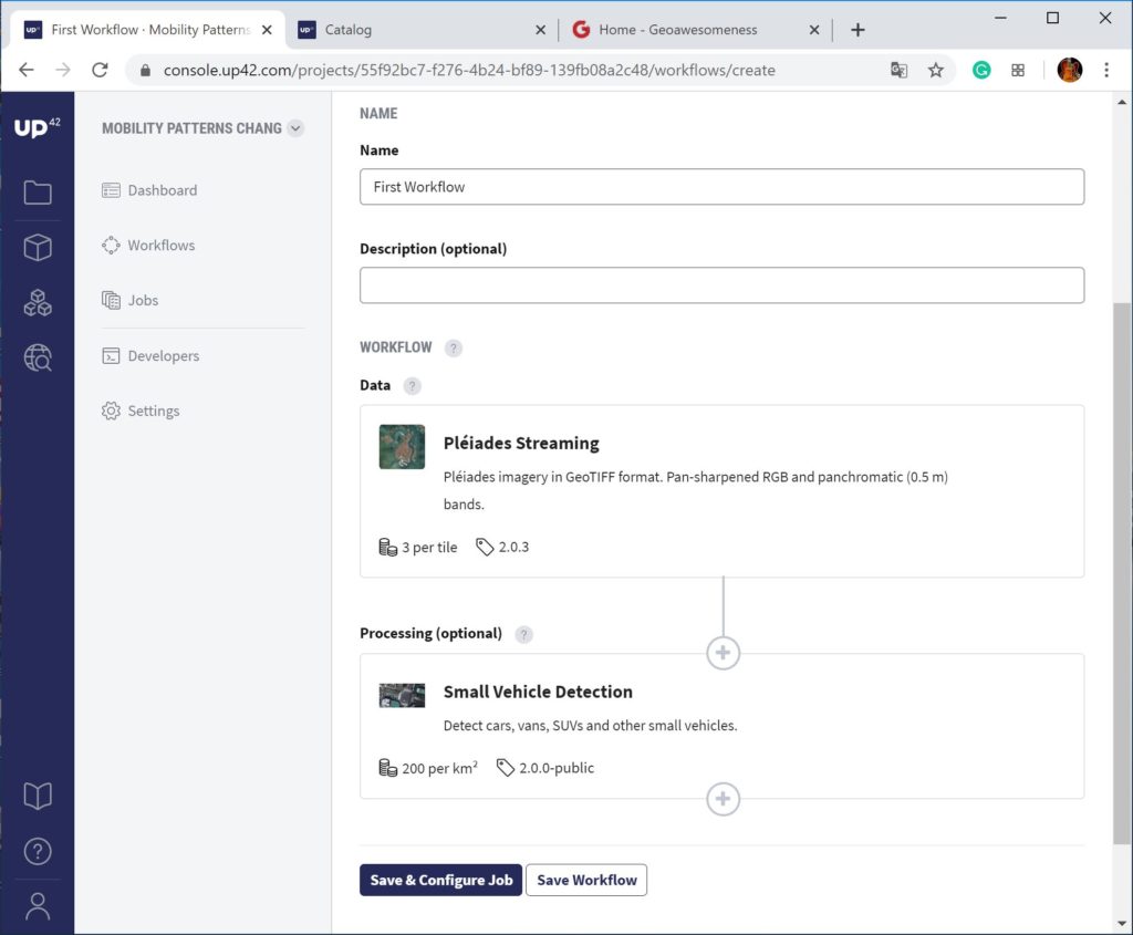
6. Now, you need to go back to Console and create a workflow for the data analytics
7. In this step, you should select the satellite system you want to use
8. It’s time to select the analytics algorithms now
9. Phew! The workflow is now complete and you can move to more complex (and interesting) part
10. Save and configure your job. I know that it may look a bit scary to non-developers, but it’s actually quite easy, so stay with me…
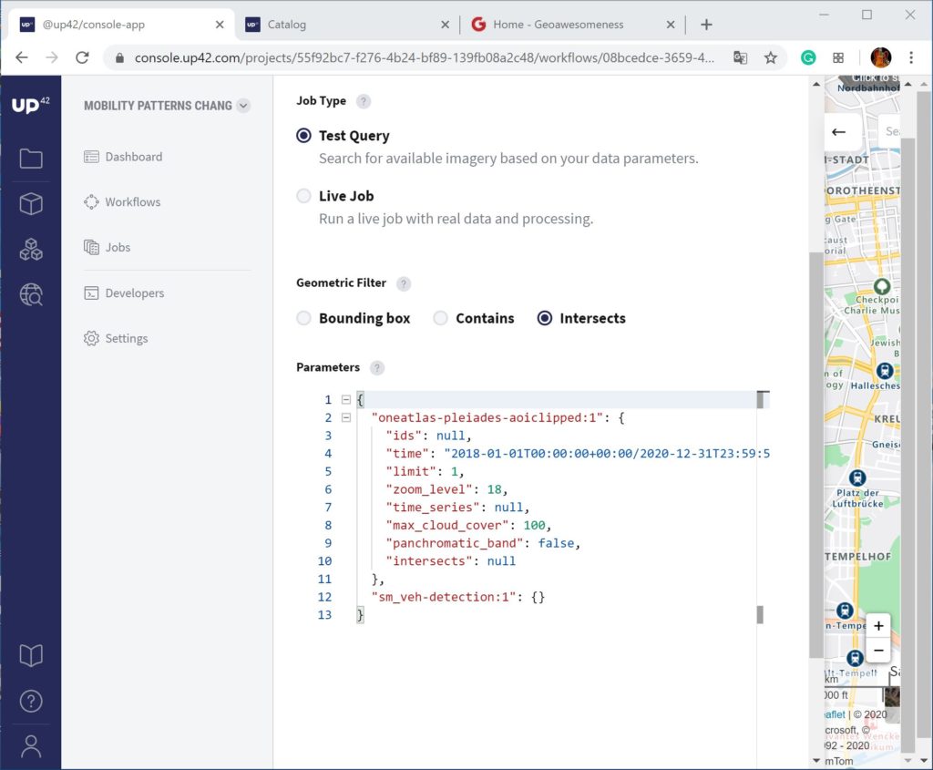
11. Draw any simple polygon on the map window on the right side of the console. You’ll notice that a parameter “coordinates” in the console changed
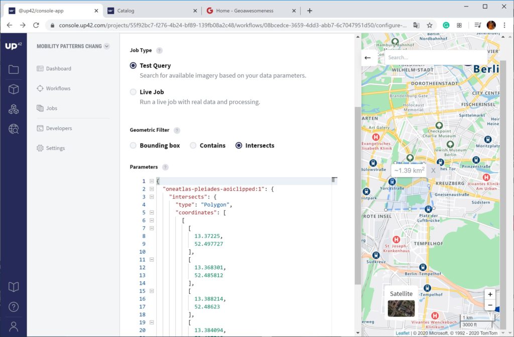
12. Now go back to Catalog view (in point 5) and update two fields: “coordinates” and “ids” of satellite images. Be careful about copying text in the right brackets. You’ll need to rerun the process for both satellite scenes separately.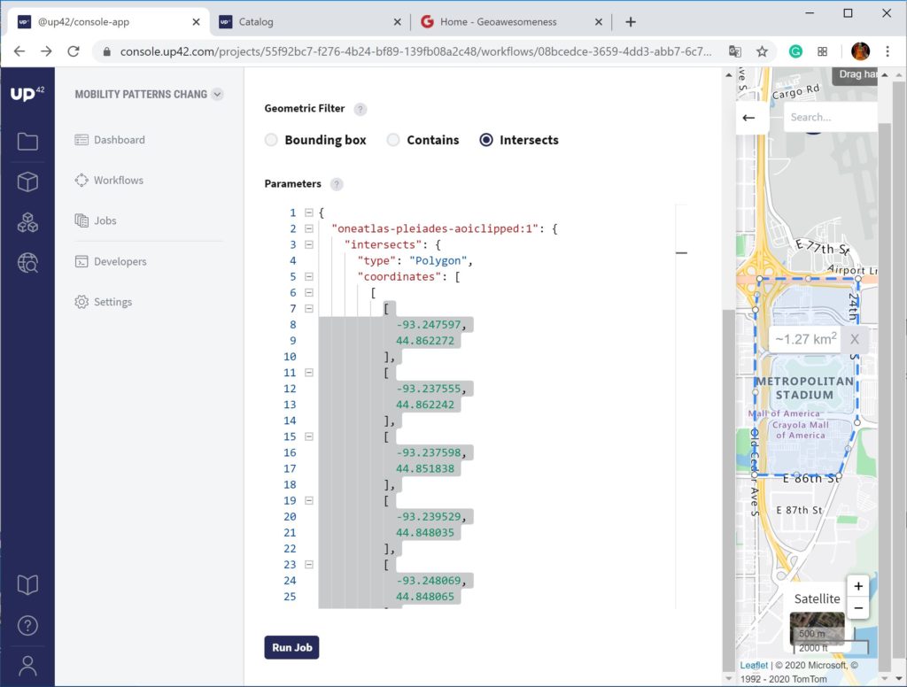
13. Now, you can run the job. Do it first on job type: “Test Query” followed by “Live Job” if everything goes well
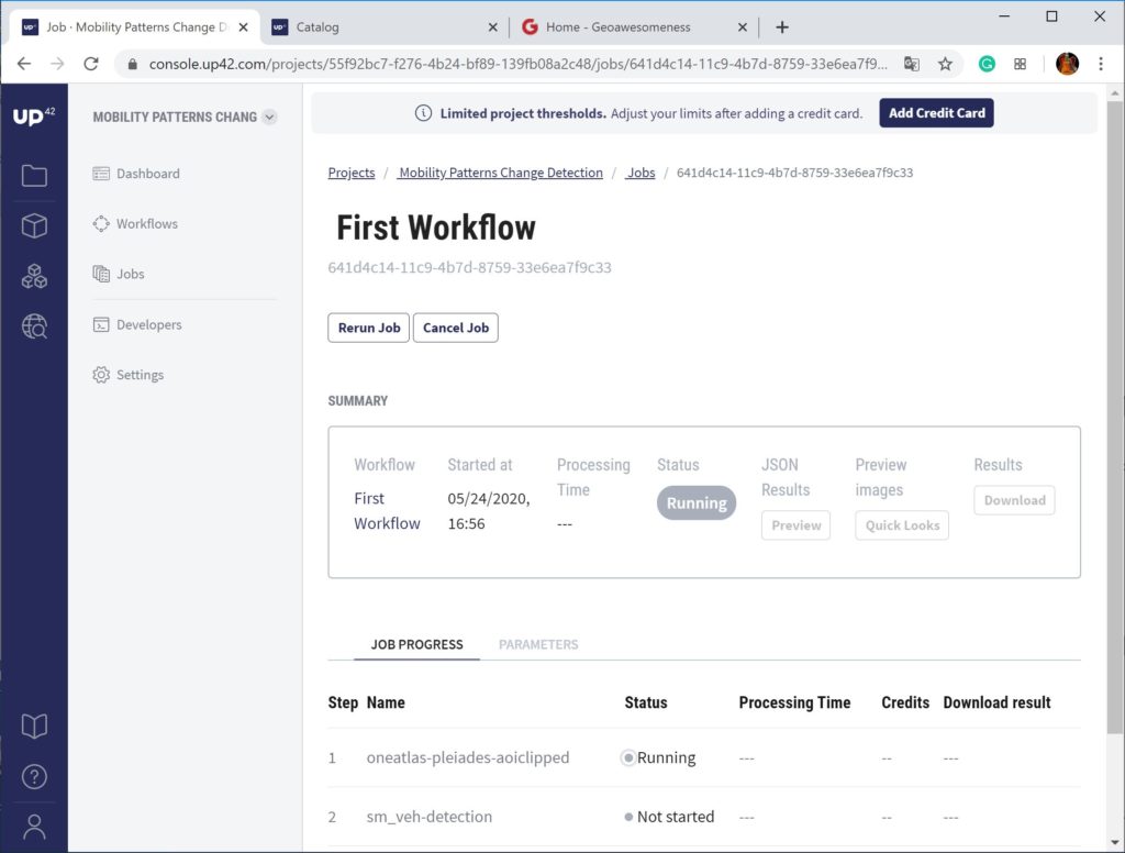
14. Download the output GeoJSON and GeoTIFF and open it in QGIS to view and analyze the results and Excel (after some JSON format edits in Notepadd++) to count the detected vehicle.
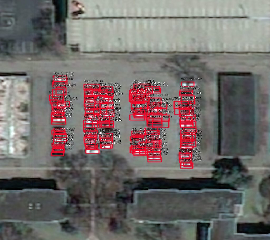
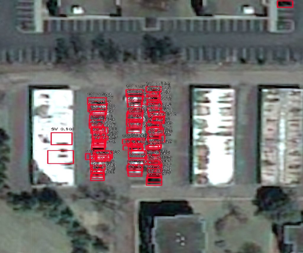
When looking at the data in QGIS I could notice that there are some errors like detection far too many cars:
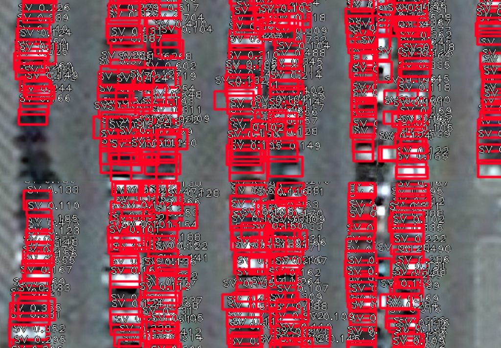 or some cars mixed with rooftop infrastructure:
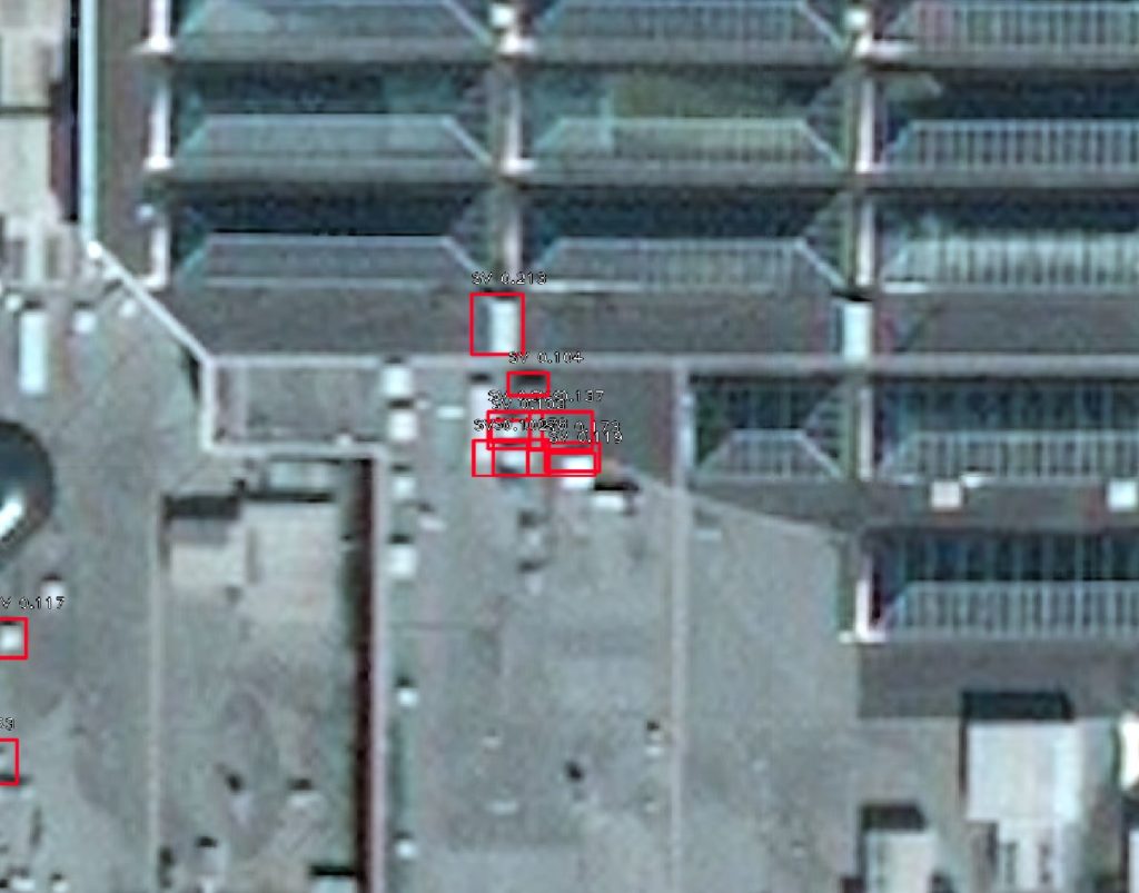 These case would, however, had a quite low confidence level which fortunately is a parameter of every objected detected. The average confidence level of all observations in my datasets was at the level of 0.25 for 3001 objects, so I decided to filter out objects with the confidence level below 0.5. and I was left with 327 vehicles detected on April 19, 2019 and 109 on April 16, 2020 which is 3x drop!
The whole experiment took me about an hour + some idle cloud processing time and I ended up using only about 3,000 of my 10,000 free credits. Pretty awesome, right?
I hope you found this tutorial useful. Let me know in the comments!
P.S. There are some useful tutorials on UP42 YouTube channel to help you get started with the user interface
and Catalog Search
Did you like the article? Read more and subscribe to our monthly newsletter!

#
Next article
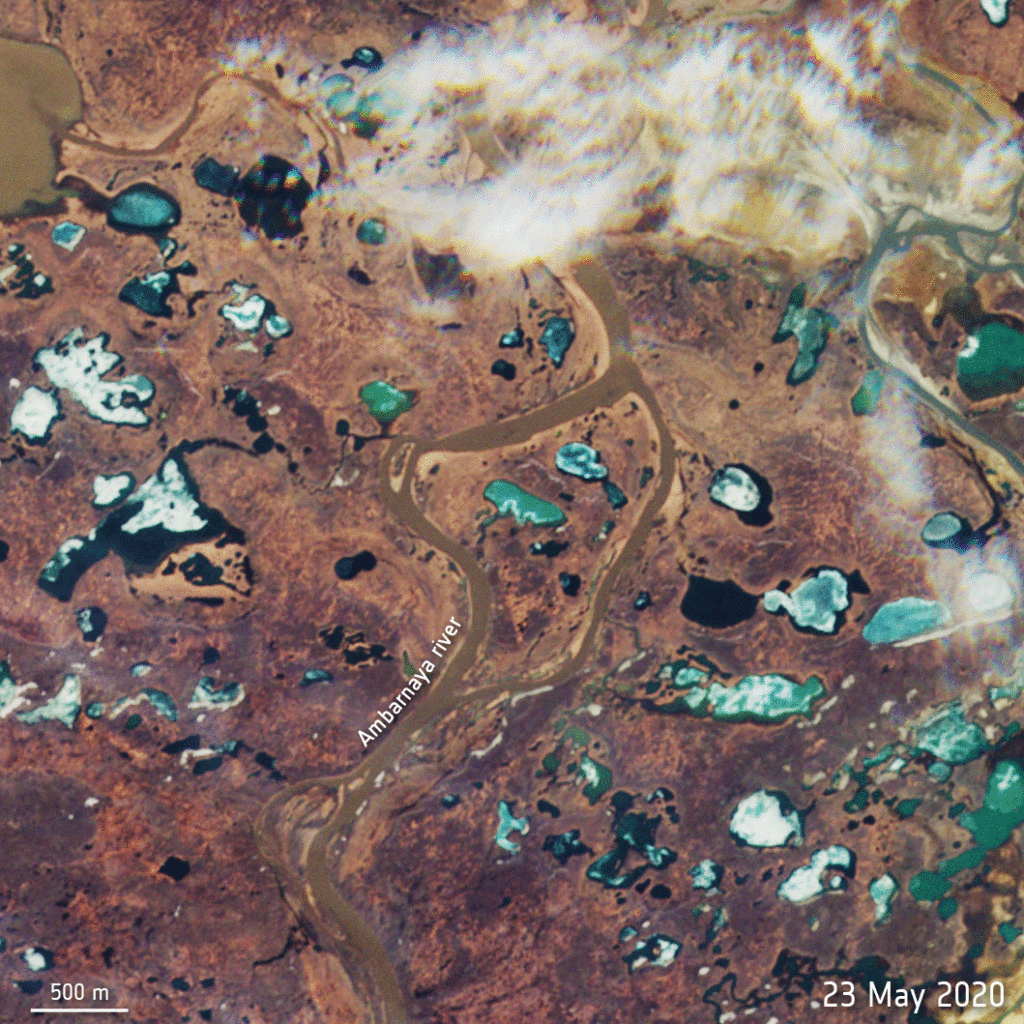

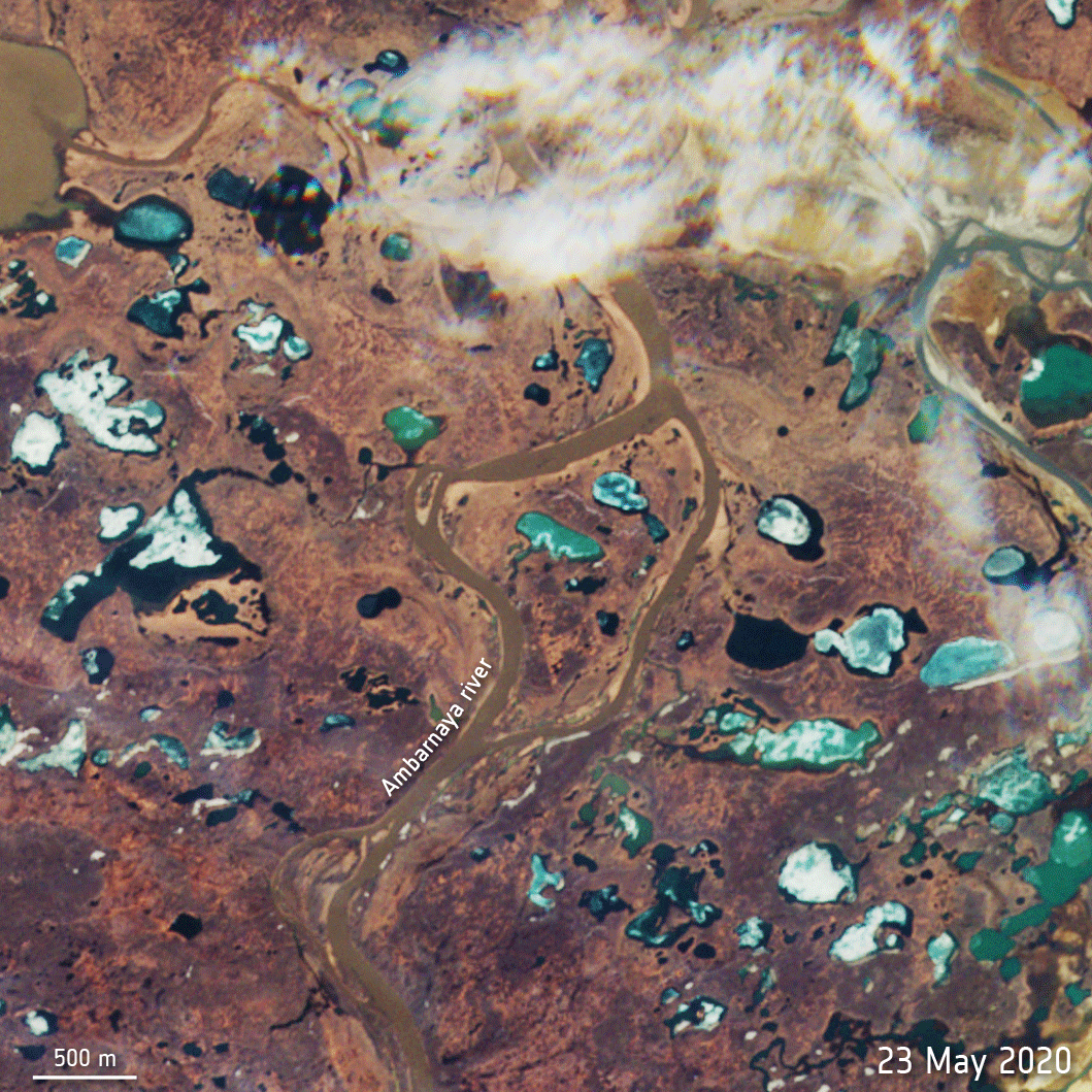
Russia declared a state of emergency on June 3, 2020, after a fuel tank holding 21,000 tons of diesel oil collapsed in Arctic Circle near the Russian city of Norilsk. It is suspected that melting permafrost caused the tank to collapse.
Citing Rosprirodnadzor, the Federal Service for Supervision of Natural Resources in Russia, USA Today reports that 6,000 tons spilled onto the ground, while another 15,000 tons got into the water – infusing oil products into the Ambarnaya and Daldykan rivers and in almost all their tributaries.
Satellite images show leaking diesel oil floating as far as 7 miles from the accident site, turning vast stretches of the Ambarnaya deep red. In the below animation provided by the European Space Agency, diesel oil is clearly visible in the images captured by the Copernicus Sentinel-2 mission on May 31 and June 1:
On June 4, earth imaging company Planet’s Dove satellite captured the devastating oil spill:
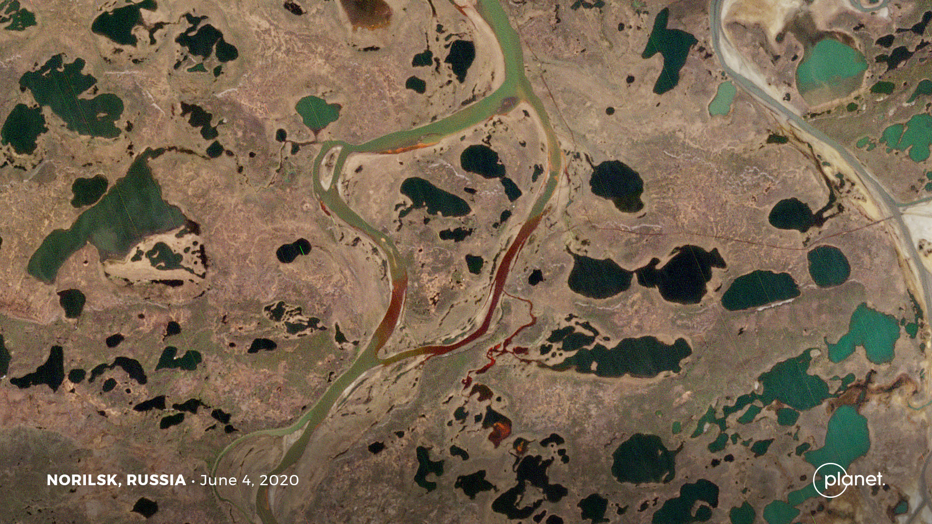
In new satellite imagery captured by Maxar on June 6, mitigation and cleanup operations could be seen. Multiple oil containment booms have been placed along the Ambarnaya in an attempt to contain the oil spill and prevent it from flowing downstream:
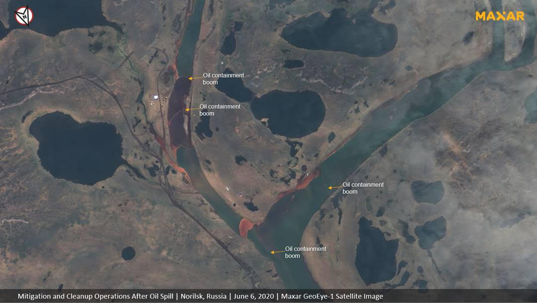
Arctic Circle, oil spill in Russia
The Ambarnaya River flows into Lake Pyasino – a major body of water and source of the Pysaina river.
According to Russian media, the containment team had already cleaned about 53,000 cubic feet of soil at the site and pumped out 201 tons of fuel by June 6. More than 130 tons of oil had been removed from the Ambarnaya river as well.
Greenpeace believes that the damage to water bodies alone the spill could amount to more than $85 million.
Did you like the article abut detecting oil spill from space? Read more and subscribe to our monthly newsletter!