
Predicting traffic conditions on the roads and determining the best routes for a journey is an incredibly complex task. And yet, Google Maps does it in a matter of seconds – every single time. So, how does the navigation app figure out whether the traffic along your route is heavy or light or what your estimated time of arrival (ETA) would be?
A look into the past, present, and future
Getting live traffic estimates — whether or not a traffic jam will affect your drive right now – is pretty straightforward. With more than 1 billion kilometers driven with Google Maps in more than 220 countries and territories around the globe, aggregate location data helps to understand the current traffic conditions on the world’s roads.
But this information does not account for what traffic will look like 10, 20, or even 50 minutes into your journey. And this is where advanced machine learning techniques come into play.
To predict what the future is going to look like, Google Maps takes a peep into the past. Analyzing historical traffic patterns over time, Google has learned what road conditions could look like at any given point of the day. “For example, one pattern may show that the 280 freeway in Northern California typically has vehicles traveling at a speed of 65mph between 6-7 am, but only at 15-20mph in the late afternoon,” explains Johann Lau, Product Manager, Google Maps.
A combination of these historical traffic patterns and live traffic conditions allow Google Maps’ machine learning algorithms to predict whether or not you’ll be affected by a slowdown that may not have even started yet!
It must be noted that Google has recently updated its predictive traffic models to accommodate the dramatic shift in driving patterns since the start of the COVID-19 pandemic. These agile models now automatically prioritize historical traffic patterns from the last two to four weeks and deprioritize patterns from any time before that.
Route selection on Google Maps
While traffic prediction is a key consideration in determining recommended routes, Google Maps also looks at several other factors, such as road quality. “Is the road paved or unpaved, or covered in gravel, dirt, or mud? Elements like these can make a road difficult to drive down, and we’re less likely to recommend this road as part of your route. We also look at the size and directness of a road—driving down a highway is often more efficient than taking a smaller road with multiple stops,” says Lau.
Other sources of information include authoritative data from local governments (speed limits, tolls, restricted movement, etc.) and real-time feedback from Google Maps users (vehicle breakdown, lane closure, construction work, etc.). These sources also help to understand when road conditions may change unexpectedly due to mudslides, snowstorms, or other forces of nature.

#Business


Next article
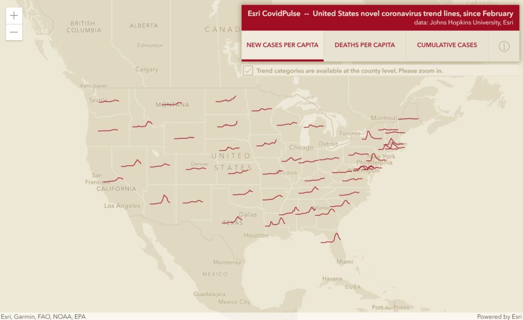
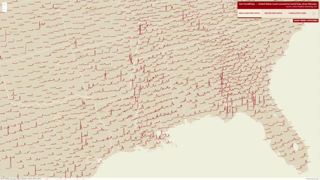
I assume that most of you already seen the real-time Esri COVID map, which is without doubts a very useful tool followed by millions. Earlier this week Esri published a new map called Covid Pulse that is one of the greatest examples of data visualization that I’ve seen for a while.
The map illustrates daily cases, mortality, and cumulative cases per state and country in a way that makes it clear and informative. The temporal data are represented as three day-over-day sparklines. The data has been normalized to per capita values to make the comparison of states and counties even possible.
When you click on a trend line you get additional details regarding particular state and country with longer timestamps looking back to February 2020.
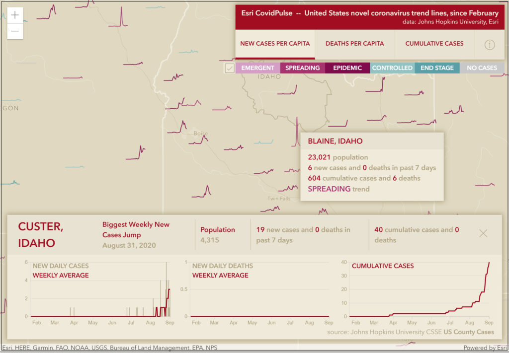
The map has been created by Jinnan Zhang and John Nelson (who’s maps we’ve been covering on Geoawesomeness a few times), of Esri, based on the data from Johns Hopkins University CSSE feature service of daily US County Cases since February 22, 2020,