In February 2015 NOAA and NASA joined forces and launched a DSCOVR satellite. The orbit of the satellite has been placed at Lagrange point 1, approximately 1 million miles from Earth, where it is balanced between the gravity of our home planet and the sun. Over the course of 1 year, a few time a day, the satellite has been taking a snapshot of Earth. NASA put together more than 3,000 of these images and created this amazing time-lapse that show a year in the life of our planet. Take a look at the NASA’s stunning time-lapse.

#

Next article

The night may be dark and full of terrors for the fans of Game of Thrones, but the good folks at NASA have shown us that our planet is never really that dark. The Earth looks absolutely spectacular when wrapped in ‘night lights’ from human colonies, wildfires, oil wells, auroras, et al. Not to forget the reflection of the stars and the moon off the oceans, ice sheets and clouds… Oh-so-stunning!
NASA has been analyzing these twinkling and flickering lights since 2011 when it launched the NASA-NOAA Suomi National Polar-orbiting Partnership (NPP) satellite. The space agency released the first global mosaic of night lights in 2012. The second comprehensive global dataset from 2016 came out last month, and we told you all about it here.
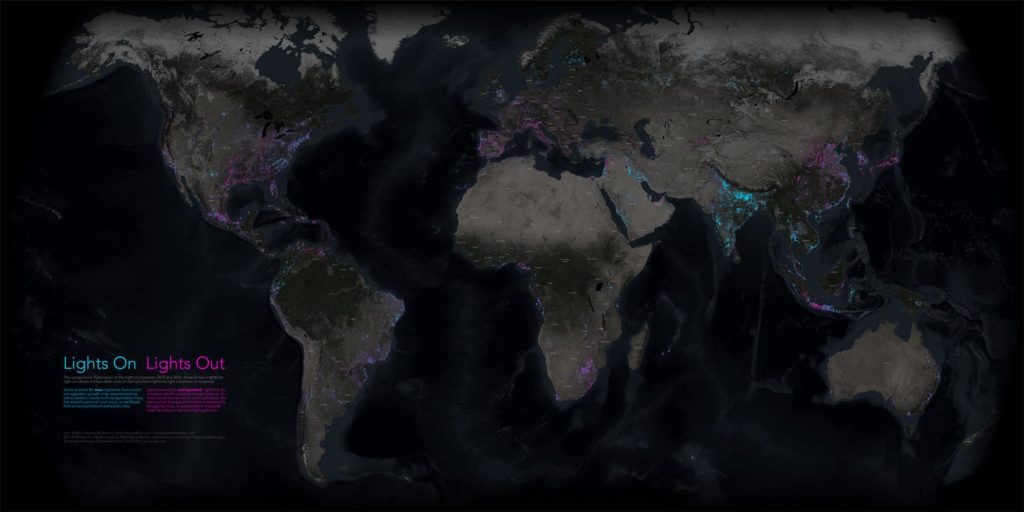
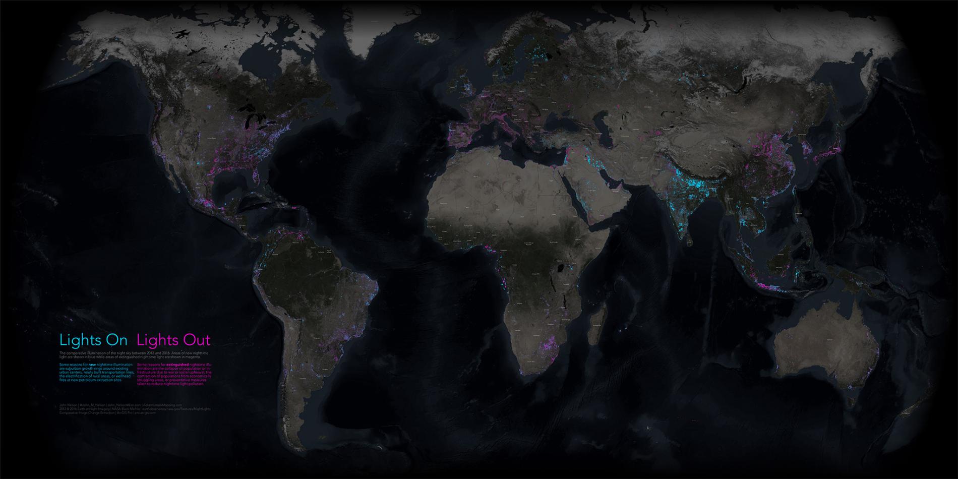
Looking at these images, Esri cartographer John Nelson thought it would be really cool to compare the nighttime lights in the two mosaics and see how the Earth and its people have transformed during this period. So, to draw out patterns of expansion and contraction of illumination, Nelson decided to map the changes in ArcGIS Pro.
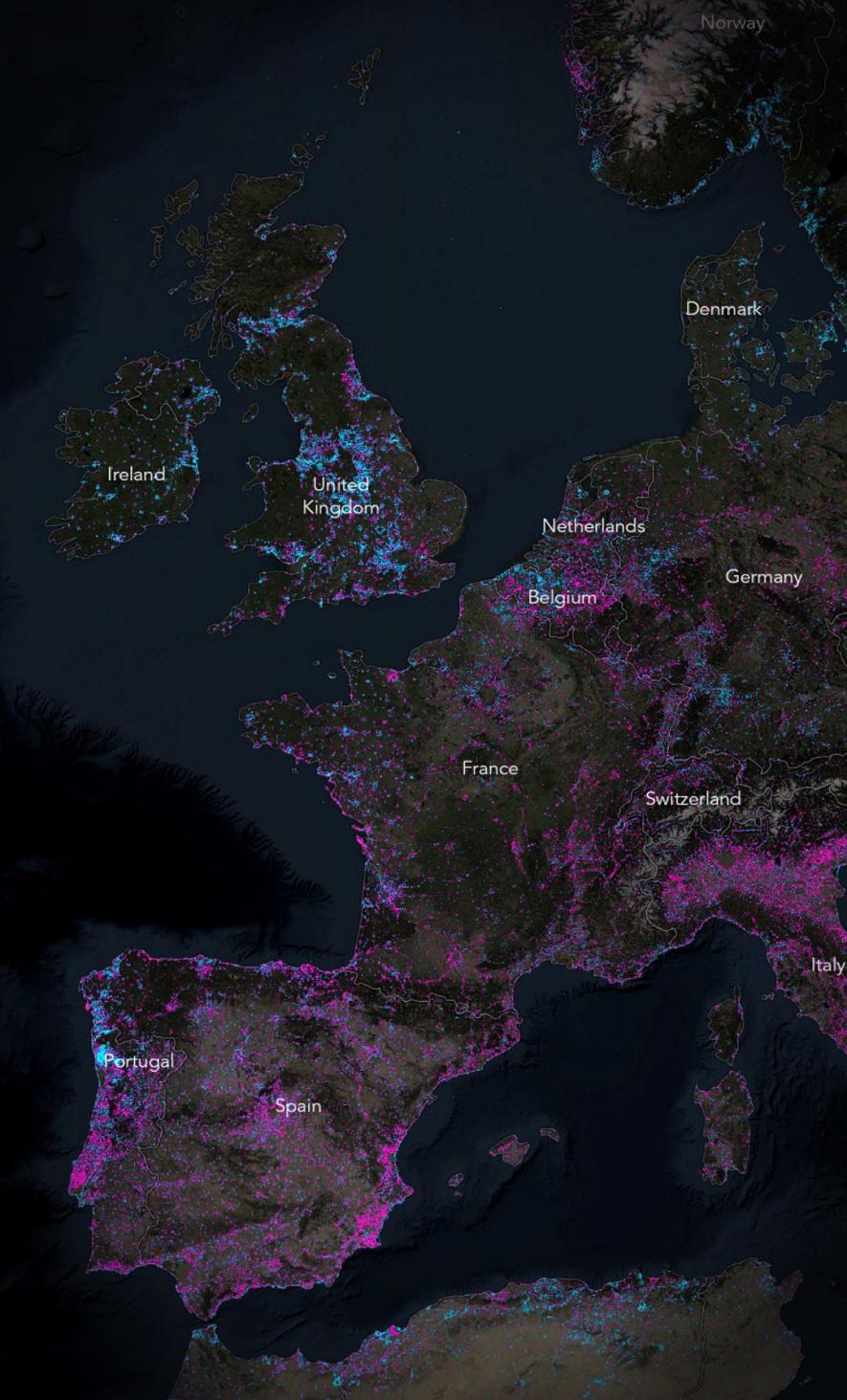
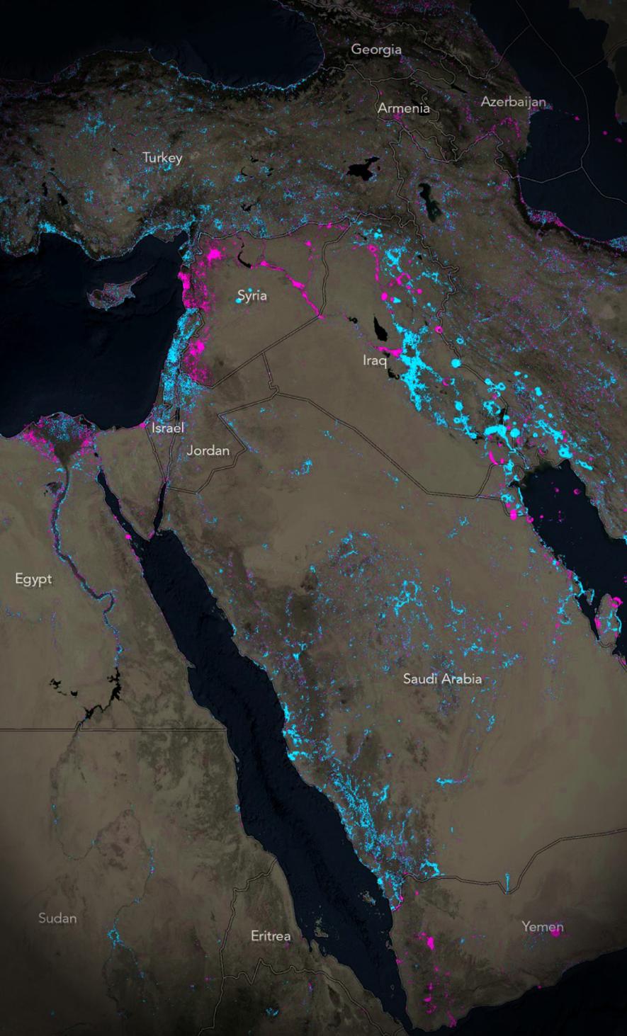
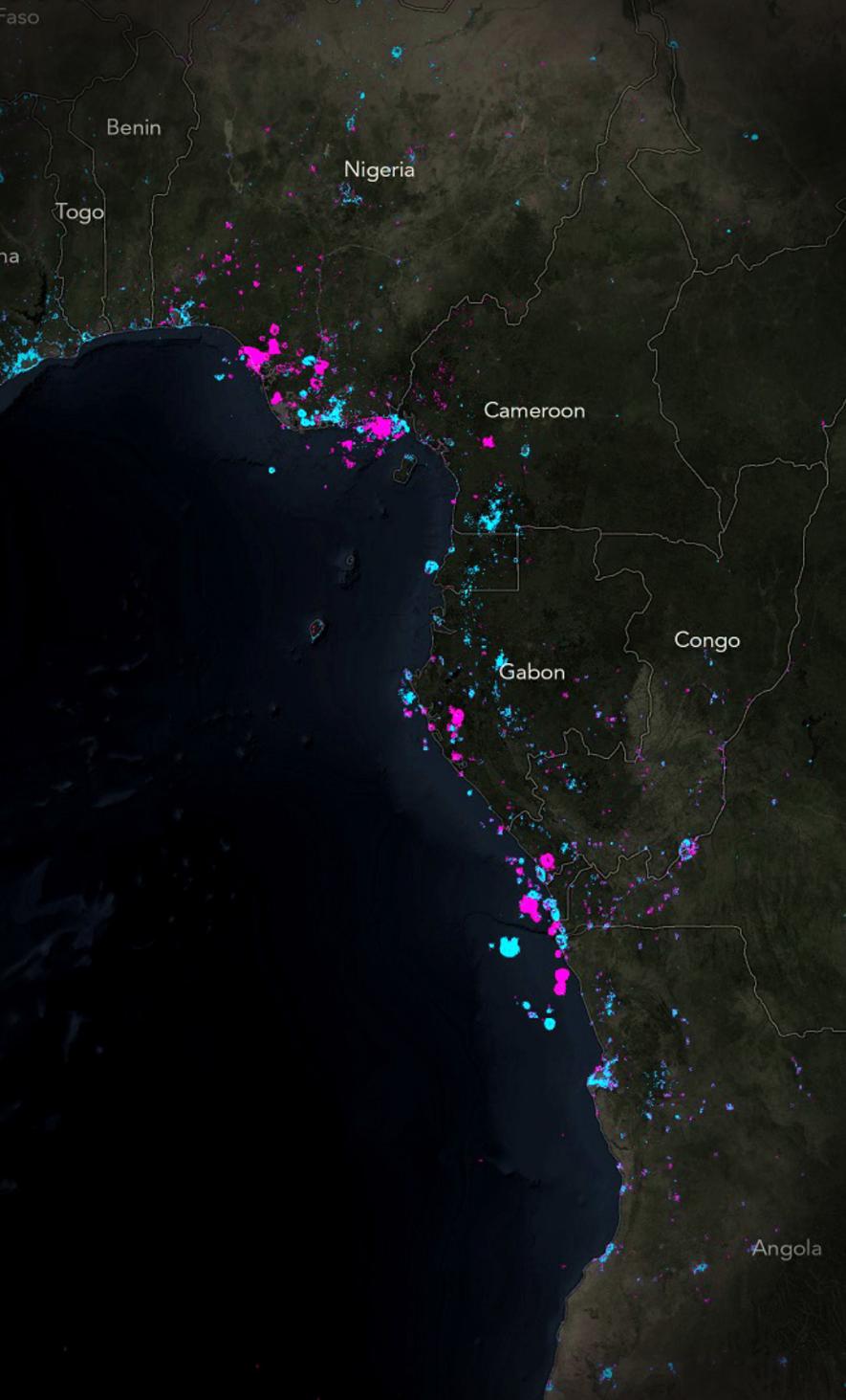
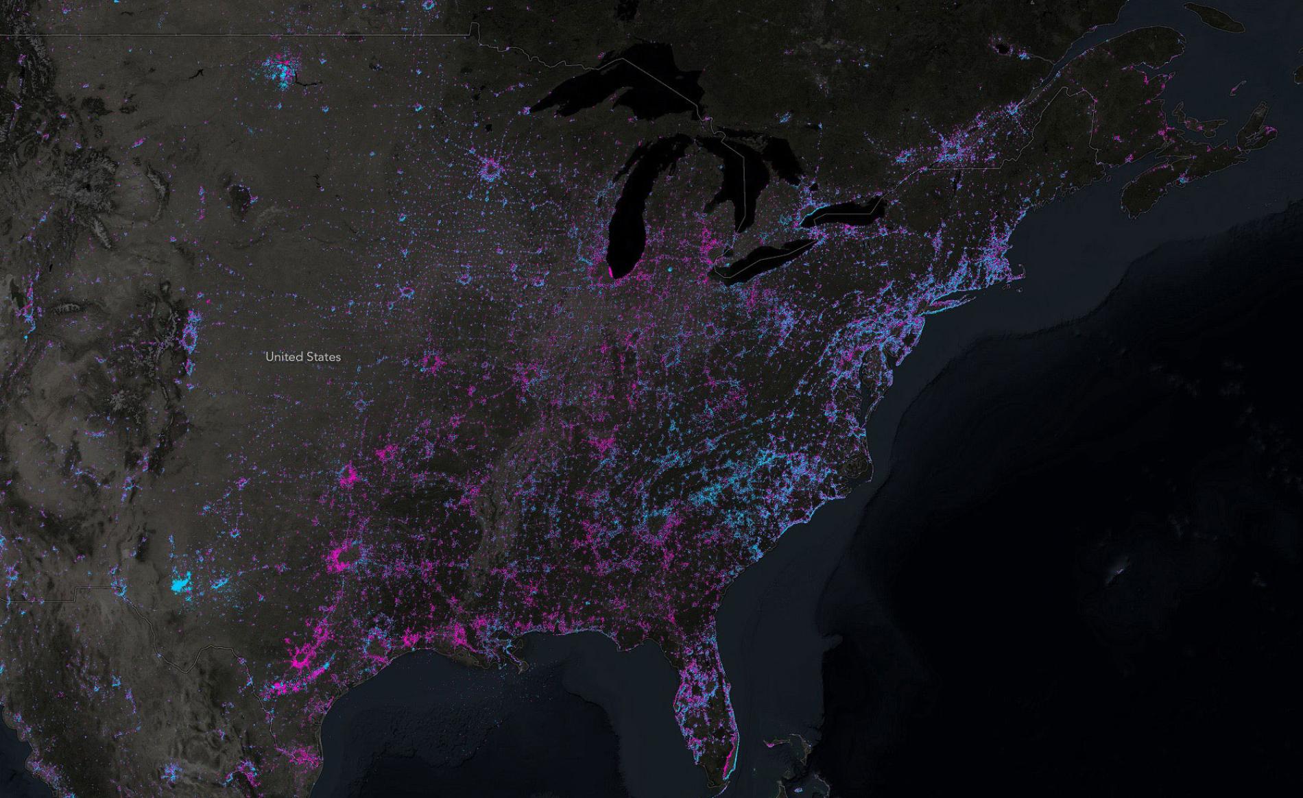
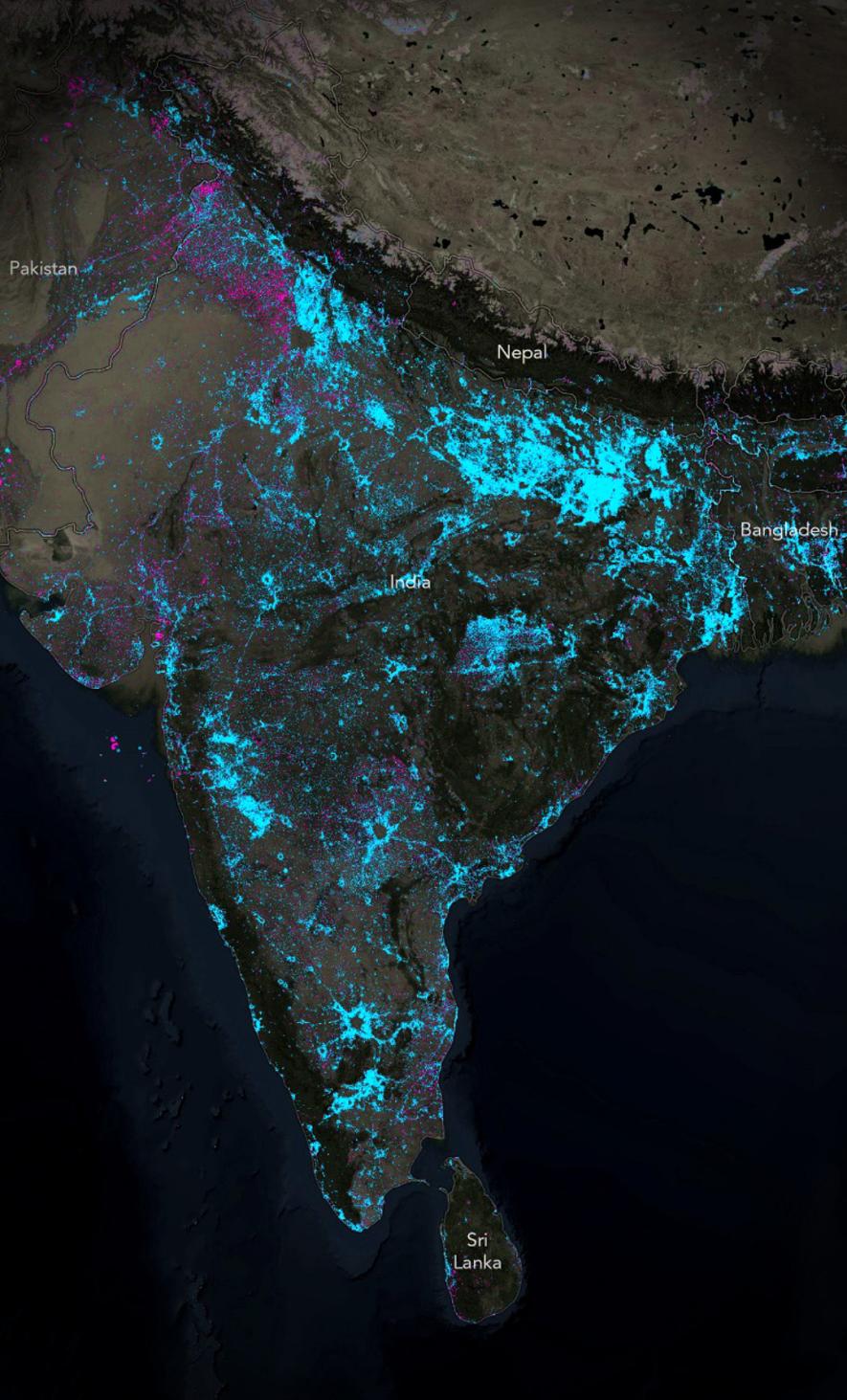
Using a simple pixel-difference math bot, the mapping nerd isolated the places where lights have come on (shown in blue) and where they have gone off (displayed in pink) in the past few years. (You can read all about the step-by-step process he followed here.) The places that haven’t changed, like metropolitan city centers, or forests and deserts, remain transparent to show the satellite imagery background.
The resulting glow map reveals quite a few striking changes – some easily explainable, some not. For example, vast expanses of new nighttime light have emerged in India over the last five years, especially at the base of the Himalayas and the southern parts of the country. These can easily be attributed to India’s electrification program for its 600,000 villages.
Some stretches in the UAE and parts of Oman also stand out for shining brightly where the night used to be dark just a few years ago. Nelson believes this light is from the new highway etched out in the desert.
However, not all changes are a testimony of hope and development. The island of Puerto Rico has dimmed significantly, as has Venezuela. Looking at the map, the struggling economies of these nations come conspicuously to mind.
There’s an overall reduction in night lighting in Western Europe also, which is hard to explain. It simply might be due to a disparity in the time when imagery was captured, like a weekday versus a weekend, or winter versus summer. To really connect these changes with specific events or activities, one would actually need to get down to the pixel level and take parameters like the viewing angle into account.
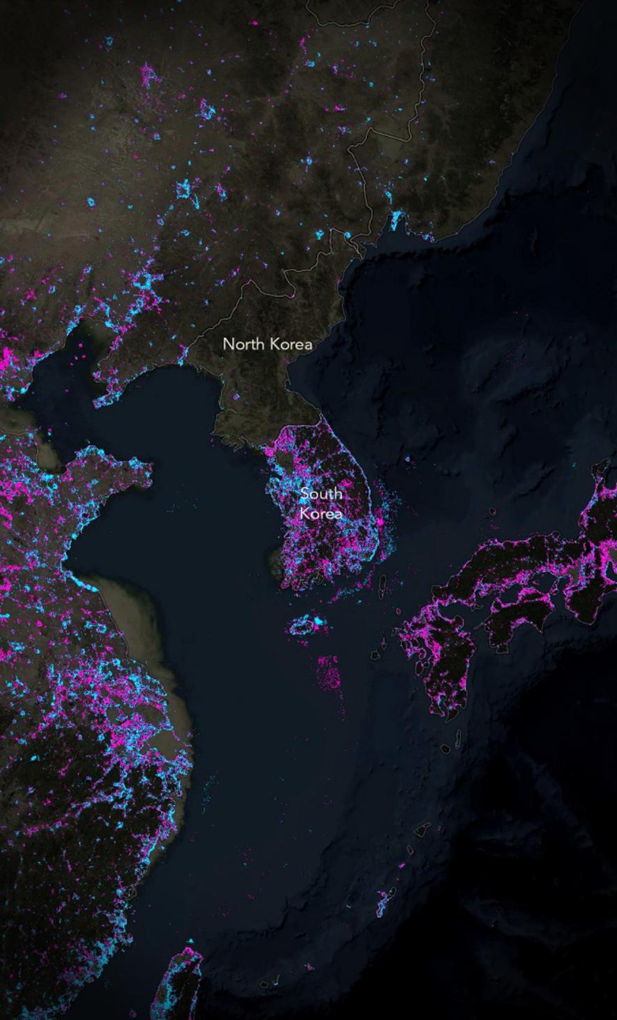
Even then, some changes are so evident, it’s difficult to ignore the most obvious explanation. As Nelson tells in this story map, “Perhaps the most stark example of extinguished nighttime lighting is apparent in war-torn Syria, where nearly all the night lights of population centers and the transportation systems that connect them have been wiped dark. Neighboring Iraq shows similar signs of conflict in the northwest, coupled with massive new illumination throughout the rest of the country.”
What are your observations? Tell us in the comments below!