
Personal interest and dedication are the best motivation for creating something of high quality with value for the society. This applies for collectors of works of arts, but also to collectors of geographic content. Throughout his life David Rumsey has been gathering historical maps of all different kinds. Today, the David Rumsey Map Collection stores more than 150.000 pieces of artwork from mainly North and South America, but also all other parts of the world, and constitutes one of the largest private map collections in the United States. The items range in date from 1700 until the mid 20th century including atlases, wall maps, globes, school geographies, pocket maps, books of exploration, maritime charts, and a variety of cartographic materials including pocket, wall, children’s, and manuscript maps. Due to its volume and range in time the collection reports history. A close inspection reveals the growth and decline of cities, the unfolding of the railways, the discovery of the American Wild West by the Europeans and generally the alteration and improvement of the cartographic perspective of the world.
After making career in real estate development and finance for over 20 years David Rumsey decided to make his collection public by building the online David Rumsey Historical Map Collection, www.davidrumsey.com. Around 45.000 were digitalised and can be observed as high resolution images that are extensively catalogued. The site is opened for public, for viewing the highest resolution of the scanned maps, a registration is needed. Technically, the collection on the Internet brings together the finest optical equipment and digital scanners, cutting edge viewing technology, the latest image processing software, powerful wavelet compression, and reliable long-term storage of digital images. The digitized maps are very high resolution images scanned at at least 300 pixels per inch, as measured against the original map’s dimensions. The larger maps generate files frequently approaching two gigabytes in size; the average file size of images in the collection is 200 megabytes.
At the bottom I am presenting some of the maps that I found inspiring. I like the recently installed tool that permits to view some hundreds of historical maps on google earth. Laid upon the actual situation the opacity regulator enables to compare historical reality and perception with the actual geographic situation of a place. Proper software, the Luna Imaging Inc., was developed for organising, managing and viewing images and map collections. Further options of the online collection include Google map function, maprank search, second life as well as 2d and 3d GIS browsers. I think the digital map archive is a wonderful place to enjoy geographic history and cartographic content from all over the world. Also, I find the online collection clearly organised and appreciate the several features connected to the maps. Have a look! Take your time!
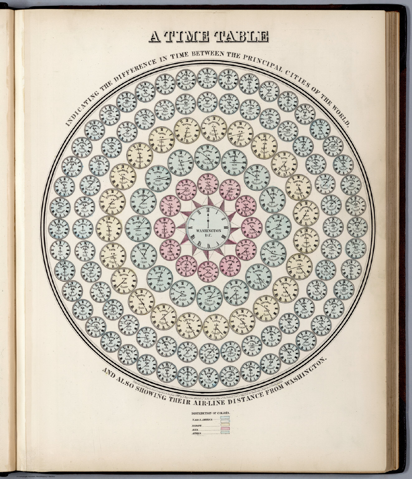
A Time Table indicating the difference in time between the principal cities of the World and also showing their air-line distance from Washington. Hand colored lithographed, with a list showing distribution of colors. 1868, Mitchell, Samuel Augustus Jr. Source: David Rumsey Map Collections.

A recent example of maps: A very early diagram/map showing where free content was available on the Internet in 1995 and how to access it. 1995, Randall, Neil; Downs, Timothy Edwards. Source: David Rumsey Map Collection
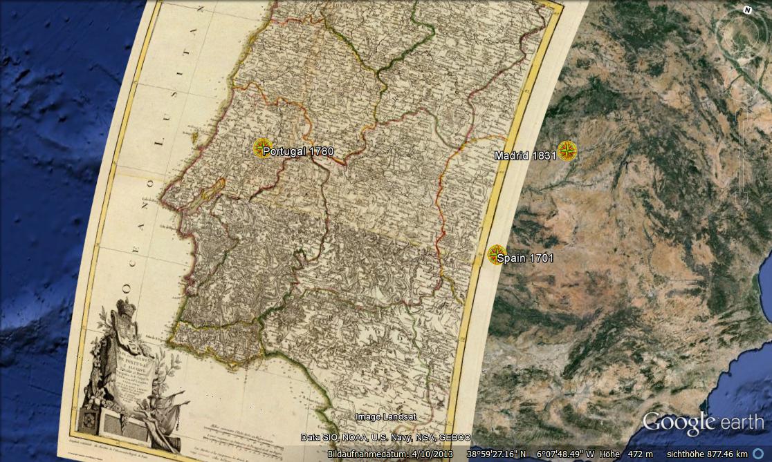
Historical map of Portugal from 1780 laid upon the actual situation on Google Earth.
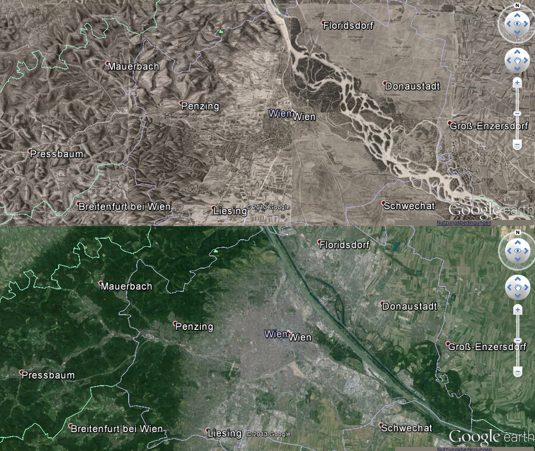
A historical map of Vienna from 1837 on Google Earth compared to the actual situation (bottom): very well to observe are the modification of the river Danube and city growth.
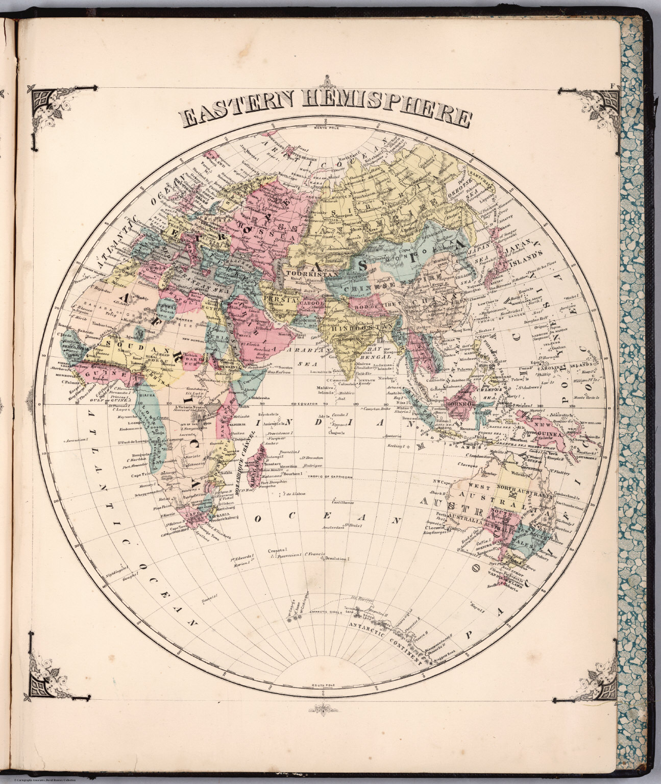
Eastern Hemisphere from 1856 published by J.H. Colton And Co. 172 William St. New York. I am impressed by the perspective of the world that is neither Europe nor America centered. Source: David Rumsey Map Collection

Map of Tokyo, Japan, 1863. Mounted and folded in cover 18×12. Wood block print in Japanese. Published by Nishimuraya Yohachi. This is a reprint of an older map, has two reprint dates: Kaei 1, 5th. month (1848) and Bunkyu 3 (1863). The date seal in the margin is the seal used for 1860. Extension pasted on the bottom of map refers to reclaimed land in the Tom river area. Shows main temples and shrines pictorially. Includes distance chart, legend and points of interest. David Rumsey Map Collection comprises maps from all over the world. Source: David Rumsey Map Collection.

#Ideas


Next article

Projection is one first step. Then comes the scale choice of what will be the limits of what matters in the trend or phenomena you want to show. More than a zoom level, picking up the right scale is a tricky and meaningful process similar to building a photograph composition.
The scale choice reveals the very interpretation the cartographer is making of the represented phenomena. People and places that do not appear on the map are considered not relevant to the topic. Then, the edges of the map define a time and space frame containing both the issue and its solution/explanation.
Example 1
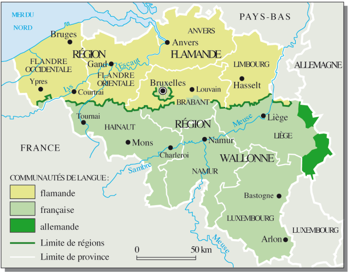
On this map from Le Monde Diplomatique, the political situation in Belgium is the topic. The map was illustrating an article about the 1993 agreement of Saint Michel that made Belgium a federal state by unifying the two main regions as well as smaller german regions under the same government. This is a very specific debate concerning Belgium and Belgium only, not depending on external forces. The issue (political unity of Belgium) contains its solution (it’s a national debate that no one else can solve but Belgians).
Example 2
On the example below, a map illustrating the Falklands War of 1982 (from the Wikipedia article about the event) between United Kingdom and Argentina over Falklands Islands sovereignty, the playground is the Atlantic Ocean, North to South.
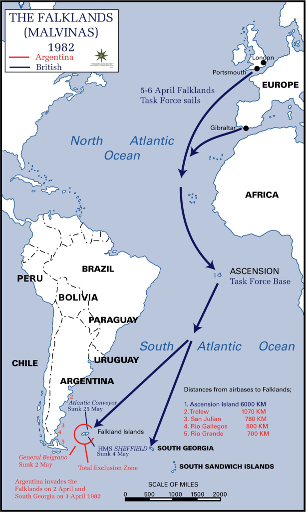
The map focuses on the two protagonists to show how & when they moved strategically to an actual open conflict over the Falklands. There is clearly no other country involved in this, nor other political influences. The map is focusing on strategy, events timeline and show very well the obvious handicap of distance United Kingdom had. That tells us a lot about how UK’s empire last bite was escaping from its yoke and how they desperately fought for it, more as a symbol than as an essential land possession.
Example 3
Taking a look at this map of the Muslim Distribution in the world from the map collection of the University of Texas. The map covers a very wide area from east to west, but a relatively smaller one from north to south. Are origins and history of Islam more about longitudinal migrations than latitudinal ones? Well, it is. The religion spread from middle east to Asia and North Africa, but were pushed away north and south by other forces (Christianity to the north & west, as well as from european colonies in central & southern Africa).
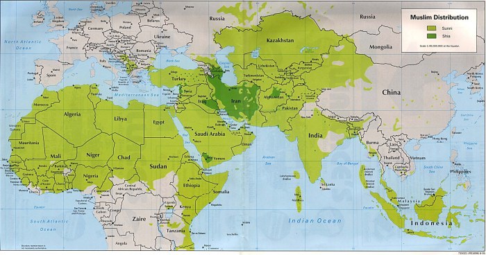
The very framing of the map is already telling us that nothing really matters outside of that area regarding the topic illustrated here. And indeed, when you look at other maps world scaled, like the one below (from Wikimedia), you see that the american continent as well as the southern part of Africa and northern part of Eurasia have a lot less muslim population than the region shown on the first map.

However, the second map gives you that information, instead of taking for granted that you already know that Muslims are more likely to be spatially concentrated in the Middle East than on the american continent. On the first one, the cartographer made the choice of assuming that information was obvious, as the second did not.