
Satellite images are a meaningful source of information for disaster mapping as recently revealed by the example of Haiyan typhoon in the Philippines. They provide a quickly available view on a disaster impacted place and its surroundings that would otherwise be difficult to obtain. The images at the bottom depict the most afflicted typhoon area of Tacloban City and its hinterland in Leyte Province. They were taken by NASA’s ASTER sensor at a height of 700km above the Earth on November 15 this year (upper image) and on April 03, 2004 (bottom image). The images are false coloured (not in RGB format as pictures) in order to discriminate vegetation as red shiny surfaces from built up areas that appear as silver-white (urbanized areas) to tan coloured areas in case of bare soil. Though being from the same location the images differ significantly. The reasons might be changes of land cover and land use within the 9 year time span, but NASA scientists argue that most of those alternations are due to the strong typhoon.
A strong difference comes from the vegetation especially toward the interior that appears cherry red in 2004 and almost beige after the typhoon. Since the tropical vegetation is not exposed to seasonal change the pale colour in 2013 was caused by the strong winds of the typhoon uprooting and stripping trees and bushes.
The built up areas in 2013 seem to be sprawled compared to 2004, which could point to intensive urban growth. However, scientists believe that the rise of silver-brown coloured areas was rather caused by the debris that was produced and blown around during the typhoon than by dramatic urban growth. They build their theory on the street grid that is clearly visible in the 2004 image and appears blurred after the storm. Also, the composition of red and brown colours along offshore areas altered to tanned tones due to aggregated mud.
Those examples point out the difficulty of extracting exact information from satellite images and the risk of misinterpretation. I think that knowledge, experience and information on the location are important features to retrieve the value of satellite imagery.
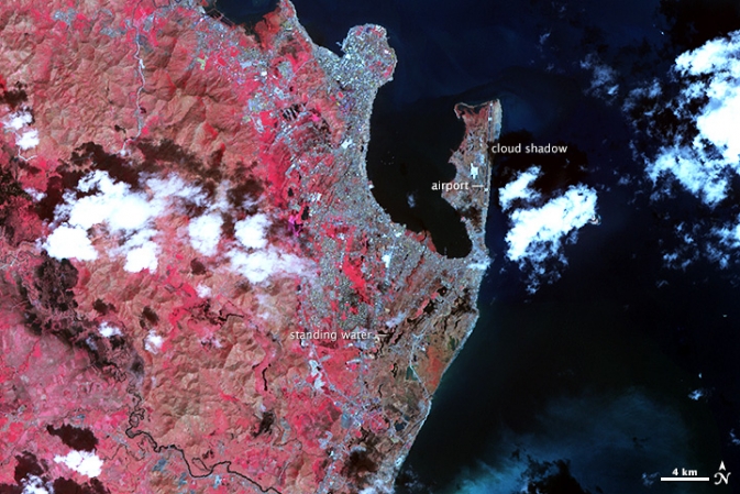
Tacloban City, 15 Nov 2013, ASTER sensor (Terra).
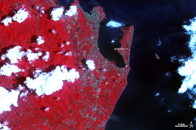
Tacloban City, 03 Apr 2004, ASTER sensor (Terra).
Source: Mashable

#


Next article
A new high resolution map of global forest extension covering the time span 2000 – 2012 was recently presented by Department of Geographical Sciences, University of Maryland, US. The time series is based on 654.178 LANDSAT images resulting in a global wide map displaying forest change at a never seen spatial detail of down to 30m. Thus, the map entails globally ‘consistent but locally relevant information’, according to a geographer of University of Maryland. Indeed, the map is useful for extracting information on local forest change, while potentially every corner of the globe may be entered. The huge amount of data processing was possible only through cloud computing.
Methodologically, forests were considered as all vegetation taller than 5m and are expressed as a percentage per output grid cell as ‘2000 Percent Tree Cover’. ‘Forest Loss’ is defined as a stand-replacement disturbance, or a change from a forest to non-forest state. ‘Forest Gain’ is defined as the inverse of loss, or a non-forest to forest change entirely within the study period.
The new forest map reveals that between 2000 and 2012 2.3 millions km² of forest have vanished. To present the gain and loss more clearly I am going to state the raw numbers:
2000 – 2012 global forest dynamics
- Gains: 800.000 km²
- Losses: 2.300.000 km²
- Loss and Re-gain: 200.000km²
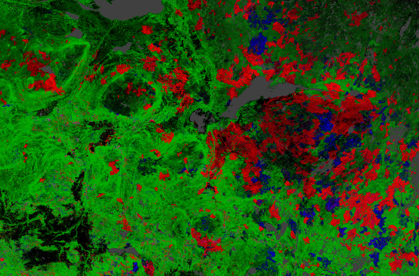
The greatest amount of loss still occurred in the tropics that count for 32% of all losses. While in Brazil due to political efforts the rate of loss reduced slightely (though after 2012 the restrictions for deforestation were loosened up again), the deforestation rate in Indonesia doubled after 2003 from 10.000 km² to more than 20.000 km² forest cut per year. Considerable are also the losses in the Canadian and Russian boreal forests.
Forest monitoring belongs to one of the highly significant topics of today. Initiatives such as UN’s REDD+ highlight the need for information upon forest change and biomass. Forests impact the climate (CO2 household), biodiversity of plants and animals, but also the humans in a positive manner. A researcher of the mapping team found out that tree cover correlates with human health as people living close to forests eat a healthier diet than people in other environments do (FAO article1, FAO article2).
In an increased situation of urbanisation, loss of biodiversity and enhanced consumption of resources the protection of forests as ecological regulators is of great importance. As political desicions for stopping deforestations unfortuantely need hard facts those forest and biomass monitoring programs in my opinion are strongly necessary in order not to experience forests being on diet themselves!
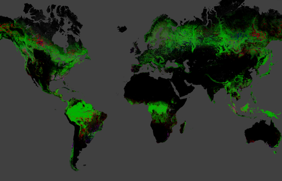
The new global map of deforestation reveals 2.3 million square kilometers lost between 2000 and 2012. Red shows losses, blue gains, purple loss and gain.

Indonesia lost forests the fastest of any nation between 2000 and 2012. Red shows losses, blue gains, purple gain and losses.
Credit: Image courtesy Matt Hansen, University of Maryland

Forest losses in tropical South America between 2000 and 2012. Particularly at the southern edge of the Amazonian Basin, in Bolivia, Paraguay the loss of forest are considerable. Red shows losses, blue gains, purple losses and gains.
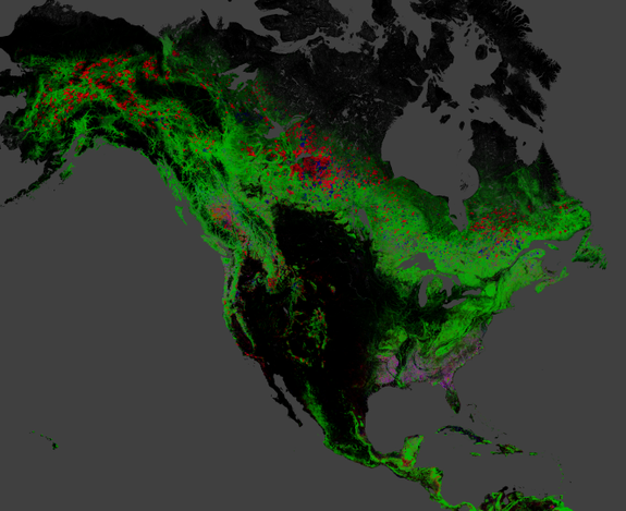
A map of change in North American forests between 2000 and 2012. Red is loss and pink represents areas of loss and gain.
Credit: Image courtesy Matt Hansen, University of Maryland
Losses in the Canadian boreal forests in a more detailed view. Red shows losses, blue gains, purple losses and gains.
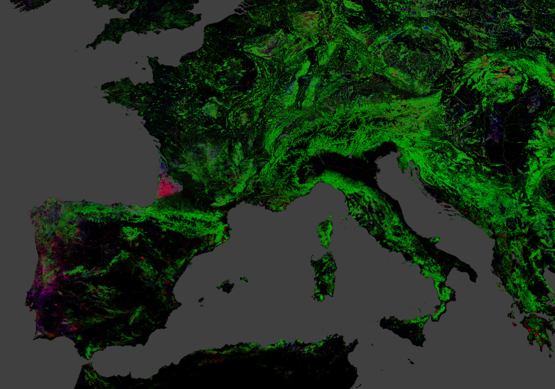
Forest change in Europe: A wind storm in 2009 leveled a forested area in the south-west of France. Portugal exhibits a strong dynamic of forest loss and gain. Red shows losses, blue gains, purple losses and gains.