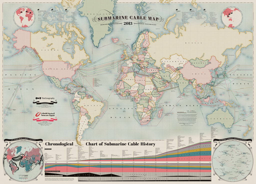
Submarine Cable Map Shows How The Internet Will Travel Underwater In 2013
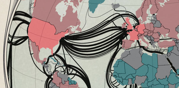
 TeleGeography released a 2013 version of its Submarine Cable Map which shows routes of 232 in-service and 12 planned undersea telecommunication cables… and it’s pretty awesome. You can buy a printed version or you can have a look at the interactive one. The maps do not denote capacity, but it shows an interesting connections around the world, which are usually difficult to see.
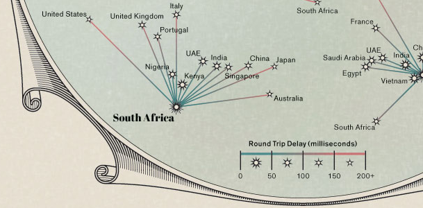
From the cartographic point of view the map is simply beautiful. The design was clearly inspired by antique maps but there is as well ‘network latency constellations’ part which brings to mind star charts, made by astronomers centuries ago.
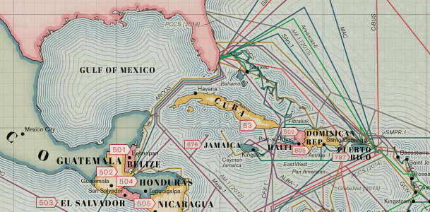
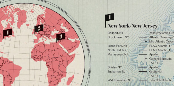
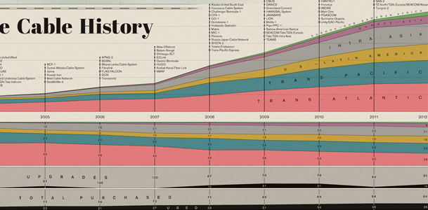
It almost a masterpiece, have a look at the graphical details:
 source: Submarine Cable Map


