
In the last 100 years, the human race has come a long way, be it the innovations in transportation, communication or any other aspect of modern life. It is interesting to note the distribution of researchers across the world. In an increasingly science-driven planet, this map is a good indicator of which countries place a higher prize on R&D : “The Research Map of the World”
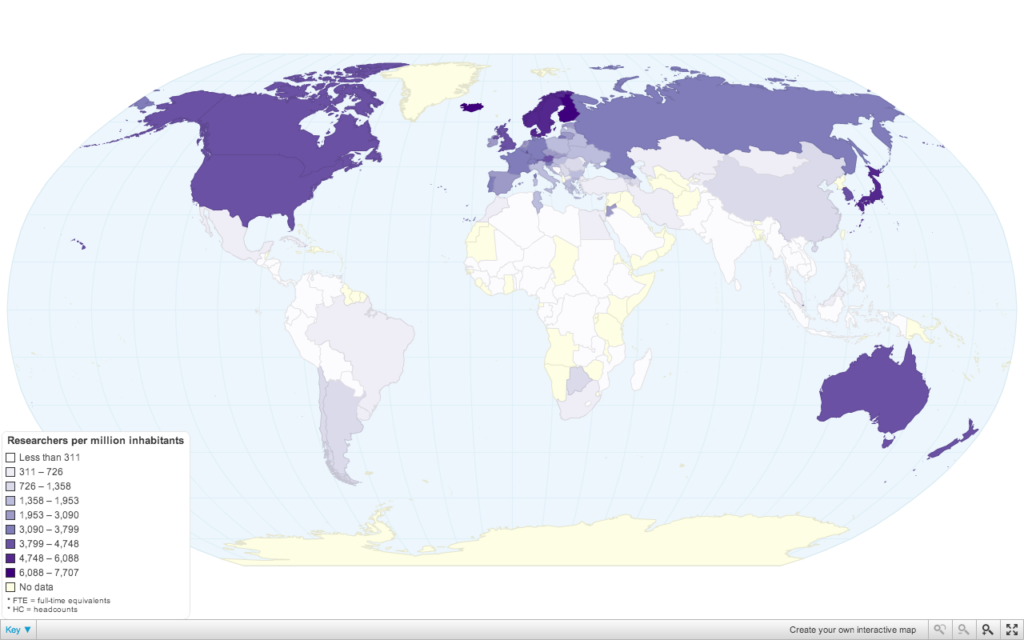
No prizes for guessing, the Scandinavian countries are on top of the researchers index. However, it is very important to note that these numbers are not absolute number of researchers in the country. For example, China with roughly 1100 researchers per million has a much higher number of researchers compared to Finland’s 7,707, which is the highest in the world.
What’s the total number of researchers in the world: 1,080.8 researchers per million inhabitants.
When we say Research today, i suppose a majority of us have a mental image of a researcher in a white coat sitting in front of a computer with some interesting looking equipment around them. PhD comics are rather quite popular on social media 😉 Nevertheless, these numbers are probably a clear indication of the “science-driven” world that we live in.
Data Source: United Nations Educational, Scientific and Cultural Organisation (UNESCO) Institute for Statistics
Visualization: ChartsBin.com


#Ideas


Next article
“Every day, all over the world, ordinary people must flee their homes for fear of death or persecution. Many leave without notice, taking only what they can carry. Many will never return. They cross oceans and minefields, they risk their lives and their futures. When they cross international borders they are called refugees.” This is the entry statement of the great project called The Refugee Project which maps UN data about refugee migrations from 1975 to 2012.
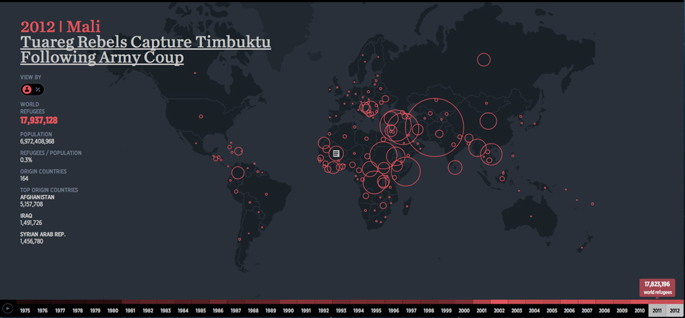
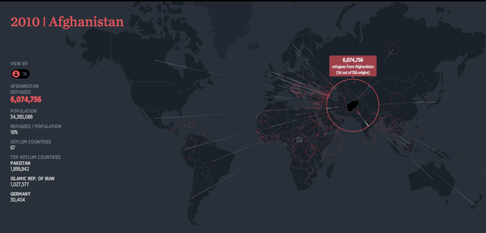
The project is the effect of collaboration between NYC-based design firm Hyperakt and designer Ekene Ijeoma, who contibuted 500 hours of volunteer work into building the website. The project gives some incredible insight into the growing amount of refugees world wide. There were 1.3 million of them in 2012 but the number grew up to nearly 18 million in 2012. In 2010 staggering number of over 6 mln citizens of Afghanistan had to flee or already have been away from their home country fearing for their lives.
The website also includes headlines for turning points in each country’s history, to help provide context behind the migrations. Deroy Peraza, Hyperakt’s Creative Director said:
There are small countries who at some point in history had a very large of their population leave, but they’re often not as big a story because the sheer volume of refugees is not as big as other countries. But to that country’s reality it must have been a tremendous impact.
From cartographic point of view I think that it’s a very good map. It clearly shows what authors wanted to present and there is no room for any misinterpretations. Amazing job!