

Last week Nokia has brought its mapping app back to iOS. Back? Some of you might still remember the terrible HERE app for iOS which has been launched in 2012 and removed from the Apple’s AppStore a few month later. I still keep it on my iPhone just to remember how not to make mapping apps. By launching the app Nokia wanted to win users during a few months when Apple released its Maps and Google Maps apps was still missing from iOS7 but the app was so bad that the plan failed totally.
But HERE learned its lesson. The Android app released in late 2014 gets really good reviews and most importantly unlike Google and Apple which stream their map data, HERE lets users to save the mapping data for offline use. Caching maps allows saving on cellular data and roaming costs, especially when traveling abroad. I believe that this feature attracted most of over 3 million users who downloaded the app for their Android devices until today. Another advantage of HERE over Google’s and Apple’s apps is a clear privacy policy, where the user exactly knows which data and for what purpose is sent to Nokia.
As of the design the iOS version looks very similarly to the Android app. And it looks good! Aside from typical navigation functions, live traffic info, photos and reviews of various locations, it also provides public transit info, which is still missing from Apple Maps.
If you still haven’t downloaded the app you can find it here.

#Business


Next article
How to make a killer map using Excel in under 5 minutes with PowerMap plugin
Many times it happens that you need to quickly visualize your data on a map but you don’t have a time to play for hours with ArcGIS or QGIS to make it look good. In this tutorial I’ll show you how make an awesome looking map in Excel in under 5 minutes with a free plugin called PowerMap (formerly GeoFlow).
1. Download and install the plugin.
Of course the first step would be to download and install the plugin from Microsoft website. You should download it and install without any issues. 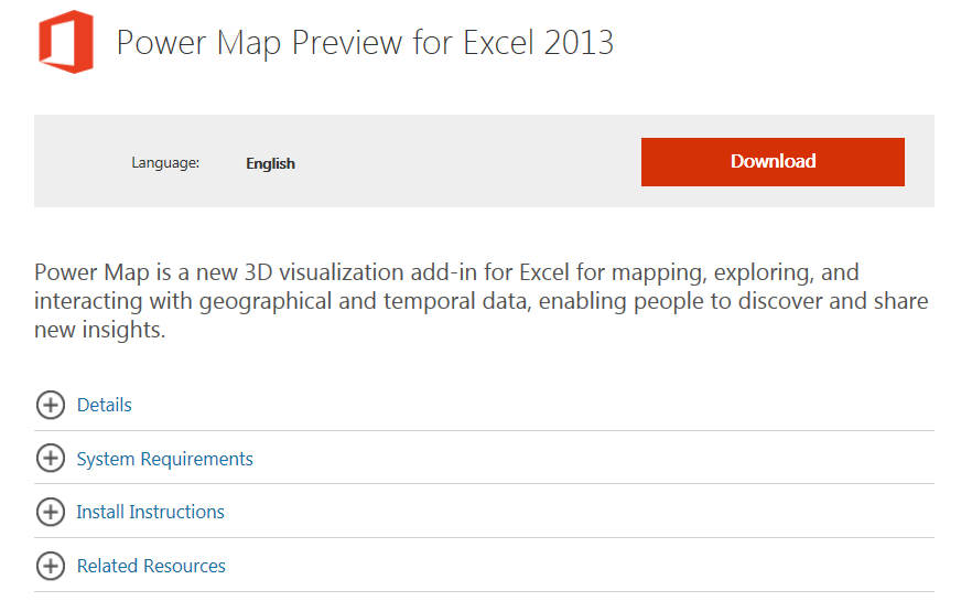 Initially the plugin was restricted only for MS Office 365 subscribers and owners of an expensive MS Office Professional Plus suite but recently it has been released for all MS Excel 2013 users. Both 32bit and 64bit Windows version are supported but it will work only with Excel 2013 (no previous Excel version is supported). It won’t work on any other operating system though. If you successfully install the plugin, you should be able to see it in your Excel under the “INSERT” tab.
  If you don’t see it you might need to activate it in Add-Ins menu. To do that go to File -> Option -> Add-Ins. You should the following window:
 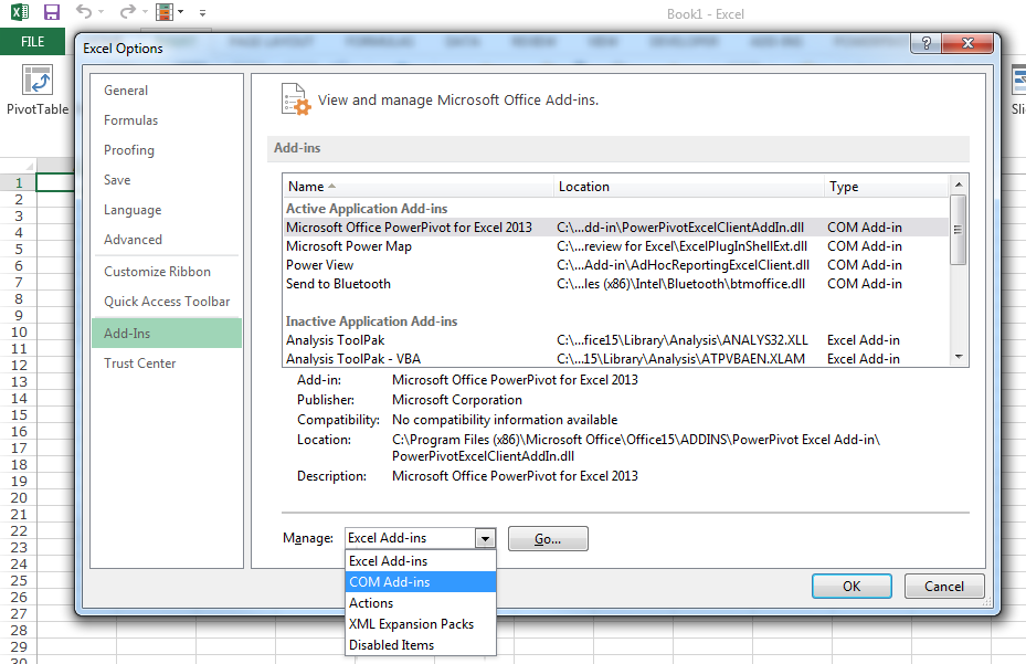 In the dropdown list on the bottom of the window select COM Add-ins and click GO. Now select Microsoft Power Map and click on OK button to activate it.
 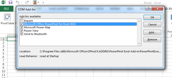 Now everything should work fine. The most difficult part is behind us:). Let’s start mapping.
2. Prepare your data.
Now its time to prepare your data. Power Map gives a couple of options to visualise it. The most obvious is to use coordinates. In this method you need to have two separates columns for latitudes and longitudes. There are a couple of cool things you can do with that and we will cover it in the future #GeoawesomeHoTo. Today lets focus on another great option of the plugin – geocoding.
Geocoding is a process which allows you to pinpoint a geographic location based on a description e.g. address, city name, postal code, country name etc. For the purpose of this tutorial I took a list of the largest agglomerations by population from Wikipedia. Selected the table in a web browser and copied it directly to Excel. Than I pressed “Text to Columns” button in the DATA tab and I came up with the following table.
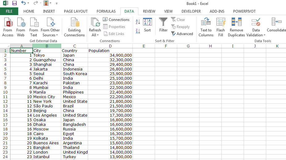
Geocoding will allow me to show a phenomena on a map based on a city or a country name. It will automatically connect the record to a centroid of a city or a country without a need to give a geographic coordinates.
This is it. Now we can start mapping:).
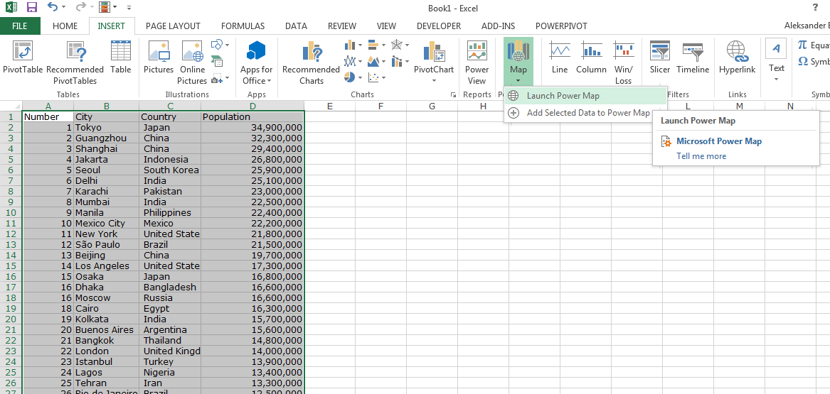
3. Select you data.
Now you just need to select the data you want to map, in my case it would be the whole table, go to INSERT tab, and click on a “Map” icon, which we’ve added to the menu at the beginning of the tutorial. Click on “Launch Power Map” and here we go.
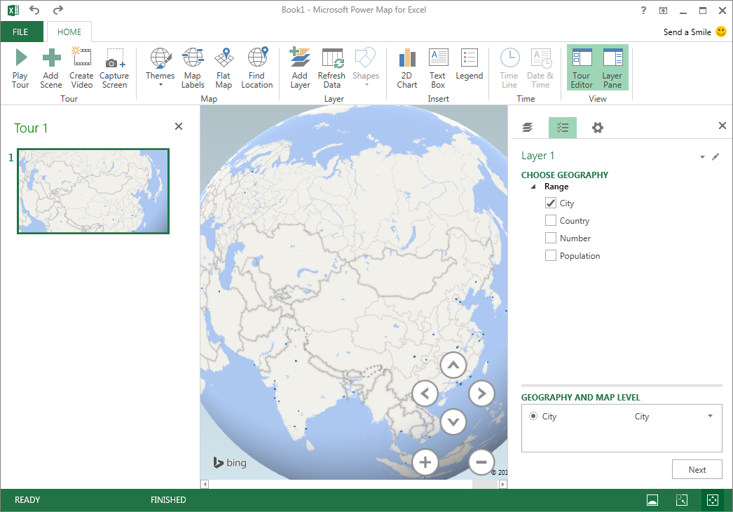
4. Create a map.
The Power Map window will pop-up on your screen. Below you can see that plugin automatically detected two parameters from our table “City” and “Country”. Based on these two columns Power Map will join the name to a centroid of a Country or a City on our list. In that case we are interested in visualizing the data for cities, so we should select only this option.
After choosing “the geography” click on the NEXT button in the bottom-right side of the page. You will be moved to the settings menu. Now you need to select which data you want to visualize. In our case we’ve got only the Population column, so we should select it. Below that there is a menu to select how you want to visualize the data. There are 5 options:
- Stacked Columns
- Clustered Columns
- Bubble
- Heat Map
- Region
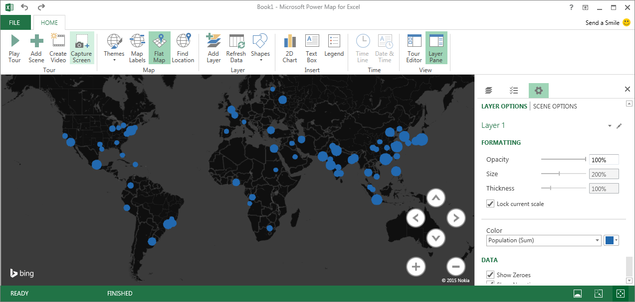
As you can see on the example below I’ve selected the Bubbles.
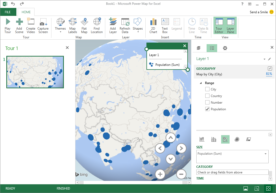
Now it’s time to play with the visualization and Power Map gives plenty of cool features to do that. You can Flat the map, you can select one of the predefined map themes, add text description (via Text Box) and so one. You can also play with the data visualization. Under settings menu on the right side you can change the opacity, size and thickness of your data points. You can also select a color. The size of the bubbles will change with the map scale so you can select “Lock current scale” if you want to keep make them look the same when you zoom in or zoom out.
5. Save the map
Our map is ready! We can present it directly in Power Map to maintain the interactive features or we can save it as a picture. To do that we just need to press the button “Capture Screen” in the main menu and paste (Ctrl + V) the picture to any graphical editor like Paint or a Photoshop.
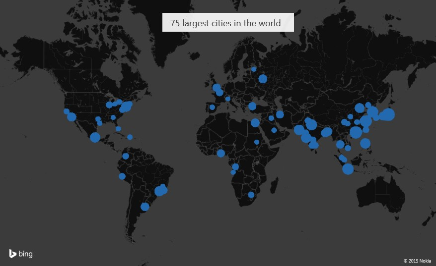
Here we are. Awesome looking map of the population of 75 largest cities in the world in under 5 minutes! Have fun!