
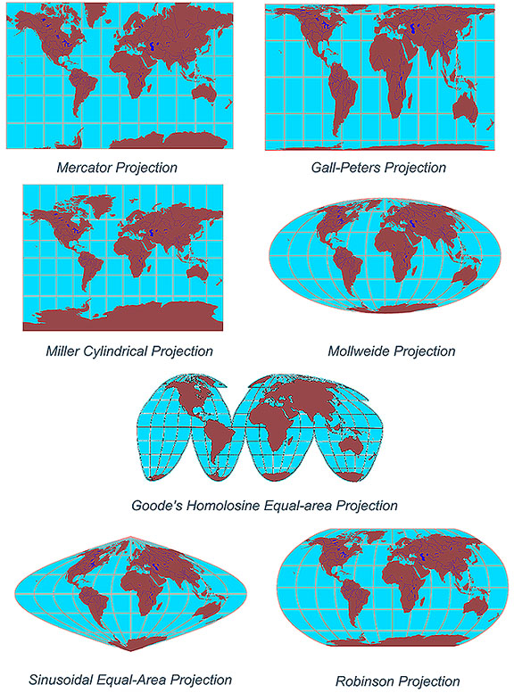
 There are four basic characteristics of a map that are distorted to some degree, depending on the map projection used. These characteristics include distance, direction, shape, and area.
My article is not to discuss the benefits of map projections but to look at how technology is contributing to skills and knowledge being lost.
What four things do map projections distort?
As a cartographer with over 25 years experience in the GeoSpatial Industry, I guess I have a slightly more critical eye when I see maps that are produced these days. It makes me cringe when I see maps that are missing some essential items like a scale, north point, legends, projection information or title. It is so easy these days to just press the ‘print’ button and have the software spit out the map. It may portray the data in the way the ‘cartographer‘ indented but it looses basic usability outside the original production when it does not have these basic elements.
Are these basic elements being lost because it does not matter anymore or is it too easy to just rely on the technology and therefore too easy to overlook the basic elements. I feel it is more about the technology, although I do see there appears to be less importance placed on some of these at some levels of education.
Technology has become more than a tool to help us but more and more a tool to do the work for us. How many of you rely on ‘spell checker’ or ‘predictive text’ to correct spelling or grammatical errors? I know I do and my spelling has suffered at the hands of technology. I look at my children’s homework and am often amazed at the poor spelling and abbreviated words. How much more effort is to type ‘great’ as opposed to ’GR8′?
This sort of approach has crept into the ‘cartographers’ of today. Many maps are produced without really asking the question; “What is my final aim for the map?” and “Why was the original data produced?” Many data providers capture and store data that is useful on a statewide basis but if you are producing a local area map, maybe the data needs to be reprojected. Maybe the data was captured at 1:1,000,000 but you are producing a map at 1:50,000.
What was the original purpose of the data you are using for your maps? Have you read the metadata associated with your data, or did it even come with metadata. Too often I see data being used in a way that it was not intended. This maybe due to scale, symbology, attributes or just poor representation. There is a saying “garbage in – garbage out” and this is very true when it come to maps. Just because your GIS software can symbolise your data in a certain way, is this really enhancing or degrading the original data.
Before ‘computer assisted cartography” each map was produced for a specific purpose and the cartographer would know about the source of the information and why they were producing the maps. Many maps were a work of art and the essential map elements were there to make it useful to the end users. I am truly amazed looking back at the maps produced by the early explorers, like Captain James Cook who mapped Australia over 200 years ago. They mapped the coastline from their ships using what we might called primitive tools but it was amazing how accurate they were. Today we just pull up the latest satellite image, assuming that it has been rectified correctly and is fit for purpose.
Rather than just pressing the ‘print’ button, ask yourself is that map useful to the end user and have I used data fit for purpose. Know why you are producing the map, know why the data was captured. Take the time to bring out the cartographer in yourself.
—
Network with other Geospatial Professionals
www.geospatialconnect.com


#Ideas

Next article

The First map is showing the distribution of total number of tweets from January 2013 to September 2013. According to the map, the highest number of tweets have been found in the Europe and in North America. Asia, South America and Middle East are in the second highest position and the lowest number of tweets been observed in the Africa and Australia. From the map we also can observe that, the number of tweet’s distribution is highly correlated with the number of population in the Asia and in South America but in Europe and in north America the tweet distribution does not depends on the number of population rather it’s the cause of rapid technological advancement and the popularity of twitter among the social network users.
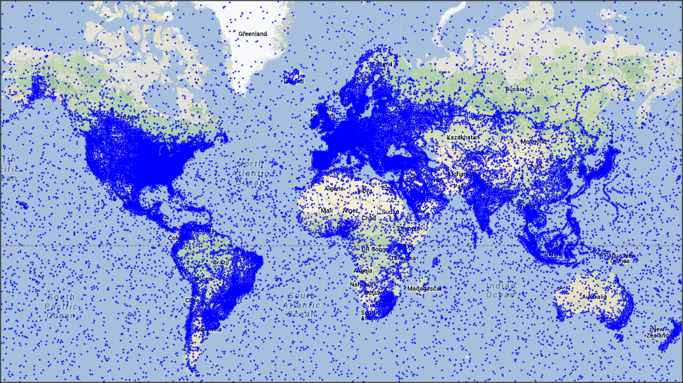
The Distribution of the total number of Tweets in 2013 (January – September)
To others, today, is an another usual day like every other regular days but for me its little bit different. Last night it seemed like the moon was bigger than usual. Then, I have found this morning warmer than other day’s though it seemed colder to others. From the very morning I’m receiving lot of phone calls, massages, mails, wishes and so. What’s special about today? Anyway, this is not an important question. The important and interesting questions are “who” are the people and “where” are they, who are feeling the same like me, today? let’s try to answer that query using social network data; twitter sphere. the clue is, to answer the question we have to find the birthday boys/girls all over the world. yes, today is my birthday. 😉
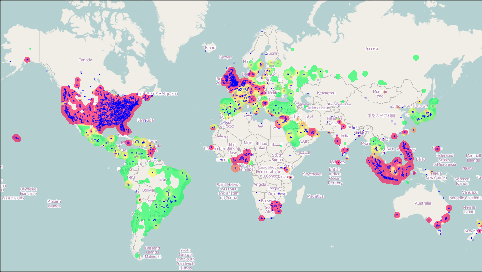
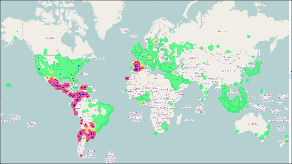
The Distribution of the total number of Tweets consists of the word “birthday” (in English) in 2013 (January – September)
The above map is showing the tweets distribution (of today; 30th September 2013) concerning “birthday”, represented in blue dots and the color ramp (green-yellow-red represents low-high regarding the total number of tweets) showing the relative distribution of the total number of tweets. for an instance, the darker red ramp represents the location with around 0.02% tweets of the total tweets and the green represents less than 0.004%. The total number of birthday people are highly correlated to the number of total tweets but there are exceptions too. for an instance in Japan, Brazil, Argentina, Portugal, Thailand, Turkey, Maxico and so. Now the question is why?
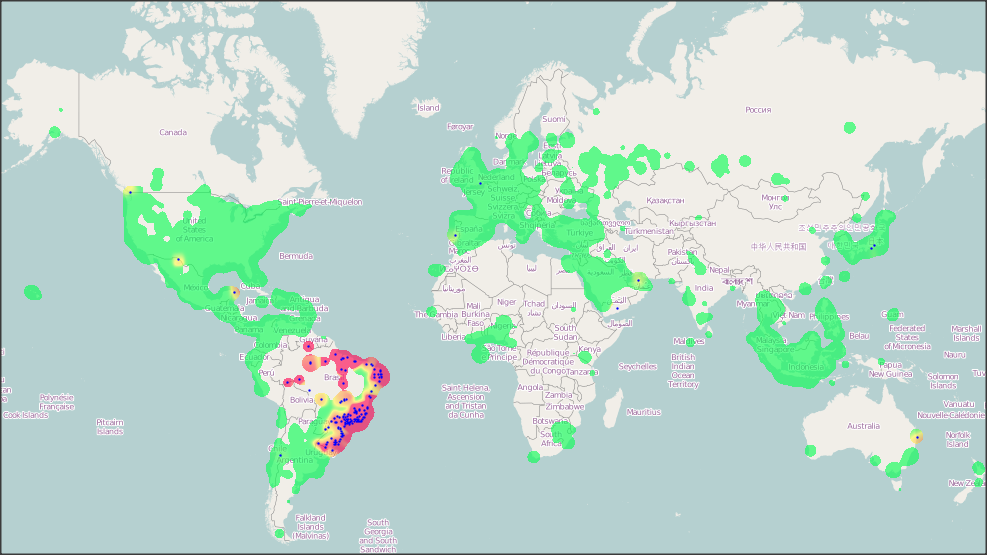
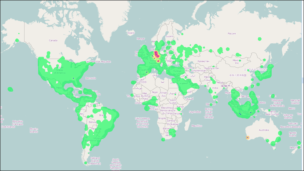
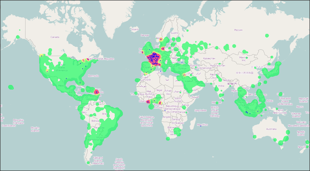
My first assumption, behind in anomaly was the “Language Diversity”. To check the fact I have plotted “birthday” tweets in the Spanish, Portuguese, French and German and generated the following map. and these maps finds my assumptions true. For an Example the people from Maxico wrote Birthday in Spanish so that was not considered into the count while plotting English “Birthday”. And in those maps the color ramps (green – red) represents the tweets distribution considering that particular language of the word “birthday. So, while analyzing the twitter data language is a very important and tricky issue, needs to be considered.
The Distribution of the total number of Tweets consists of the word “birthday” (in Portuguese) in 2013 (January – September)
The Distribution of the total number of Tweets consists of the word “birthday” (in Spanish) in 2013 (January – September)
The Distribution of the total number of Tweets consists of the word “birthday” (in German) in 2013 (January – September)
The Distribution of the total number of Tweets consists of the word “birthday” (in French) in 2013 (January – September)
Finally, The people who are talking about birthday, they are mainly wishing happy birthday to others, living in the same house or living in the other part of the world. Interestingly, Now I know where are the birthday boys/girls are living/staying tonight. Wish you a very happy birthday to you all and send my warm wished spatially 😉
All this maps were developed using the weetMap ALPHA; A Sample Big Geodata Exploration Tool Powered by MapD and WorldMap