
If you drive in a crowded city, you must have learned by now that even if you know the route to a place, it’s good to check what the traffic is going to be like – especially if you are going to a time-bound event like a job interview or the movies. But even after you have armed yourself with that knowledge, there’s a good chance you neglected to factor in the other most significant time-guzzler for a motorist: finding a parking spot.
Did you know Americans spend an average of 17 hours every year looking for parking spaces? Sounds exhausting, doesn’t it? But now with Google Maps putting its machine learning magic to good use, things are starting to look up – at least for 50-odd cities across the world.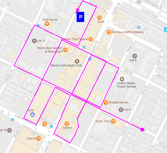
How does machine learning predict parking?
Building the algorithm is no mean feat. Researchers at Google studied the historical parking data and collected ground truth inputs from over 100K people, asking pointed questions like: How long did it take you to find parking? Then, they made use of anonymous aggregated information from users who had opted to share their location data to create training models. For example, if a person keeps circling or walking around after reaching the intended destination, it could mean finding a parking spot there is difficult.
After that, it was up to the standard logistic regression model for machine learning to leverage the features based on the dispersion of parking locations and predict how difficult finding an empty spot would be at any given time.
Related: Let Google Maps remember where you parked your car
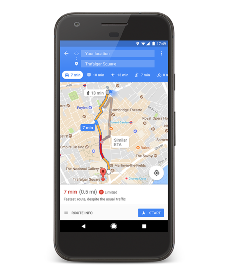 As a result, now we have a parking difficulty icon feature in Google Maps for 25 cities in the United States, and another 25 in other parts of the world. Parking difficulties vary from limited to medium to easy and will show up once you tap the ‘find parking’ tab on the directions card. You will be shown a list of parking spots near your location, along with walking direction from there to your final destination. Pretty cool, right?
The feature has been rolled out only on Android devices for now. So, if you are an Android user who has made use of this, let us know how useful you found it in the comments below!
Here’s a full list of cities where this feature is available:
In the US: Atlanta, Boston, Charlotte, Chicago, Cleveland, Dallas/Fort Worth, DC, Denver, Detroit, Houston, Los Angeles, Miami, Minneapolis/St. Paul, New York City, Orlando, Philadelphia, Phoenix, Pittsburgh, Portland, San Diego, Sacramento, San Francisco, Seattle, St. Louis, Tampa.
Outside the US: Alicante, Amsterdam, Copenhagen, Barcelona, Cologne, Darmstadt, Dusseldorf, London, Madrid, Malaga, Manchester, Milan, Montreal, Moscow, Munich, Paris, Prague, Rio de Janeiro, Rome, Sao Paulo, Stockholm, Stuttgart, Toronto, Valencia, Vancouver.

#Business


Next article

Trade deficits and protectionism are making headlines across the globe but how exactly does the flow of international trade look like? The global market for imported goods was $15300 billion in 2015 (UN’s Comtrade database).
Mapping the flow of international trade
This map created by Max Galka shows where those products came from and where they went, each dot representing $1 billion in value. It’s amazing to see how certain countries dominate exports. You can select any country to get an overview of the imports. The Map is totally cool and would be helpful if you could have also selected particular goods.
Max created the map using data from UN’s Comtrade database which provides free access to detailed global trade data. If you are interested in learning more about how the map was created – here’s the link to the Youtube video explaining that.