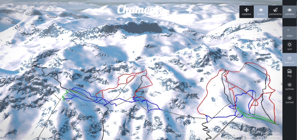


There is a cool new mapping project called Piste.io which allows you to view 3D maps of ski slopes. The website combines digital elevation model, satellite images and ski pistes data from OpenStreetMap. It runs the data through purpose-build terrain engine to generate impressive realistic interactive visualizations of mountain ranges.
 Piste.io uses WebGL, so you’ll need a WebGL enabled browser. The engine gives some cool options. You change the view, zoom in and out or show the panorama of the resort but the most visually impressive are “the style” options which allow to change the weather conditions of the visualisation: sunny, foggy, at the sunrise or at the sunset. It looks really impressive. More over it allows you to make a virtual run down long the selected piste. You need to try it out!
Currently there are maps of 27 ski resorts available, mostly in European but there are also couple of resorts from US and Canada.
Really geoawesome project!

#Ideas

Next article
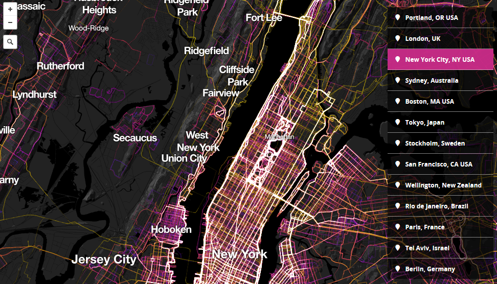
Two Mapbox developers Garrett Miller & Eric Fischer worked on a cool project. They’ve pulled some data from RunKeeper, a jogging app that recently partnered with Mapbox, and they visualized 1.5 million walks, runs and bike rides in cities all over of the world.
The effect is really cool. The colors of the tracks represent a length of each track. Shorter workouts range from cold blue to hot pink, mid-length routes are represented by glowing white and longer routes over 25 km yellow. Of course some cities have more data available than others. Nonetheless there are several patterns common in most of urban spaces e.g people like to run by a water.
We’ve seen a similar project made by Strava, which launched as a commercial platform called Strava Metro with a similar data designed for urban planners. Check out this video to learn how has the platform been used in Portalnd:
Compared, the Mapbox and Strava platforms are similar. What I like about Mapbox is that it visualizes additional data about the length of a trip. Strava on the other hand allows for much more detailed zoom than Mapbox. At the end the most important thing is the volume of the data, and I guess that this varies from a city to a city.
source: MapBox