
Google Maps and Google Earth are amazing tools. We are so used to them that we tend to forget how they have changed our lives. Recently a graphic design student Matteo Archondis decided to give a tribute to Google Maps for the 12th birthday of the service and created an awesome timelapse-based tour around the world.
The timelapse is based on 3305 screenshots captured frame by frame. It shows famous landmarks from all over the world—from Rome to Tokyo but more importantly, it reminds us useful these tools are.

#Featured


Next article

Medical mapping is not a new concept. It has been part of the healthcare landscape since ancient times; medical geography is mentioned in the writings of ancient China, Greece, and India. It has evolved over the centuries from these early mentions to Dr. Robert Baker’s map of the English cholera epidemic during the 1800s to today’s innovations.
Providers and scholars now have GIS technology at their disposal. This combined with the continuing research that points to the connection between public health and environmental health has given rise to GeoHealth.
GeoHealth is where geography and public health meet. It is now a major academic discipline, using spatial sciences such as GIS, hydrography, and cartography to help with a number of public health crises and trends.
An Outbreak
In the last three years, the world has seen high incidences of disease outbreaks. First, there was the Ebola outbreak in West Africa. Then there is the ongoing fight against Zika, which has impacted South and Middle American countries, some Asian countries, and has now spread to the contiguous United States themselves.
The United Stated Department of Health & Human Services now tracks incidents like Zika outbreaks, severe weather patterns, and even large social events with its new platform GeoHEALTH. The mapping system uses an ArcGIS service to track information from a number of public agencies as well as non-governmental organizations.
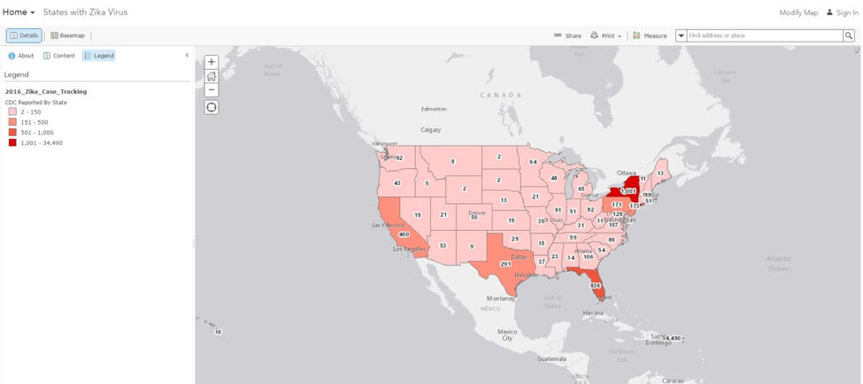
The data tracked on GeoHEALTH shows information such as the location of an outbreak as well as the response to it. For instance, the map is currently tracking a Zika outbreak in Puerto Rico. It also shows that there have been cases of Zika reported to the CDC in all of the lower 48 states. The map itself distinguishes between isolated cases and full-on outbreaks, with Puerto Rico classified as “Event Impacted.”
Tracking this kind of data can show not only the pattern of movement of an outbreak such as Zika, it can help public health professionals make the decision to combat it. These decisions could be travel warnings, or they could be the dispatching of a team of Centers for Disease Control experts.
Natural Disasters
Hurricane season in the United States has come to end, but the National Geospatial-Intelligence Agency (NGA) is still tracking storm data. Its GEOINT Services are GIS-based maps that track the number of public health data, including 2016’s Hurricane Matthew Support.
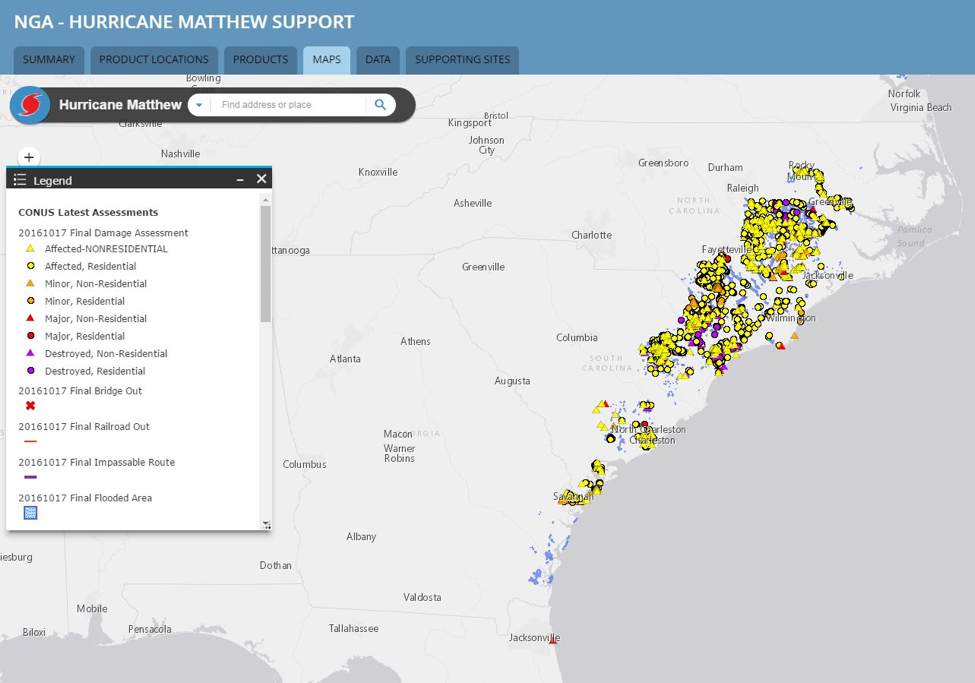
The map itself tracks damage assessments throughout Matthew’s path, which runs as south as Haiti. It shows everything from residential and non-residential destruction to flooded areas. Tracking this kind of data assists public health and emergency response organizations in two ways.
First, they can see where their efforts are needed. Second, they can track paths of storms and make predictions for early assistance. ArcGIS isn’t the only technological means of mapping this kind of information, as noted by Eastern Kentucky University. MicroMappers is a crowdsourced means of tracking public health data, such as requests for assistance post-natural disaster.
MicroMappers are the public themselves, submitting their pictures, tweets, and other social media posts to various sites intended to help the affected areas. One of the first disasters ever to use MicroMappers was the Phillipines’ Typhoon Ruby. The United Nations Office for the Coordination of Humanitarian Efforts enacted its Digital Humanitarian Network (DHN). The DHN is the UN’s official interface between humanitarian organizations and digitally savvy volunteers. For past disasters, the UN has asked that the DHN curate tweets related to requests for assistance. The MicroMappers have used everything from artificial intelligence to drone imagery to find survivors.
Chronic Conditions
GeoHealth as a discipline is also focused on seeing the connections between the health of the environment and the health of the population. The National Center Institute has created its own Geographic Information Systems and Science for Cancer Control. This GIS database tracks multiple data points.
Its map viewer shows users data concerning the following areas:
- Historical mortality
- Incidence
- Mortality
- Prevalence
- Screening and risk factors
Each category has its own set of data points which allows users such as the public and health professionals to track cancer data. The tools can be used to track geographical incidences of risk factors such as sun exposure, helping with preventive care as well as information sharing.
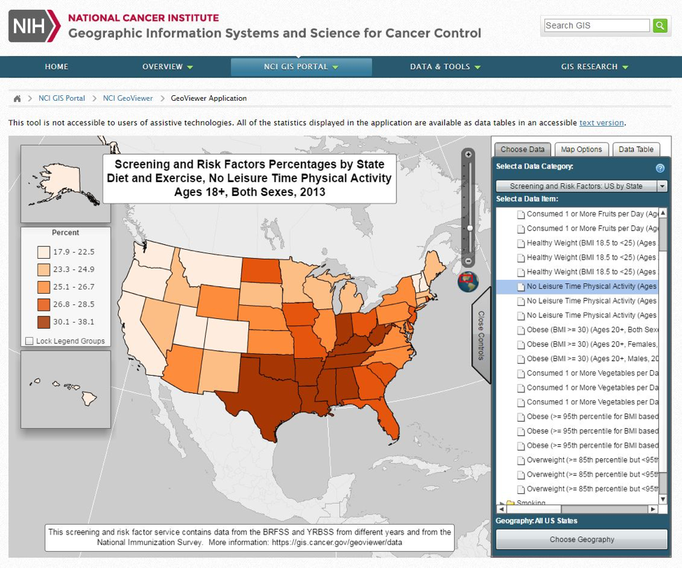
The tool even tracks smoking statistics, helping to combat multiple issues, such as the spread of lung cancer, tobacco’s impact on the environment, and the spread of cigarette use among youth populations.
Other Uses
The NGA’s GEOINT platform also tracks environmental issues such as global warming and wildlife trafficking. GEOINT’s Arctic Support map shows the polar ice cap and includes layers showing elevation readings and nautical charts.
The wildlife trafficking map collects data across multiple points. There are ethnicity layers, land ownership and use, and even language. The most compelling layer of this map is the Significant Events layer.
This layer shows major ivory trafficking routes, according the National Geographic, poaching events, and the elephant population. Rhinoceros poachings are also tracked.
These are just a handful of ways GIS and other mapping tech is being used by government agencies and NGOs to aid in disaster relief and public health. As more organizations embrace the use of this kind of tech, its ability to impact public health will be more comprehensive.